本演练的目的是了解如何创建用于 Windows Presentation Foundation (WPF) 应用程序的动画按钮。 本演练使用样式和模板创建自定义按钮资源,该资源允许重复使用按钮逻辑的代码和分离按钮逻辑与按钮声明。 本演练完全采用可扩展应用程序标记语言(XAML)编写。
重要
本演练将指导你完成创建应用程序的步骤,方法是键入或复制可扩展应用程序标记语言(XAML)并将其粘贴到 Visual Studio 中。 如果想要了解如何使用设计器创建同一应用程序,请参阅 使用 Microsoft Expression Blend 创建按钮。
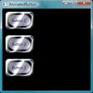
下图显示了已完成的按钮。
创建基本按钮
首先,创建一个新项目并将几个按钮添加到窗口中。
创建新的 WPF 项目并将按钮添加到窗口
启动 Visual Studio。
创建新的 WPF 项目: 在“ 文件 ”菜单上,指向“ 新建”,然后单击“ 项目”。 找到 Windows 应用程序(WPF) 模板,并将项目命名为“AnimatedButton”。 这将为应用程序创建框架。
添加基本默认按钮: 此演练所需的所有文件都由模板提供。 通过在解决方案资源管理器中双击它,打开 Window1.xaml 文件。 默认情况下,Window1.xaml 中有一个 Grid 元素。 首先,从 Window1.xaml 文件中删除 Grid 元素。然后,通过键入或复制并粘贴以下突出显示的代码,将几个按钮添加到可扩展应用程序标记语言(XAML)页面:
<Window x:Class="AnimatedButton.Window1"
  xmlns="http://schemas.microsoft.com/winfx/2006/xaml/presentation"
  xmlns:x="http://schemas.microsoft.com/winfx/2006/xaml"
  Title="AnimatedButton" Height="300" Width="300"
  Background="Black">
  <!-- Buttons arranged vertically inside a StackPanel. -->
  <StackPanel HorizontalAlignment="Left">
      <Button>Button 1</Button>
      <Button>Button 2</Button>
      <Button>Button 3</Button>
  </StackPanel>
</Window>
按 F5 运行应用程序;应会看到一组如下所示的按钮。

创建基本按钮后,即可在 Window1.xaml 文件中完成工作。 本演练的其余部分侧重于 app.xaml 文件,定义按钮的样式和模板。
设置基本属性
接下来,在这些按钮上设置一些属性来控制按钮的外观和布局。 你将使用资源来定义整个应用程序的按钮属性,而不是单独设置按钮属性。 应用程序资源在概念上类似于网页的外部级联样式表(CSS):但是,资源比级联样式表(CSS)更强大,如本演练结束时所示。 若要了解有关资源的详细信息,请参阅 XAML 资源。
使用样式在按钮上设置基本属性
定义 Application.Resources 块: 打开 app.xaml,并添加以下突出显示的标记(如果尚不存在):
<Application x:Class="AnimatedButton.App"
  xmlns="http://schemas.microsoft.com/winfx/2006/xaml/presentation"
  xmlns:x="http://schemas.microsoft.com/winfx/2006/xaml"
  StartupUri="Window1.xaml"
  >
  <Application.Resources>
    <!-- Resources for the entire application can be defined here. -->
  </Application.Resources>
</Application>
资源范围由定义资源的位置确定。 在 app.xaml 文件中定义资源
Application.Resources可使资源从应用程序中的任意位置使用。 若要详细了解如何定义资源范围,请参阅 XAML 资源。创建样式并定义基本属性值: 将以下标记添加到
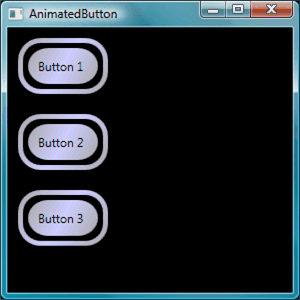
Application.Resources块。 此标记创建适用于应用程序中所有按钮的 Style,将按钮的 Width 设置为 90,Margin 设置为 10:<Application.Resources> <Style TargetType="Button"> <Setter Property="Width" Value="90" /> <Setter Property="Margin" Value="10" /> </Style> </Application.Resources>该 TargetType 属性指定样式适用于类型 Button的所有对象。 每个 Setter 为 Style 设置不同的属性值。 因此,此时应用程序中的每个按钮的宽度为 90,边距为 10。 如果按 F5 运行应用程序,则会看到以下窗口。

可以用样式做更多的事情,包括各种方法来微调目标对象的选择、指定复杂的属性值,甚至可以将样式用作其他样式的输入。 有关详细信息,请参阅样式设置和模板化。
将样式属性值设置为资源: 资源允许一种简单的方式来重复使用常用对象和值。 使用资源定义复杂值以使代码更加模块化尤其有用。 将以下突出显示的标记添加到 app.xaml。
<Application.Resources>
  <LinearGradientBrush x:Key="GrayBlueGradientBrush" StartPoint="0,0" EndPoint="1,1">
    <GradientStop Color="DarkGray" Offset="0" />
    <GradientStop Color="#CCCCFF" Offset="0.5" />
    <GradientStop Color="DarkGray" Offset="1" />
  </LinearGradientBrush>
  <Style TargetType="{x:Type Button}">
    <Setter Property="Background" Value="{StaticResource GrayBlueGradientBrush}" />
    <Setter Property="Width" Value="80" />
    <Setter Property="Margin" Value="10" />
  </Style>
</Application.Resources>
直接在
Application.Resources块下创建了一个名为“GrayBlueGradientBrush”的资源。 此资源定义水平渐变。 此资源可以在应用程序的任意位置充当属性值,包括在 Background 属性的按钮样式设置器内部使用。 现在,所有按钮都具有 Background 此渐变的属性值。按 F5 运行应用程序。 该消息应如下所示。

创建定义按钮外观的模板
在这一部分中,你将创建一个模板,用于自定义按钮的外观(呈现)。 按钮演示文稿由多个对象组成,包括矩形和其他组件,使按钮具有独特的外观。
到目前为止,对应用程序中按钮外观的控制仅限于更改按钮的属性。 如果要对按钮的外观做出更激进的更改,该怎么办? 模板支持对对象的呈现进行强大的控制。 由于模板可以在样式中使用,因此可以将模板应用于样式应用于的所有对象(在本演练中,按钮)。
使用模板定义按钮的外观
设置模板:由于像Button这样的控件具有Template属性,因此,您可以使用Setter在Style中定义模板属性值,方式就像我们之前设置的其他属性值一样。 将以下突出显示的标记添加到按钮样式。
<Application.Resources>
  <LinearGradientBrush x:Key="GrayBlueGradientBrush"
    StartPoint="0,0" EndPoint="1,1">
    <GradientStop Color="DarkGray" Offset="0" />
    <GradientStop Color="#CCCCFF" Offset="0.5" />
    <GradientStop Color="DarkGray" Offset="1" />
  </LinearGradientBrush>
  <Style TargetType="{x:Type Button}">
    <Setter Property="Background" Value="{StaticResource GrayBlueGradientBrush}" />
    <Setter Property="Width" Value="80" />
    <Setter Property="Margin" Value="10" />
    <Setter Property="Template">
      <Setter.Value>
        <!-- The button template is defined here. -->
      </Setter.Value>
    </Setter>
  </Style>
</Application.Resources>
更改按钮演示文稿: 此时,需要定义模板。 添加以下突出显示的标记。 此标记指定两 Rectangle 个带圆边的元素,后跟一个 DockPanel。 DockPanel 用于托管按钮的ContentPresenter。 ContentPresenter 显示按钮的内容。 在本演练中,内容为文本(“Button 1”、“Button 2”、“Button 3”)。 所有模板组件(矩形和 DockPanel)都布局在一个 Grid内部。
<Setter.Value>
  <ControlTemplate TargetType="Button">
    <Grid Width="{TemplateBinding Width}" Height="{TemplateBinding Height}" ClipToBounds="True">
      <!-- Outer Rectangle with rounded corners. -->
      <Rectangle x:Name="outerRectangle" HorizontalAlignment="Stretch" VerticalAlignment="Stretch" Stroke="{TemplateBinding Background}" RadiusX="20" RadiusY="20" StrokeThickness="5" Fill="Transparent" />
      <!-- Inner Rectangle with rounded corners. -->
      <Rectangle x:Name="innerRectangle" HorizontalAlignment="Stretch" VerticalAlignment="Stretch" Stroke="Transparent" StrokeThickness="20" Fill="{TemplateBinding Background}" RadiusX="20" RadiusY="20" />
      <!-- Present Content (text) of the button. -->
      <DockPanel Name="myContentPresenterDockPanel">
        <ContentPresenter x:Name="myContentPresenter" Margin="20" Content="{TemplateBinding  Content}" TextBlock.Foreground="Black" />
      </DockPanel>
    </Grid>
  </ControlTemplate>
</Setter.Value>
按 F5 运行应用程序。 该消息应如下所示。
向模板添加玻璃效果: 接下来,你将添加玻璃效果。 首先创建一些创建玻璃渐变效果的资源。 在
Application.Resources块中任何位置添加这些渐变资源。<Application.Resources> <GradientStopCollection x:Key="MyGlassGradientStopsResource"> <GradientStop Color="WhiteSmoke" Offset="0.2" /> <GradientStop Color="Transparent" Offset="0.4" /> <GradientStop Color="WhiteSmoke" Offset="0.5" /> <GradientStop Color="Transparent" Offset="0.75" /> <GradientStop Color="WhiteSmoke" Offset="0.9" /> <GradientStop Color="Transparent" Offset="1" /> </GradientStopCollection> <LinearGradientBrush x:Key="MyGlassBrushResource" StartPoint="0,0" EndPoint="1,1" Opacity="0.75" GradientStops="{StaticResource MyGlassGradientStopsResource}" /> <!-- Styles and other resources below here. -->这些资源被用作矩形的Fill,我们将其插入按钮模板的Grid。 将以下突出显示的标记添加到模板。
<Setter.Value>
  <ControlTemplate TargetType="{x:Type Button}">
    <Grid Width="{TemplateBinding Width}" Height="{TemplateBinding Height}"
      ClipToBounds="True">

    <!-- Outer Rectangle with rounded corners. -->
    <Rectangle x:Name="outerRectangle" HorizontalAlignment="Stretch"
      VerticalAlignment="Stretch" Stroke="{TemplateBinding Background}"
      RadiusX="20" RadiusY="20" StrokeThickness="5" Fill="Transparent" />

    <!-- Inner Rectangle with rounded corners. -->
    <Rectangle x:Name="innerRectangle" HorizontalAlignment="Stretch"
      VerticalAlignment="Stretch" Stroke="Transparent" StrokeThickness="20"
      Fill="{TemplateBinding Background}" RadiusX="20" RadiusY="20" />

    <!-- Glass Rectangle -->
    <Rectangle x:Name="glassCube" HorizontalAlignment="Stretch"
      VerticalAlignment="Stretch"
      StrokeThickness="2" RadiusX="10" RadiusY="10" Opacity="0"
      Fill="{StaticResource MyGlassBrushResource}"
      RenderTransformOrigin="0.5,0.5">
      <Rectangle.Stroke>
        <LinearGradientBrush StartPoint="0.5,0" EndPoint="0.5,1">
          <LinearGradientBrush.GradientStops>
            <GradientStop Offset="0.0" Color="LightBlue" />
            <GradientStop Offset="1.0" Color="Gray" />
          </LinearGradientBrush.GradientStops>
        </LinearGradientBrush>
      </Rectangle.Stroke>
      <!-- These transforms have no effect as they are declared here.
      The reason the transforms are included is to be targets
      for animation (see later). -->
      <Rectangle.RenderTransform>
        <TransformGroup>
          <ScaleTransform />
          <RotateTransform />
        </TransformGroup>
      </Rectangle.RenderTransform>
      <!-- A BevelBitmapEffect is applied to give the button a "Beveled" look. -->
      <Rectangle.BitmapEffect>
        <BevelBitmapEffect />
      </Rectangle.BitmapEffect>
    </Rectangle>

    <!-- Present Text of the button. -->
    <DockPanel Name="myContentPresenterDockPanel">
      <ContentPresenter x:Name="myContentPresenter" Margin="20"
        Content="{TemplateBinding  Content}" TextBlock.Foreground="Black" />
    </DockPanel>
  </Grid>
</ControlTemplate>
</Setter.Value>
请注意,矩形的
x:Name属性“glassCube”值为0,因此运行示例时,看不到覆盖在顶部的玻璃矩形。 这是因为稍后我们会在用户与按钮交互时将触发器添加到模板。 但是,可以通过将 Opacity 值更改为 1 并运行应用程序来查看按钮现在的外观。 请参阅下图。 在继续执行下一步之前,将Opacity更改回0。
创建按钮交互
在本部分中,你将创建属性触发器和事件触发器来更改属性值并运行动画,以响应用户作,例如将鼠标指针移到按钮上并单击。
添加交互性(鼠标悬停、单击等)的一种简单方法是在模板或样式中定义触发器。 若要创建Trigger,请定义一个属性“条件”,例如:按钮IsMouseOver属性值等于true。 然后,定义在触发器条件为 true 时要执行的设定动作。
创建按钮的交互功能
添加模板触发器: 将突出显示的标记添加到模板。
<Setter.Value>
  <ControlTemplate TargetType="{x:Type Button}">
    <Grid Width="{TemplateBinding Width}"
      Height="{TemplateBinding Height}" ClipToBounds="True">

      <!-- Outer Rectangle with rounded corners. -->
      <Rectangle x:Name="outerRectangle" HorizontalAlignment="Stretch"
      VerticalAlignment="Stretch" Stroke="{TemplateBinding Background}"
      RadiusX="20" RadiusY="20" StrokeThickness="5" Fill="Transparent" />

      <!-- Inner Rectangle with rounded corners. -->
      <Rectangle x:Name="innerRectangle" HorizontalAlignment="Stretch"
        VerticalAlignment="Stretch" Stroke="Transparent"
        StrokeThickness="20"
        Fill="{TemplateBinding Background}" RadiusX="20" RadiusY="20"
      />

      <!-- Glass Rectangle -->
      <Rectangle x:Name="glassCube" HorizontalAlignment="Stretch"
        VerticalAlignment="Stretch"
        StrokeThickness="2" RadiusX="10" RadiusY="10" Opacity="0"
        Fill="{StaticResource MyGlassBrushResource}"
        RenderTransformOrigin="0.5,0.5">
        <Rectangle.Stroke>
          <LinearGradientBrush StartPoint="0.5,0" EndPoint="0.5,1">
            <LinearGradientBrush.GradientStops>
              <GradientStop Offset="0.0" Color="LightBlue" />
              <GradientStop Offset="1.0" Color="Gray" />
            </LinearGradientBrush.GradientStops>
          </LinearGradientBrush>
        </Rectangle.Stroke>

        <!-- These transforms have no effect as they
             are declared here.
             The reason the transforms are included is to be targets
             for animation (see later). -->
        <Rectangle.RenderTransform>
          <TransformGroup>
            <ScaleTransform />
            <RotateTransform />
          </TransformGroup>
        </Rectangle.RenderTransform>

          <!-- A BevelBitmapEffect is applied to give the button a
               "Beveled" look. -->
        <Rectangle.BitmapEffect>
          <BevelBitmapEffect />
        </Rectangle.BitmapEffect>
      </Rectangle>

      <!-- Present Text of the button. -->
      <DockPanel Name="myContentPresenterDockPanel">
        <ContentPresenter x:Name="myContentPresenter" Margin="20"
          Content="{TemplateBinding  Content}" TextBlock.Foreground="Black" />
      </DockPanel>
    </Grid>

    <ControlTemplate.Triggers>       <!-- Set action triggers for the buttons and define            what the button does in response to those triggers. -->     </ControlTemplate.Triggers>
  </ControlTemplate>
</Setter.Value>
添加属性触发器: 将突出显示的
ControlTemplate.Triggers标记添加到块:<ControlTemplate.Triggers> <!-- Set properties when mouse pointer is over the button. --> <Trigger Property="IsMouseOver" Value="True"> <!-- Below are three property settings that occur when the condition is met (user mouses over button). --> <!-- Change the color of the outer rectangle when user mouses over it. --> <Setter Property ="Rectangle.Stroke" TargetName="outerRectangle" Value="{DynamicResource {x:Static SystemColors.HighlightBrushKey}}" /> <!-- Sets the glass opacity to 1, therefore, the glass "appears" when user mouses over it. --> <Setter Property="Rectangle.Opacity" Value="1" TargetName="glassCube" /> <!-- Makes the text slightly blurry as though you were looking at it through blurry glass. --> <Setter Property="ContentPresenter.BitmapEffect" TargetName="myContentPresenter"> <Setter.Value> <BlurBitmapEffect Radius="1" /> </Setter.Value> </Setter> </Trigger> <ControlTemplate.Triggers/>按 F5 运行应用程序,并在按钮上运行鼠标指针时看到效果。
添加焦点触发器: 接下来,我们将添加一些类似的设置器来处理按钮具有焦点的情况(例如,在用户单击它之后)。
<ControlTemplate.Triggers>

  <!-- Set properties when mouse pointer is over the button. -->
  <Trigger Property="IsMouseOver" Value="True">

    <!-- Below are three property settings that occur when the
         condition is met (user mouses over button).  -->
    <!-- Change the color of the outer rectangle when user          mouses over it. -->
    <Setter Property ="Rectangle.Stroke" TargetName="outerRectangle"
      Value="{DynamicResource {x:Static SystemColors.HighlightBrushKey}}" />

    <!-- Sets the glass opacity to 1, therefore, the          glass "appears" when user mouses over it. -->
    <Setter Property="Rectangle.Opacity" Value="1"       TargetName="glassCube" />

    <!-- Makes the text slightly blurry as though you were          looking at it through blurry glass. -->
    <Setter Property="ContentPresenter.BitmapEffect"       TargetName="myContentPresenter">
      <Setter.Value>
        <BlurBitmapEffect Radius="1" />
      </Setter.Value>
    </Setter>
  </Trigger>
  <!-- Set properties when button has focus. -->   <Trigger Property="IsFocused" Value="true">     <Setter Property="Rectangle.Opacity" Value="1"       TargetName="glassCube" />     <Setter Property="Rectangle.Stroke" TargetName="outerRectangle"       Value="{DynamicResource {x:Static SystemColors.HighlightBrushKey}}" />     <Setter Property="Rectangle.Opacity" Value="1" TargetName="glassCube" />   </Trigger>

</ControlTemplate.Triggers>
按 F5 运行应用程序,然后单击其中一个按钮。 请注意,单击按钮后会保持突出显示状态,因为它仍然具有焦点。 如果单击另一个按钮,新按钮将获得焦点,而最后一个按钮将失去焦点。
为MouseEnter和MouseLeave添加动画: 接下来,我们将一些动画添加到触发器中。 将以下标记添加到块内的
ControlTemplate.Triggers任意位置。<!-- Animations that start when mouse enters and leaves button. --> <EventTrigger RoutedEvent="Mouse.MouseEnter"> <EventTrigger.Actions> <BeginStoryboard Name="mouseEnterBeginStoryboard"> <Storyboard> <!-- This animation makes the glass rectangle shrink in the X direction. --> <DoubleAnimation Storyboard.TargetName="glassCube" Storyboard.TargetProperty= "(Rectangle.RenderTransform).(TransformGroup.Children)[0].(ScaleTransform.ScaleX)" By="-0.1" Duration="0:0:0.5" /> <!-- This animation makes the glass rectangle shrink in the Y direction. --> <DoubleAnimation Storyboard.TargetName="glassCube" Storyboard.TargetProperty= "(Rectangle.RenderTransform).(TransformGroup.Children)[0].(ScaleTransform.ScaleY)" By="-0.1" Duration="0:0:0.5" /> </Storyboard> </BeginStoryboard> </EventTrigger.Actions> </EventTrigger> <EventTrigger RoutedEvent="Mouse.MouseLeave"> <EventTrigger.Actions> <!-- Stopping the storyboard sets all animated properties back to default. --> <StopStoryboard BeginStoryboardName="mouseEnterBeginStoryboard" /> </EventTrigger.Actions> </EventTrigger>鼠标指针在按钮上移动时,玻璃矩形会收缩,当指针离开时返回正常大小。
当指针悬停在按钮上时,会触发两个动画(MouseEnter 事件被引发)。 这些动画沿 X 轴和 Y 轴收缩玻璃矩形。 请注意元素的属性 DoubleAnimation 以及 DurationBy。 指定 Duration 动画的持续时间为半秒,而 By 规定玻璃收缩 10%。
第二个事件触发器(MouseLeave)的作用仅仅是停止第一个。 当你停止Storyboard时,所有动画属性将返回到其默认值。 因此,当用户将指针从按钮上移开时,按钮会返回到鼠标指针在按钮上移动之前的方式。 有关动画的详细信息,请参阅 动画概述。
为单击按钮时添加动画: 最后一步是添加用户单击按钮时的触发器。 将以下标记添加到块内的
ControlTemplate.Triggers任意位置:<!-- Animation fires when button is clicked, causing glass to spin. --> <EventTrigger RoutedEvent="Button.Click"> <EventTrigger.Actions> <BeginStoryboard> <Storyboard> <DoubleAnimation Storyboard.TargetName="glassCube" Storyboard.TargetProperty= "(Rectangle.RenderTransform).(TransformGroup.Children)[1].(RotateTransform.Angle)" By="360" Duration="0:0:0.5" /> </Storyboard> </BeginStoryboard> </EventTrigger.Actions> </EventTrigger>按 F5 运行应用程序,然后单击其中一个按钮。 单击按钮时,玻璃矩形会四处旋转。
概要
在本演练中,你执行了以下练习:
使用 Style 控制了整个应用程序中按钮的基本属性。
为 setter 的 Style 属性值创建的资源(如渐变)。
通过向按钮应用模板来自定义整个应用程序中按钮的外观。
自定义按钮在响应用户动作(例如 MouseEnter,MouseLeave 和 Click)时的行为,包括动画效果。