 浏览示例。
浏览示例。.NET 多平台应用 UI (.NET MAUI) ContentView 是一个控件,用于创建自定义、可重用的控件。
ContentView 类定义 View类型的 Content 属性,该属性表示 ContentView的内容。 此属性由 BindableProperty 对象提供支持,这意味着它可以是数据绑定的目标,并设置样式。
ContentView 类派生自 TemplatedView 类,该类定义了类型为 ControlTemplate的 ControlTemplate 可绑定属性,而该属性定义了控件的外观。 有关 ControlTemplate 属性的详细信息,请参阅 使用 ControlTemplate自定义外观。
注意
ContentView 只能包含单个子元素。
创建自定义控件
ContentView 类本身提供很少的功能,但可用于创建自定义控件。 创建自定义控件的过程是:
- 创建派生自 ContentView 类的类。
- 在后台代码文件中定义自定义控件的任何控件属性或事件。
- 定义自定义控件的 UI。
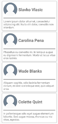
本文演示如何创建一个 CardView 控件,该控件是一个 UI 元素,用于在类似卡片的布局中显示图像、标题和说明。
创建 ContentView 派生类
可以使用 Visual Studio 中的 ContentView 项模板创建 ContentView派生类。 此模板创建一个 XAML 文件,可在其中定义自定义控件的 UI,以及可在其中定义任何控件属性、事件和其他逻辑的代码隐藏文件。
定义控件属性
应在 ContentView派生类的后台代码文件中定义任何控件属性、事件和其他逻辑。
CardView 自定义控件定义以下属性:
-
CardTitle,类型为string,显示在卡片上的标题。 -
CardDescription,类型为string,表示卡片上显示的说明。 -
IconImageSource,类型为 ImageSource,表示卡片上显示的图像。 -
IconBackgroundColor,属于 Color类型,表示卡片上显示的图像的背景色。 -
BorderColor,类型为 Color,表示卡片边框、图像边框和分隔线的颜色。 -
CardColor,类型为 Color,表示卡片的背景色。
每个属性都由 BindableProperty 实例提供支持。
以下示例展示了 CardTitle 可绑定属性在 CardView 类的后台代码文件中:
public partial class CardView : ContentView
{
    public static readonly BindableProperty CardTitleProperty = BindableProperty.Create(nameof(CardTitle), typeof(string), typeof(CardView), string.Empty);

    public string CardTitle
    {
        get => (string)GetValue(CardView.CardTitleProperty);
        set => SetValue(CardView.CardTitleProperty, value);
    }
    // ...

    public CardView()
    {
        InitializeComponent();
    }
}
有关 BindableProperty 对象的详细信息,请参阅 可绑定属性。
定义 UI
可以在 ContentView派生类的 XAML 文件中定义自定义控件 UI,该类使用 ContentView 作为控件的根元素:
<ContentView ...
             xmlns:local="clr-namespace:CardViewDemo.Controls"
             x:Name="this"
             x:Class="CardViewDemo.Controls.CardView"
             x:DataType="local:CardView">
    <Border BindingContext="{x:Reference this}"
            BackgroundColor="{Binding CardColor}"
            Stroke="{Binding BorderColor}"
            ...>
        <Grid>
            ...
            <Border Stroke="{Binding BorderColor, FallbackValue='Black'}"
                    BackgroundColor="{Binding IconBackgroundColor, FallbackValue='Grey'}"
                   ...>
                <Image Source="{Binding IconImageSource}"
                       .. />
            </Border>
            <Label Text="{Binding CardTitle, FallbackValue='Card Title'}"
                   ... />
            <BoxView BackgroundColor="{Binding BorderColor, FallbackValue='Black'}"
                     ... />
            <Label Text="{Binding CardDescription, FallbackValue='Card description text.'}"
                   ... />
        </Grid>
    </Border>
</ContentView>
ContentView 元素将 x:Name 属性设置为 this,该属性可用于访问绑定到 CardView 实例的对象。 布局中的元素将属性上的绑定设置为绑定对象上定义的值。 有关数据绑定的详细信息,请参阅 数据绑定。
注意
Binding 表达式中的 FallbackValue 属性提供了一个默认值,以防绑定 null。
实例化自定义控件
必须将对自定义控件命名空间的引用添加到实例化自定义控件的页面。 添加引用后,可以实例化 CardView 及其属性:
<ContentPage xmlns="http://schemas.microsoft.com/dotnet/2021/maui"
             xmlns:x="http://schemas.microsoft.com/winfx/2009/xaml"
             xmlns:controls="clr-namespace:CardViewDemo.Controls"
             x:Class="CardViewDemo.CardViewXamlPage">
   <ScrollView>
       <StackLayout>
           <controls:CardView BorderColor="DarkGray"
                              CardTitle="Slavko Vlasic"
                              CardDescription="Lorem ipsum dolor sit amet, consectetur adipiscing elit. Nulla elit dolor, convallis non interdum."
                              IconBackgroundColor="SlateGray"
                              IconImageSource="user.png" />
            <!-- More CardView objects -->
       </StackLayout>
   </ScrollView>
</ContentPage>
以下屏幕截图显示了多个 CardView 对象:
使用 ControlTemplate 自定义外观
派生自 ContentView 类的自定义控件可以使用 XAML 或代码定义其 UI,或者根本不定义其 UI。 无论如何定义该外观,都可以使用 ControlTemplate 来替代控件的外观。
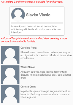
例如,对于某些用例,CardView 布局可能会占用太多空间。
ControlTemplate 可用于替代 CardView 布局,以提供更紧凑的视图,适合用于简化后的列表:
<ContentPage.Resources>
    <ResourceDictionary>
        <ControlTemplate x:Key="CardViewCompressed">
            <Grid>
                <Grid.RowDefinitions>
                    <RowDefinition Height="100" />
                </Grid.RowDefinitions>
                <Grid.ColumnDefinitions>
                    <ColumnDefinition Width="100" />
                    <ColumnDefinition Width="100*" />
                </Grid.ColumnDefinitions>
                <Image Source="{TemplateBinding IconImageSource}"
                       BackgroundColor="{TemplateBinding IconBackgroundColor}"
                       WidthRequest="100"
                       HeightRequest="100"
                       Aspect="AspectFill"
                       HorizontalOptions="Center"
                       VerticalOptions="Center" />
                <StackLayout Grid.Column="1">
                    <Label Text="{TemplateBinding CardTitle}"
                           FontAttributes="Bold" />
                    <Label Text="{TemplateBinding CardDescription}" />
                </StackLayout>
            </Grid>
        </ControlTemplate>
    </ResourceDictionary>
</ContentPage.Resources>
ControlTemplate 中的数据绑定使用 TemplateBinding 标记扩展来指定绑定。 然后,可以使用 x:Key 值将 ControlTemplate 属性设置为定义的 ControlTemplate 对象。 以下示例演示在 CardView 实例上设置的 ControlTemplate 属性:
<controls:CardView ControlTemplate="{StaticResource CardViewCompressed}" />
以下屏幕截图显示了一个标准 CardView 实例,以及多个 CardView 实例,其控件模板已被重写:
有关控件模板的详细信息,请参阅 控件模板。