使用 Windows Presentation Foundation (WPF),可以使用自己的可重用模板自定义现有控件的视觉结构和行为。 模板可以全局应用于应用程序、窗口和页面,也可以直接应用于控件。 大多数需要创建新控件的方案都可以通过为现有控件创建新模板来涵盖。
在本文中,你将了解如何为Button控件创建新ControlTemplate控件。
何时创建 ControlTemplate
控件具有许多属性,例如 Background, Foreground和 FontFamily。 这些属性控制控件外观的不同方面,但通过设置这些属性可以做出的更改受到限制。 例如,可以在CheckBox上将属性设置为Foreground蓝色和FontStyle斜体。 如果想要自定义控件的外观是控件上设置其他属性无法满足的功能时,可以创建一个 ControlTemplate。
在大多数用户界面中,按钮具有相同的常规外观:具有一些文本的矩形。 如果想要创建圆角按钮,可以创建一个新控件,该控件继承自该按钮或重新创建按钮的功能。 此外,新的用户控件将提供圆形视觉效果。
可以通过自定义现有控件的视觉布局来避免创建新控件。 使用圆形按钮,您可以创建具有所需视觉布局的 ControlTemplate。
另一方面,如果需要具有新功能、不同属性和新设置的控件,则需要创建新的 UserControl控件。
先决条件
创建新的 WPF 应用程序并在 MainWindow.xaml(或所选的另一个窗口)中设置 Window> 元素上的<以下属性:
| 资产 | 价值 |
|---|---|
| Title | Template Intro Sample |
| SizeToContent | WidthAndHeight |
| MinWidth | 250 |
将 <Window> 元素的内容设置为以下 XAML:
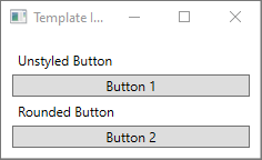
<StackPanel Margin="10">
    <Label>Unstyled Button</Label>
    <Button>Button 1</Button>
    <Label>Rounded Button</Label>
    <Button>Button 2</Button>
</StackPanel>
最后, MainWindow.xaml 文件应如下所示:
<Window x:Class="IntroToStylingAndTemplating.Window1"
        xmlns="http://schemas.microsoft.com/winfx/2006/xaml/presentation"
        xmlns:x="http://schemas.microsoft.com/winfx/2006/xaml"
        xmlns:d="http://schemas.microsoft.com/expression/blend/2008"
        xmlns:mc="http://schemas.openxmlformats.org/markup-compatibility/2006"
        xmlns:local="clr-namespace:IntroToStylingAndTemplating"
        mc:Ignorable="d"
        Title="Template Intro Sample" SizeToContent="WidthAndHeight" MinWidth="250">
    <StackPanel Margin="10">
        <Label>Unstyled Button</Label>
        <Button>Button 1</Button>
        <Label>Rounded Button</Label>
        <Button>Button 2</Button>
    </StackPanel>
</Window>
如果运行应用程序,如下所示:
创建 ControlTemplate
声明 a ControlTemplate 的最常用方法是在 XAML 文件中的 Resources 节中作为资源。 由于模板是资源,因此它们遵循适用于所有资源的相同范围规则。 简单地说,声明模板的位置会影响模板的应用位置。 例如,如果在应用程序定义 XAML 文件的根元素中声明模板,则可以在应用程序中的任意位置使用该模板。 如果在窗口中定义模板,则只有该窗口中的控件可以使用该模板。
首先,将 Window.Resources 元素添加到 MainWindow.xaml 文件:
<Window x:Class="IntroToStylingAndTemplating.Window2"
        xmlns="http://schemas.microsoft.com/winfx/2006/xaml/presentation"
        xmlns:x="http://schemas.microsoft.com/winfx/2006/xaml"
        xmlns:d="http://schemas.microsoft.com/expression/blend/2008"
        xmlns:mc="http://schemas.openxmlformats.org/markup-compatibility/2006"
        xmlns:local="clr-namespace:IntroToStylingAndTemplating"
        mc:Ignorable="d"
        Title="Template Intro Sample" SizeToContent="WidthAndHeight" MinWidth="250">
    <Window.Resources>

    </Window.Resources>
    <StackPanel Margin="10">
        <Label>Unstyled Button</Label>
        <Button>Button 1</Button>
        <Label>Rounded Button</Label>
        <Button>Button 2</Button>
    </StackPanel>
</Window>
使用以下属性集创建新的 <ControlTemplate> :
| 资产 | 价值 |
|---|---|
| x:Key | roundbutton |
| TargetType | Button |
此控件模板非常简单:
- 控件的一个根元素,Grid
- 绘制 Ellipse 按钮的圆角效果
- 用于显示用户指定按钮内容的 ContentPresenter
<ControlTemplate x:Key="roundbutton" TargetType="Button">
    <Grid>
        <Ellipse Fill="{TemplateBinding Background}" Stroke="{TemplateBinding Foreground}" />
        <ContentPresenter HorizontalAlignment="Center" VerticalAlignment="Center" />
    </Grid>
</ControlTemplate>
模板绑定
创建新的 ControlTemplate控件时,仍可能需要使用公共属性来更改控件的外观。 TemplateBinding 标记扩展将元素的属性ControlTemplate绑定到控件定义的公共属性。 使用 TemplateBinding 时,允许控件上的属性充当模板的参数。 也就是说,设置控件上的属性时,该值将传递给具有 TemplateBinding 的元素。
椭圆
请注意,FillStroke属性和<椭圆>元素绑定到控件的ForegroundBackground属性。
内容呈现器
<ContentPresenter> 元素也会添加到模板中。 由于此模板是为按钮设计的,因此请注意该按钮继承自 ContentControl。 该按钮显示元素的内容。 可以在按钮内设置任何内容,例如纯文本,甚至其他控件。 以下两个按钮都是有效的按钮:
<Button>My Text</Button>

<!-- and -->

<Button>
    <CheckBox>Checkbox in a button</CheckBox>
</Button>
在前面的两个示例中,文本和复选框都设置为 Button.Content 属性。 任何设置为内容的项都可以通过 <ContentPresenter> 呈现,这是模板的功能。
ControlTemplate如果应用于某个ContentControl类型(如 aButton),则会在元素树中搜索 aContentPresenter。 如果找到ContentPresenter,模板会自动将控件的Content属性绑定到ContentPresenter。
使用模板
查找本文开头声明的按钮。
<StackPanel Margin="10">
    <Label>Unstyled Button</Label>
    <Button>Button 1</Button>
    <Label>Rounded Button</Label>
    <Button>Button 2</Button>
</StackPanel>
将第二个按钮 Template 的属性设置为 roundbutton 资源:
<StackPanel Margin="10">
    <Label>Unstyled Button</Label>
    <Button>Button 1</Button>
    <Label>Rounded Button</Label>
    <Button Template="{StaticResource roundbutton}">Button 2</Button>
</StackPanel>
如果运行项目并查看结果,你将看到该按钮具有圆角背景。
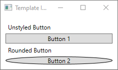
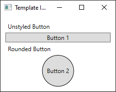
你可能已注意到按钮不是圆圈,而是倾斜。 <由于椭圆>元素的工作方式,它始终扩展以填充可用空间。 通过将按钮 width 和 height 属性更改为相同的值,使圆圈统一:
<StackPanel Margin="10">
    <Label>Unstyled Button</Label>
    <Button>Button 1</Button>
    <Label>Rounded Button</Label>
    <Button Template="{StaticResource roundbutton}" Width="65" Height="65">Button 2</Button>
</StackPanel>

添加触发器
尽管应用了模板的按钮看起来不同,但它的行为与任何其他按钮的行为相同。 如果按该按钮,事件 Click 将触发。 但是,你可能已经注意到,当你将鼠标移到按钮上时,按钮的视觉对象不会更改。 这些视觉对象交互都由模板定义。
使用 WPF 提供的动态事件和属性系统,可以监视某个值的特定属性,然后在适当时重述模板。 在此示例中,你将监视按钮 IsMouseOver 的属性。 当鼠标悬停在控件上时,使用新颜色设置 <椭圆> 样式。 这种类型的触发器称为 PropertyTrigger。
要使其正常工作,您需要向可以引用的 <椭圆> 添加名称。 为它指定 backgroundElement 的名称。
<Ellipse x:Name="backgroundElement" Fill="{TemplateBinding Background}" Stroke="{TemplateBinding Foreground}" />
接下来,向 ControlTemplate.Triggers 集合添加新内容Trigger。 触发器将监视 IsMouseOver 值 true的事件。
<ControlTemplate x:Key="roundbutton" TargetType="Button">
    <Grid>
        <Ellipse x:Name="backgroundElement" Fill="{TemplateBinding Background}" Stroke="{TemplateBinding Foreground}" />
        <ContentPresenter HorizontalAlignment="Center" VerticalAlignment="Center" />
    </Grid>
    <ControlTemplate.Triggers>
        <Trigger Property="IsMouseOver" Value="true">

        </Trigger>
    </ControlTemplate.Triggers>
</ControlTemplate>
接下来,将 <Setter> 添加到 <触发器> 中,该触发器更改 <椭圆> 的 Fill 属性为新颜色。
<Trigger Property="IsMouseOver" Value="true">
    <Setter Property="Fill" TargetName="backgroundElement" Value="AliceBlue"/>
</Trigger>
启动项目。 请注意,在按钮上移动鼠标时,椭圆>的颜色<会更改。
使用 VisualState
视觉状态由控件定义和触发。 例如,当鼠标移动到控件顶部时,CommonStates.MouseOver 状态被触发。 可以根据控件的当前状态对属性更改进行动画处理。 在上一节中,使用<PropertyTrigger>在属性IsMouseOver为true时更改按钮AliceBlue的背景。 相反,请创建一个视觉状态,以动画显示此颜色的更改,从而提供流畅的切换效果。 有关 VisualStates 的详细信息,请参阅 WPF 中的样式和模板。
若要将 <PropertyTrigger> 转换为动画视觉状态,请先从模板中删除 <ControlTemplate.Triggers> 元素。
<ControlTemplate x:Key="roundbutton" TargetType="Button">
    <Grid>
        <Ellipse x:Name="backgroundElement" Fill="{TemplateBinding Background}" Stroke="{TemplateBinding Foreground}" />
        <ContentPresenter HorizontalAlignment="Center" VerticalAlignment="Center" />
    </Grid>
</ControlTemplate>
接下来,在控件模板的<Grid>根目录中,添加一个<VisualStateGroup>到<VisualStateManager.VisualStateGroups>元素中。CommonStates 定义两种状态, Normal 以及 MouseOver。
<ControlTemplate x:Key="roundbutton" TargetType="Button">
    <Grid>
        <VisualStateManager.VisualStateGroups>
            <VisualStateGroup Name="CommonStates">
                <VisualState Name="Normal">
                </VisualState>
                <VisualState Name="MouseOver">
                </VisualState>
            </VisualStateGroup>
        </VisualStateManager.VisualStateGroups>
        <Ellipse x:Name="backgroundElement" Fill="{TemplateBinding Background}" Stroke="{TemplateBinding Foreground}" />
        <ContentPresenter HorizontalAlignment="Center" VerticalAlignment="Center" />
    </Grid>
</ControlTemplate>
触发该状态时,将应用 VisualState> 中<定义的任何动画。 为每个状态创建动画。 动画放置在情节提要>元素内<。 有关分镜头脚本的详细信息,请参阅 分镜头脚本概述。
正常
此状态对椭圆填充进行动画处理,将其还原到控件
Background的颜色。<Storyboard> <ColorAnimation Storyboard.TargetName="backgroundElement" Storyboard.TargetProperty="(Shape.Fill).(SolidColorBrush.Color)" To="{TemplateBinding Background}" Duration="0:0:0.3"/> </Storyboard>鼠标悬停
此状态将椭圆
Background颜色动画为新颜色:Yellow<Storyboard> <ColorAnimation Storyboard.TargetName="backgroundElement" Storyboard.TargetProperty="(Shape.Fill).(SolidColorBrush.Color)" To="Yellow" Duration="0:0:0.3"/> </Storyboard>
<ControlTemplate> 现在应如下所示。
<ControlTemplate x:Key="roundbutton" TargetType="Button">
<Grid>
<VisualStateManager.VisualStateGroups>
<VisualStateGroup Name="CommonStates">
<VisualState Name="Normal">
<Storyboard>
    <ColorAnimation Storyboard.TargetName="backgroundElement"
        Storyboard.TargetProperty="(Shape.Fill).(SolidColorBrush.Color)"
        To="{TemplateBinding Background}"
        Duration="0:0:0.3"/>
</Storyboard>
</VisualState>
<VisualState Name="MouseOver">
<Storyboard>
    <ColorAnimation Storyboard.TargetName="backgroundElement"
        Storyboard.TargetProperty="(Shape.Fill).(SolidColorBrush.Color)"
        To="Yellow"
        Duration="0:0:0.3"/>
</Storyboard>
</VisualState>
</VisualStateGroup>
</VisualStateManager.VisualStateGroups>
<Ellipse Name="backgroundElement" Fill="{TemplateBinding Background}" Stroke="{TemplateBinding Foreground}" />
<ContentPresenter x:Name="contentPresenter" HorizontalAlignment="Center" VerticalAlignment="Center" />
</Grid>
</ControlTemplate>
启动项目。 请注意,在按钮上移动鼠标时,椭圆>的颜色<会进行动画处理。