この記事では、ほとんどの WPF アプリケーションに共通する要素 (拡張アプリケーション マークアップ言語 (XAML) マークアップ、分離コード、アプリケーション定義、コントロール、レイアウト、データ バインディング、およびスタイルを含む Windows Presentation Foundation (WPF) デスクトップ アプリケーションを開発する方法について説明します。 アプリケーションを開発するには、Visual Studio を使用します。
重要
この記事は.NET Framework 用に記述されています。 .NET の使用を開始するには、「 チュートリアル: 新しい WPF アプリを作成する (WPF .NET)」を参照してください。
このチュートリアルでは、以下の内容を学習します。
- WPF プロジェクトを作成します。
- XAML を使用して、アプリケーションのユーザー インターフェイス (UI) の外観を設計します。
- アプリケーションの動作をビルドするコードを記述します。
- アプリケーションを管理するアプリケーション定義を作成します。
- コントロールを追加し、レイアウトを作成してアプリケーション UI を作成します。
- アプリケーションの UI 全体で一貫した外観を実現するスタイルを作成します。
- UI をデータにバインドして、データから UI を設定し、データと UI の同期を維持します。
このチュートリアルを終了すると、ユーザーが選択したユーザーの経費明細書を表示できるスタンドアロンの Windows アプリケーションが構築されます。 アプリケーションは、ブラウザー スタイルのウィンドウでホストされているいくつかの WPF ページで構成されます。
ヒント
このチュートリアルで使用するサンプル コードは、チュートリアル WPF アプリサンプル コードの Visual Basic と C# の両方で使用できます。
このページの上部にある言語セレクターを使用して、C# と Visual Basic の間でサンプル コードのコード言語を切り替えることができます。
[前提条件]
.NET デスクトップ開発ワークロードがインストールされている Visual Studio 2019。
最新バージョンの Visual Studio のインストールの詳細については、「 Visual Studio のインストール」を参照してください。
アプリケーション プロジェクトを作成する
最初の手順では、アプリケーション定義、2 つのページ、およびイメージを含むアプリケーション インフラストラクチャを作成します。
ExpenseItという名前の Visual Basic または Visual C# で新しい WPF アプリケーション プロジェクトを作成します。Visual Studio を開き、[作業の開始] メニューの [新しいプロジェクトの作成] を選択します。
[ 新しいプロジェクトの作成 ] ダイアログが開きます。
[ 言語 ] ドロップダウンで、 C# または Visual Basic を選択します。
WPF アプリ (.NET Framework) テンプレートを選択し、[次へ] を選択します。
![[新しいプロジェクトの作成] ダイアログ](media/walkthrough-my-first-wpf-desktop-application/create-new-project-dialog.png)
[ 新しいプロジェクトの構成 ] ダイアログが開きます。
ExpenseItプロジェクト名を入力し、[作成] を選択します。![[新しいプロジェクトの構成] ダイアログ](media/walkthrough-my-first-wpf-desktop-application/configure-new-project-dialog.png)
Visual Studio によってプロジェクトが作成され、 MainWindow.xaml という名前の既定のアプリケーション ウィンドウのデザイナーが開きます。
Application.xaml (Visual Basic) または App.xaml (C#) を開きます。
この XAML ファイルは、WPF アプリケーションと任意のアプリケーション リソースを定義します。 また、このファイルを使用して、アプリケーションの起動時に自動的に表示される UI (この場合は MainWindow.xaml) を指定します。
Visual Basic では、XAML は次のようになります。
<Application x:Class="Application"
    xmlns="http://schemas.microsoft.com/winfx/2006/xaml/presentation"
    xmlns:x="http://schemas.microsoft.com/winfx/2006/xaml"
    StartupUri="MainWindow.xaml">
    <Application.Resources>

    </Application.Resources>
</Application>
C# では次のようになります。
<Application x:Class="ExpenseIt.App"
     xmlns="http://schemas.microsoft.com/winfx/2006/xaml/presentation"
     xmlns:x="http://schemas.microsoft.com/winfx/2006/xaml"
     StartupUri="MainWindow.xaml">
    <Application.Resources>

    </Application.Resources>
</Application>
MainWindow.xaml を開きます。
この XAML ファイルは、アプリケーションのメイン ウィンドウであり、ページで作成されたコンテンツを表示します。 Window クラスは、ウィンドウのプロパティ (タイトル、サイズ、アイコンなど) を定義し、閉じる、非表示にするなどのイベントを処理します。
次の XAML に示すように、 Window 要素を NavigationWindowに変更します。
<NavigationWindow x:Class="ExpenseIt.MainWindow"
     xmlns="http://schemas.microsoft.com/winfx/2006/xaml/presentation"
     xmlns:x="http://schemas.microsoft.com/winfx/2006/xaml"
     ...
</NavigationWindow>
このアプリは、ユーザー入力に応じて異なるコンテンツに移動します。 このため、主な Window を NavigationWindowに変更する必要があります。 NavigationWindow は、 Windowのすべてのプロパティを継承します。 XAML ファイルの NavigationWindow 要素は、 NavigationWindow クラスのインスタンスを作成します。 詳細については、「ナビゲーションの 概要」を参照してください。
Grid タグの間からNavigationWindow要素を削除します。
NavigationWindow要素の XAML コードで次のプロパティを変更します。
Visual Basic の XAML は次のようになります。
<NavigationWindow x:Class="MainWindow"
    xmlns="http://schemas.microsoft.com/winfx/2006/xaml/presentation"
    xmlns:x="http://schemas.microsoft.com/winfx/2006/xaml"
    Title="ExpenseIt" Height="350" Width="500">

</NavigationWindow>
C# の場合は次のようになります。
<NavigationWindow x:Class="ExpenseIt.MainWindow" xmlns="http://schemas.microsoft.com/winfx/2006/xaml/presentation" xmlns:x="http://schemas.microsoft.com/winfx/2006/xaml" Title="ExpenseIt" Height="350" Width="500"> </NavigationWindow>MainWindow.xaml.vbまたはMainWindow.xaml.csを開きます。
このファイルは、 MainWindow.xaml で宣言されたイベントを処理するコードを含む分離コード ファイルです。 このファイルには、XAML で定義されているウィンドウの部分クラスが含まれています。
C# を使用している場合は、
MainWindowから派生するように NavigationWindow クラスを変更します。 (Visual Basic では、これは XAML でウィンドウを変更すると自動的に発生します)。C# コードは次のようになります。using System; using System.Collections.Generic; using System.Linq; using System.Text; using System.Windows; using System.Windows.Controls; using System.Windows.Data; using System.Windows.Documents; using System.Windows.Input; using System.Windows.Media; using System.Windows.Media.Imaging; using System.Windows.Navigation; using System.Windows.Shapes; namespace ExpenseIt { /// <summary> /// Interaction logic for MainWindow.xaml /// </summary> public partial class MainWindow : NavigationWindow { public MainWindow() { InitializeComponent(); } } }
アプリケーションにファイルを追加する
このセクションでは、アプリケーションに 2 つのページと画像を追加します。
プロジェクトに新しいページを追加し、
ExpenseItHome.xaml名前を付けます。ソリューション エクスプローラーで、
ExpenseItプロジェクト ノードを右クリックし、[追加>Page] を選択します。[ 新しい項目の追加] ダイアログで、 ページ (WPF) テンプレートが既に選択されています。
ExpenseItHome名前を入力し、[追加] を選択します。
このページは、アプリケーションの起動時に表示される最初のページです。 経費明細書を表示するために、選択するユーザーの一覧が表示されます。
ExpenseItHome.xamlを開きます。Titleを "
ExpenseIt - Home" に設定します。DesignHeightを 350 ピクセルに、DesignWidthを 500 ピクセルに設定します。Visual Basic では、XAML は次のように表示されるようになりました。
<Page x:Class="ExpenseItHome"
  xmlns="http://schemas.microsoft.com/winfx/2006/xaml/presentation"
  xmlns:x="http://schemas.microsoft.com/winfx/2006/xaml"
  xmlns:mc="http://schemas.openxmlformats.org/markup-compatibility/2006"
  xmlns:d="http://schemas.microsoft.com/expression/blend/2008"
  mc:Ignorable="d"
  d:DesignHeight="350" d:DesignWidth="500"
  Title="ExpenseIt - Home">
    <Grid>

    </Grid>
</Page>
C# の場合は次のようになります。
<Page x:Class="ExpenseIt.ExpenseItHome"
      xmlns="http://schemas.microsoft.com/winfx/2006/xaml/presentation"
      xmlns:x="http://schemas.microsoft.com/winfx/2006/xaml"
      xmlns:mc="http://schemas.openxmlformats.org/markup-compatibility/2006"
      xmlns:d="http://schemas.microsoft.com/expression/blend/2008"
      mc:Ignorable="d"
      d:DesignHeight="350" d:DesignWidth="500"
    Title="ExpenseIt - Home">

    <Grid>

    </Grid>
</Page>
MainWindow.xaml を開きます。
Sourceプロパティを NavigationWindow 要素に追加し、"
ExpenseItHome.xaml" に設定します。これにより、
ExpenseItHome.xamlアプリケーションの起動時に開かれた最初のページに設定されます。Visual Basic の XAML の例:
<NavigationWindow x:Class="MainWindow"
    xmlns="http://schemas.microsoft.com/winfx/2006/xaml/presentation"
    xmlns:x="http://schemas.microsoft.com/winfx/2006/xaml"
    Title="ExpenseIt" Height="350" Width="500" Source="ExpenseItHome.xaml">

</NavigationWindow>
C# の場合:
<NavigationWindow x:Class="ExpenseIt.MainWindow"
    xmlns="http://schemas.microsoft.com/winfx/2006/xaml/presentation"
    xmlns:x="http://schemas.microsoft.com/winfx/2006/xaml"
    Title="ExpenseIt" Height="350" Width="500" Source="ExpenseItHome.xaml">

</NavigationWindow>
ヒント
[プロパティ] ウィンドウの [その他] カテゴリで Sourceプロパティを設定することもできます。
![[プロパティ] ウィンドウの Source プロパティ](media/walkthrough-my-first-wpf-desktop-application/properties-source.png)
別の新しい WPF ページをプロジェクトに追加し、 ExpenseReportPage.xaml という名前を付けます。
ソリューション エクスプローラーで、
ExpenseItプロジェクト ノードを右クリックし、[追加>Page] を選択します。[ 新しい項目の追加] ダイアログで、 ページ (WPF) テンプレートを選択します。 ExpenseReportPage という名前を入力し、[追加] を選択します。
このページには、
ExpenseItHomeページで選択されているユーザーの経費明細書が表示されます。ExpenseReportPage.xaml を開きます。
Titleを "
ExpenseIt - View Expense" に設定します。DesignHeightを 350 ピクセルに、DesignWidthを 500 ピクセルに設定します。Visual Basic では、ExpenseReportPage.xaml は次のようになります。
<Page x:Class="ExpenseReportPage"
      xmlns="http://schemas.microsoft.com/winfx/2006/xaml/presentation"
      xmlns:x="http://schemas.microsoft.com/winfx/2006/xaml"
      xmlns:mc="http://schemas.openxmlformats.org/markup-compatibility/2006"
      xmlns:d="http://schemas.microsoft.com/expression/blend/2008"
      mc:Ignorable="d"
      d:DesignHeight="350" d:DesignWidth="500"
      Title="ExpenseIt - View Expense">
    <Grid>

    </Grid>
</Page>
C# では次のようになります。
<Page x:Class="ExpenseIt.ExpenseReportPage" xmlns="http://schemas.microsoft.com/winfx/2006/xaml/presentation" xmlns:x="http://schemas.microsoft.com/winfx/2006/xaml" xmlns:mc="http://schemas.openxmlformats.org/markup-compatibility/2006" xmlns:d="http://schemas.microsoft.com/expression/blend/2008" mc:Ignorable="d" d:DesignHeight="350" d:DesignWidth="500" Title="ExpenseIt - View Expense"> <Grid> </Grid> </Page>ExpenseItHome.xaml.vbとExpenseReportPage.xaml.vb、またはExpenseItHome.xaml.csとExpenseReportPage.xaml.csを開きます。
新しいページ ファイルを作成すると、Visual Studio によってコードビハインド ファイルが自動的に作成されます。 これらのコードビハインド ファイルは、ユーザー入力に応答するロジックを処理します。
ExpenseItHomeのコードは次のようになります。using System; using System.Collections.Generic; using System.Linq; using System.Text; using System.Windows; using System.Windows.Controls; using System.Windows.Data; using System.Windows.Documents; using System.Windows.Input; using System.Windows.Media; using System.Windows.Media.Imaging; using System.Windows.Navigation; using System.Windows.Shapes; namespace ExpenseIt { /// <summary> /// Interaction logic for ExpenseItHome.xaml /// </summary> public partial class ExpenseItHome : Page { public ExpenseItHome() { InitializeComponent(); } } }Class ExpenseItHome End ClassExpenseReportPage の場合は次のようになります。
using System;
using System.Collections.Generic;
using System.Linq;
using System.Text;
using System.Windows;
using System.Windows.Controls;
using System.Windows.Data;
using System.Windows.Documents;
using System.Windows.Input;
using System.Windows.Media;
using System.Windows.Media.Imaging;
using System.Windows.Navigation;
using System.Windows.Shapes;

namespace ExpenseIt
{
    /// <summary>
    /// Interaction logic for ExpenseReportPage.xaml
    /// </summary>
    public partial class ExpenseReportPage : Page
    {
        public ExpenseReportPage()
        {
            InitializeComponent();
        }
    }
}
Class ExpenseReportPage End Classwatermark.png という名前のイメージをプロジェクトに追加します。 独自のイメージを作成したり、サンプル コードからファイルをコピーしたり、 microsoft/WPF-Samples GitHub リポジトリから取得したりできます。
プロジェクト ノードを右クリックし、[追加>Existing Item] を選択するか、Shift キー+Alt+A キーを押します。
[ 既存アイテムの追加 ] ダイアログで、ファイル フィルターを [すべてのファイル ] または [ イメージ ファイル] に設定し、使用するイメージ ファイルを参照して、[ 追加] を選択します。
ソリューション エクスプローラーでイメージ ファイルを選択し、[プロパティ] ウィンドウで [ビルド アクション] を [リソース] に設定します。
アプリケーションの構築と実行
アプリケーションをビルドして実行するには、F5 キーを押すか、[デバッグ] メニューから [デバッグの開始] を選択します。
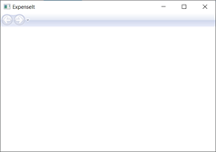
次の図は、 NavigationWindow ボタンを持つアプリケーションを示しています。
アプリケーションを閉じて Visual Studio に戻ります。
レイアウトを作成する
レイアウトは、UI 要素を配置するための順序付けされた方法を提供し、UI のサイズが変更されたときにそれらの要素のサイズと位置も管理します。 通常は、次のいずれかのレイアウト コントロールを使用してレイアウトを作成します。
- Canvas - キャンバス領域を基準とする座標を使用して子要素を明示的に配置できる領域を定義します。
- DockPanel - 子要素を互いに相対的に水平方向または垂直方向に配置できる領域を定義します。
- Grid - 列と行で構成される柔軟なグリッド領域を定義します。
- StackPanel - 子要素を、水平方向または垂直方向に配置できる単一の行に配置します。
- VirtualizingStackPanel - 水平方向または垂直方向の 1 行にコンテンツを配置および仮想化します。
- WrapPanel - 子要素を左から右に順番に配置し、コンテンツを格納ボックスの端にある次の行に分割します。 後続の順序は、Orientation プロパティの値に応じて、上から下または右から左に順番に行われます。
これらの各レイアウト コントロールは、その子要素の特定の種類のレイアウトをサポートしています。
ExpenseIt ページのサイズを変更でき、各ページには、他の要素と共に水平方向と垂直方向に配置される要素があります。 この例では、 Grid がアプリケーションのレイアウト要素として使用されます。
このセクションでは、GridのExpenseItHome.xamlに列と行の定義を追加して、3 つの行と 10 ピクセルの余白を持つ単一列テーブルを作成します。
ExpenseItHome.xamlで、Margin要素のGrid プロパティを "10,0,10,10" に設定します。これは左、上、右、下の余白に対応します。<Grid Margin="10,0,10,10">ヒント
[プロパティ] ウィンドウの [レイアウト] カテゴリで、[余白] の値を設定することもできます。

Grid タグの間に次の XAML を追加して、行と列の定義を作成します。
<Grid.ColumnDefinitions>
    <ColumnDefinition />
</Grid.ColumnDefinitions>
<Grid.RowDefinitions>
    <RowDefinition Height="Auto"/>
    <RowDefinition />
    <RowDefinition Height="Auto"/>
</Grid.RowDefinitions>
2 つの行の Height は Auto に設定されます。つまり、行の内容に基づいて行のサイズが決まります。 既定の Height は Star サイズ設定です。つまり、行の高さは使用可能なスペースに対する加重比例となります。 たとえば、それぞれ 2 つの行の Height が "*" の場合、それぞれの行の高さは使用可能な領域の半分になります。
これで、 Grid に次の XAML が含まれるようになります。
<Grid Margin="10,0,10,10">
    <Grid.ColumnDefinitions>
        <ColumnDefinition />
    </Grid.ColumnDefinitions>
    <Grid.RowDefinitions>
        <RowDefinition Height="Auto"/>
        <RowDefinition />
        <RowDefinition Height="Auto"/>
    </Grid.RowDefinitions>
</Grid>
コントロールを追加する
このセクションでは、ホーム ページ UI を更新してユーザーの一覧を表示します。ここで、経費明細書を表示する 1 人のユーザーを選択します。 コントロールは、ユーザーがアプリケーションと対話できるようにする UI オブジェクトです。 詳細については、「 コントロール」を参照してください。
この UI を作成するには、次の要素を ExpenseItHome.xamlに追加します。
各コントロールは、Grid添付プロパティを設定することによって、Grid.Rowの行に配置されます。 添付プロパティの詳細については、「添付プロパティの 概要」を参照してください。
ExpenseItHome.xamlで、Grid タグの間のどこかに次の XAML を追加します。<!-- People list --> <Border Grid.Column="0" Grid.Row="0" Height="35" Padding="5" Background="#4E87D4"> <Label VerticalAlignment="Center" Foreground="White">Names</Label> </Border> <ListBox Name="peopleListBox" Grid.Column="0" Grid.Row="1"> <ListBoxItem>Mike</ListBoxItem> <ListBoxItem>Lisa</ListBoxItem> <ListBoxItem>John</ListBoxItem> <ListBoxItem>Mary</ListBoxItem> </ListBox> <!-- View report button --> <Button Grid.Column="0" Grid.Row="2" Margin="0,10,0,10" Width="125" Height="25" HorizontalAlignment="Right">View</Button>ヒント
コントロールを作成するには、[ ツールボックス] ウィンドウからデザイン ウィンドウにコントロールをドラッグし、[ プロパティ ] ウィンドウでプロパティを設定します。
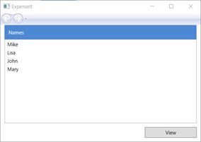
アプリケーションをビルドして実行します。
次の図は、作成したコントロールを示しています。
イメージとタイトルを追加する
このセクションでは、ホーム ページ UI をイメージとページ タイトルで更新します。
ExpenseItHome.xamlで、固定ColumnDefinitions 230 ピクセルの別の列をWidthに追加します。<Grid.ColumnDefinitions> <ColumnDefinition Width="230" /> <ColumnDefinition /> </Grid.ColumnDefinitions>RowDefinitionsに別の行を追加し、合計で 4 行を追加します。
<Grid.RowDefinitions>
    <RowDefinition/>
    <RowDefinition Height="Auto"/>
    <RowDefinition />
    <RowDefinition Height="Auto"/>
</Grid.RowDefinitions>
3 つのコントロール (Border、ListBox、Button) のそれぞれで Grid.Column プロパティを 1 に設定して、コントロールを 2 番目の列に移動します。
3 つのコントロール (Border、ListBox、Button) と Border 要素のそれぞれについて、 Grid.Row 値を 1 ずつ増やして、各コントロールを 1 行下に移動します。
3 つのコントロールの XAML は次のようになります。
  <Border Grid.Column="1" Grid.Row="1" Height="35" Padding="5" Background="#4E87D4">
      <Label VerticalAlignment="Center" Foreground="White">Names</Label>
  </Border>
  <ListBox Name="peopleListBox" Grid.Column="1" Grid.Row="2">
      <ListBoxItem>Mike</ListBoxItem>
      <ListBoxItem>Lisa</ListBoxItem>
      <ListBoxItem>John</ListBoxItem>
      <ListBoxItem>Mary</ListBoxItem>
  </ListBox>

  <!-- View report button -->
  <Button Grid.Column="1" Grid.Row="3" Margin="0,10,0,0" Width="125"
Height="25" HorizontalAlignment="Right">View</Button>
タグと
<Grid>タグの間の任意の場所に次の XAML を追加して、</Grid>プロパティをwatermark.pngイメージ ファイルに設定します。<Grid.Background> <ImageBrush ImageSource="watermark.png"/> </Grid.Background>Border要素の前に、コンテンツ "経費明細書の表示" を含むLabelを追加します。 このラベルはページのタイトルです。
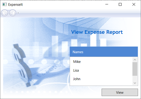
<Label Grid.Column="1" VerticalAlignment="Center" FontFamily="Trebuchet MS"
        FontWeight="Bold" FontSize="18" Foreground="#0066cc">
    View Expense Report
</Label>
アプリケーションをビルドして実行します。
次の図は、追加した内容の結果を示しています。
イベントを処理するコードを追加する
ExpenseItHome.xamlで、Click イベント ハンドラーを Button 要素に追加します。 詳細については、「 方法: 単純なイベント ハンドラーを作成する」を参照してください。<!-- View report button --> <Button Grid.Column="1" Grid.Row="3" Margin="0,10,0,0" Width="125" Height="25" HorizontalAlignment="Right" Click="Button_Click">View</Button>ExpenseItHome.xaml.vbまたはExpenseItHome.xaml.csを開きます。ExpenseItHomeクラスに次のコードを追加して、ボタン クリック イベント ハンドラーを追加します。 イベント ハンドラーによって ExpenseReportPage ページが開きます。private void Button_Click(object sender, RoutedEventArgs e) { // View Expense Report ExpenseReportPage expenseReportPage = new ExpenseReportPage(); this.NavigationService.Navigate(expenseReportPage); }Private Sub Button_Click(ByVal sender As Object, ByVal e As RoutedEventArgs) ' View Expense Report Dim expenseReportPage As New ExpenseReportPage() Me.NavigationService.Navigate(expenseReportPage) End Sub
ExpenseReportPage の UI を作成する
ExpenseReportPage.xaml は、 ExpenseItHome ページで選択されているユーザーの経費明細書を表示します。 このセクションでは、 ExpenseReportPage の UI を作成します。 また、さまざまな UI 要素に背景と塗りつぶしの色を追加します。
ExpenseReportPage.xaml を開きます。
Grid タグの間に次の XAML を追加します。
 <Grid.Background>
     <ImageBrush ImageSource="watermark.png" />
 </Grid.Background>
 <Grid.ColumnDefinitions>
     <ColumnDefinition Width="230" />
     <ColumnDefinition />
 </Grid.ColumnDefinitions>
 <Grid.RowDefinitions>
     <RowDefinition Height="Auto" />
     <RowDefinition />
 </Grid.RowDefinitions>


 <Label Grid.Column="1" VerticalAlignment="Center" FontFamily="Trebuchet MS"
 FontWeight="Bold" FontSize="18" Foreground="#0066cc">
     Expense Report For:
 </Label>
 <Grid Margin="10" Grid.Column="1" Grid.Row="1">

     <Grid.ColumnDefinitions>
         <ColumnDefinition />
         <ColumnDefinition />
     </Grid.ColumnDefinitions>
     <Grid.RowDefinitions>
         <RowDefinition Height="Auto" />
         <RowDefinition Height="Auto" />
         <RowDefinition />
     </Grid.RowDefinitions>

     <!-- Name -->
     <StackPanel Grid.Column="0" Grid.ColumnSpan="2" Grid.Row="0" Orientation="Horizontal">
         <Label Margin="0,0,0,5" FontWeight="Bold">Name:</Label>
         <Label Margin="0,0,0,5" FontWeight="Bold"></Label>
     </StackPanel>

     <!-- Department -->
     <StackPanel Grid.Column="0" Grid.ColumnSpan="2" Grid.Row="1" Orientation="Horizontal">
         <Label Margin="0,0,0,5" FontWeight="Bold">Department:</Label>
         <Label Margin="0,0,0,5" FontWeight="Bold"></Label>
     </StackPanel>

     <Grid Grid.Column="0" Grid.ColumnSpan="2" Grid.Row="2" VerticalAlignment="Top"
           HorizontalAlignment="Left">
         <!-- Expense type and Amount table -->
         <DataGrid  AutoGenerateColumns="False" RowHeaderWidth="0" >
             <DataGrid.ColumnHeaderStyle>
                 <Style TargetType="{x:Type DataGridColumnHeader}">
                     <Setter Property="Height" Value="35" />
                     <Setter Property="Padding" Value="5" />
                     <Setter Property="Background" Value="#4E87D4" />
                     <Setter Property="Foreground" Value="White" />
                 </Style>
             </DataGrid.ColumnHeaderStyle>
             <DataGrid.Columns>
                 <DataGridTextColumn Header="ExpenseType" />
                 <DataGridTextColumn Header="Amount"  />
             </DataGrid.Columns>
         </DataGrid>
     </Grid>
 </Grid>
この UI は
ExpenseItHome.xamlに似ていますが、レポート データが DataGridに表示される点が異なります。アプリケーションをビルドして実行します。
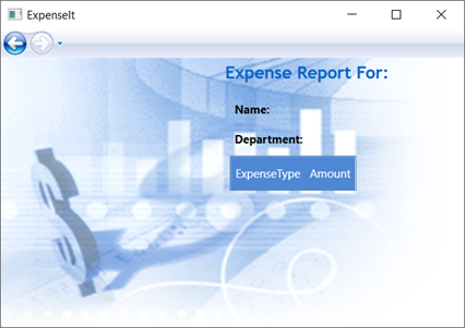
[ 表示 ] ボタンを選択します。
経費明細書ページが表示されます。 また、[戻る] ナビゲーション ボタンが有効になっていることにも注意してください。
次の図は、 ExpenseReportPage.xaml に追加された UI 要素を示しています。
スタイル コントロール
多くの場合、UI 内の同じ型のすべての要素で、さまざまな要素の外観は同じです。 UI では 、スタイル を使用して、複数の要素間で外観を再利用できるようにします。 スタイルの再利用性は、XAML の作成と管理を簡素化するのに役立ちます。 このセクションでは、前の手順で定義した要素ごとの属性をスタイルに置き換えます。
Application.xaml または App.xaml を開きます。
Application.Resources タグの間に次の XAML を追加します。
<!-- Header text style -->
<Style x:Key="headerTextStyle">
    <Setter Property="Label.VerticalAlignment" Value="Center"></Setter>
    <Setter Property="Label.FontFamily" Value="Trebuchet MS"></Setter>
    <Setter Property="Label.FontWeight" Value="Bold"></Setter>
    <Setter Property="Label.FontSize" Value="18"></Setter>
    <Setter Property="Label.Foreground" Value="#0066cc"></Setter>
</Style>

<!-- Label style -->
<Style x:Key="labelStyle" TargetType="{x:Type Label}">
    <Setter Property="VerticalAlignment" Value="Top" />
    <Setter Property="HorizontalAlignment" Value="Left" />
    <Setter Property="FontWeight" Value="Bold" />
    <Setter Property="Margin" Value="0,0,0,5" />
</Style>

<!-- DataGrid header style -->
<Style x:Key="columnHeaderStyle" TargetType="{x:Type DataGridColumnHeader}">
    <Setter Property="Height" Value="35" />
    <Setter Property="Padding" Value="5" />
    <Setter Property="Background" Value="#4E87D4" />
    <Setter Property="Foreground" Value="White" />
</Style>

<!-- List header style -->
<Style x:Key="listHeaderStyle" TargetType="{x:Type Border}">
    <Setter Property="Height" Value="35" />
    <Setter Property="Padding" Value="5" />
    <Setter Property="Background" Value="#4E87D4" />
</Style>

<!-- List header text style -->
<Style x:Key="listHeaderTextStyle" TargetType="{x:Type Label}">
    <Setter Property="Foreground" Value="White" />
    <Setter Property="VerticalAlignment" Value="Center" />
    <Setter Property="HorizontalAlignment" Value="Left" />
</Style>

<!-- Button style -->
<Style x:Key="buttonStyle" TargetType="{x:Type Button}">
    <Setter Property="Width" Value="125" />
    <Setter Property="Height" Value="25" />
    <Setter Property="Margin" Value="0,10,0,0" />
    <Setter Property="HorizontalAlignment" Value="Right" />
</Style>
この XAML では、次のスタイルが追加されます。
headerTextStyle: ページ タイトルの Labelを書式設定します。labelStyle: Label コントロールの書式を設定します。columnHeaderStyle: DataGridColumnHeaderの書式を設定します。listHeaderStyle: リスト ヘッダー Border コントロールの書式を設定します。listHeaderTextStyle: リスト ヘッダーの Labelを書式設定します。buttonStyle: ButtonのExpenseItHome.xamlを書式設定します。
スタイルは、 Application.Resources プロパティ要素のリソースと子であることに注意してください。 この場所では、スタイルはアプリケーション内のすべての要素に適用されます。 .NET アプリでリソースを使用する例については、「 アプリケーション リソースの使用」を参照してください。
ExpenseItHome.xamlで、Grid要素間のすべてを次の XAML に置き換えます。<Grid.Background> <ImageBrush ImageSource="watermark.png" /> </Grid.Background> <Grid.ColumnDefinitions> <ColumnDefinition Width="230" /> <ColumnDefinition /> </Grid.ColumnDefinitions> <Grid.RowDefinitions> <RowDefinition/> <RowDefinition Height="Auto"/> <RowDefinition /> <RowDefinition Height="Auto"/> </Grid.RowDefinitions> <!-- People list --> <Label Grid.Column="1" Style="{StaticResource headerTextStyle}" > View Expense Report </Label> <Border Grid.Column="1" Grid.Row="1" Style="{StaticResource listHeaderStyle}"> <Label Style="{StaticResource listHeaderTextStyle}">Names</Label> </Border> <ListBox Name="peopleListBox" Grid.Column="1" Grid.Row="2"> <ListBoxItem>Mike</ListBoxItem> <ListBoxItem>Lisa</ListBoxItem> <ListBoxItem>John</ListBoxItem> <ListBoxItem>Mary</ListBoxItem> </ListBox> <!-- View report button --> <Button Grid.Column="1" Grid.Row="3" Click="Button_Click" Style="{StaticResource buttonStyle}">View</Button>各コントロールの外観を定義する VerticalAlignment や FontFamily などのプロパティは削除され、スタイルを適用して置き換えられます。 たとえば、
headerTextStyleは [経費明細書の表示] Labelに適用されます。ExpenseReportPage.xaml を開きます。
Grid要素間のすべてを次の XAML に置き換えます。
<Grid.Background> <ImageBrush ImageSource="watermark.png" /> </Grid.Background> <Grid.ColumnDefinitions> <ColumnDefinition Width="230" /> <ColumnDefinition /> </Grid.ColumnDefinitions> <Grid.RowDefinitions> <RowDefinition Height="Auto" /> <RowDefinition /> </Grid.RowDefinitions> <Label Grid.Column="1" Style="{StaticResource headerTextStyle}"> Expense Report For: </Label> <Grid Margin="10" Grid.Column="1" Grid.Row="1"> <Grid.ColumnDefinitions> <ColumnDefinition /> <ColumnDefinition /> </Grid.ColumnDefinitions> <Grid.RowDefinitions> <RowDefinition Height="Auto" /> <RowDefinition Height="Auto" /> <RowDefinition /> </Grid.RowDefinitions> <!-- Name --> <StackPanel Grid.Column="0" Grid.ColumnSpan="2" Grid.Row="0" Orientation="Horizontal"> <Label Style="{StaticResource labelStyle}">Name:</Label> <Label Style="{StaticResource labelStyle}"></Label> </StackPanel> <!-- Department --> <StackPanel Grid.Column="0" Grid.ColumnSpan="2" Grid.Row="1" Orientation="Horizontal"> <Label Style="{StaticResource labelStyle}">Department:</Label> <Label Style="{StaticResource labelStyle}"></Label> </StackPanel> <Grid Grid.Column="0" Grid.ColumnSpan="2" Grid.Row="2" VerticalAlignment="Top" HorizontalAlignment="Left"> <!-- Expense type and Amount table --> <DataGrid ColumnHeaderStyle="{StaticResource columnHeaderStyle}" AutoGenerateColumns="False" RowHeaderWidth="0" > <DataGrid.Columns> <DataGridTextColumn Header="ExpenseType" /> <DataGridTextColumn Header="Amount" /> </DataGrid.Columns> </DataGrid> </Grid> </Grid>アプリケーションをビルドして実行します。 ウィンドウの外観は以前と同じです。
アプリケーションを閉じて Visual Studio に戻ります。
コントロールにデータをバインドする
このセクションでは、さまざまなコントロールにバインドされた XML データを作成します。
ExpenseItHome.xamlで、開始Grid要素の後に、次の XAML を追加して、各ユーザーのデータを含むXmlDataProviderを作成します。<Grid.Resources> <!-- Expense Report Data --> <XmlDataProvider x:Key="ExpenseDataSource" XPath="Expenses"> <x:XData> <Expenses xmlns=""> <Person Name="Mike" Department="Legal"> <Expense ExpenseType="Lunch" ExpenseAmount="50" /> <Expense ExpenseType="Transportation" ExpenseAmount="50" /> </Person> <Person Name="Lisa" Department="Marketing"> <Expense ExpenseType="Document printing" ExpenseAmount="50"/> <Expense ExpenseType="Gift" ExpenseAmount="125" /> </Person> <Person Name="John" Department="Engineering"> <Expense ExpenseType="Magazine subscription" ExpenseAmount="50"/> <Expense ExpenseType="New machine" ExpenseAmount="600" /> <Expense ExpenseType="Software" ExpenseAmount="500" /> </Person> <Person Name="Mary" Department="Finance"> <Expense ExpenseType="Dinner" ExpenseAmount="100" /> </Person> </Expenses> </x:XData> </XmlDataProvider> </Grid.Resources>データは、 Grid リソースとして作成されます。 通常、このデータはファイルとして読み込まれますが、わかりやすくするために、データはインラインで追加されます。
<Grid.Resources>要素内に、<xref:System.Windows.DataTemplate>要素の後に、ListBox内のデータを表示する方法を定義する次の<XmlDataProvider>要素を追加します。<Grid.Resources> <!-- Name item template --> <DataTemplate x:Key="nameItemTemplate"> <Label Content="{Binding XPath=@Name}"/> </DataTemplate> </Grid.Resources>データ テンプレートの詳細については、「 データ テンプレートの概要」を参照してください。
既存の ListBox を次の XAML に置き換えます。
<ListBox Name="peopleListBox" Grid.Column="1" Grid.Row="2"
         ItemsSource="{Binding Source={StaticResource ExpenseDataSource}, XPath=Person}"
         ItemTemplate="{StaticResource nameItemTemplate}">
</ListBox>
この XAML は、ItemsSourceのListBox プロパティをデータ ソースにバインドし、データ テンプレートをItemTemplateとして適用します。
データをコントロールに接続する
次に、 ExpenseItHome ページで選択されている名前を取得し、 ExpenseReportPage のコンストラクターに渡すコードを追加します。
ExpenseReportPage は、渡された項目を使用してデータ コンテキストを設定します。これは 、ExpenseReportPage.xaml で定義されたコントロールのバインド先です。
ExpenseReportPage.xaml.vbまたはExpenseReportPage.xaml.csを開きます。
選択したユーザーの経費明細書データを渡すことができるように、オブジェクトを受け取るコンストラクターを追加します。
public partial class ExpenseReportPage : Page
{
    public ExpenseReportPage()
    {
        InitializeComponent();
    }

    // Custom constructor to pass expense report data
    public ExpenseReportPage(object data):this()
    {
        // Bind to expense report data.
        this.DataContext = data;
    }
}
Partial Public Class ExpenseReportPage Inherits Page Public Sub New() InitializeComponent() End Sub ' Custom constructor to pass expense report data Public Sub New(ByVal data As Object) Me.New() ' Bind to expense report data. Me.DataContext = data End Sub End ClassExpenseItHome.xaml.vbまたはExpenseItHome.xaml.csを開きます。Click イベント ハンドラーを変更して、選択したユーザーの経費明細書データを渡す新しいコンストラクターを呼び出します。
private void Button_Click(object sender, RoutedEventArgs e)
{
    // View Expense Report
    ExpenseReportPage expenseReportPage = new ExpenseReportPage(this.peopleListBox.SelectedItem);
    this.NavigationService.Navigate(expenseReportPage);
}
Private Sub Button_Click(ByVal sender As Object, ByVal e As RoutedEventArgs) ' View Expense Report Dim expenseReportPage As New ExpenseReportPage(Me.peopleListBox.SelectedItem) Me.NavigationService.Navigate(expenseReportPage) End Sub
データ テンプレートを使用してデータのスタイルを設定する
このセクションでは、データ テンプレートを使用して、データ バインド リスト内の各項目の UI を更新します。
ExpenseReportPage.xaml を開きます。
"Name" 要素と "Department" Label 要素の内容を適切なデータ ソース プロパティにバインドします。 データ バインディングの詳細については、「データ バインディングの概要」を参照してください。
<!-- Name -->
<StackPanel Grid.Column="0" Grid.ColumnSpan="2" Grid.Row="0" Orientation="Horizontal">
    <Label Style="{StaticResource labelStyle}">Name:</Label>
    <Label Style="{StaticResource labelStyle}" Content="{Binding XPath=@Name}"></Label>
</StackPanel>

<!-- Department -->
<StackPanel Grid.Column="0" Grid.ColumnSpan="2" Grid.Row="1" Orientation="Horizontal">
    <Label Style="{StaticResource labelStyle}">Department:</Label>
    <Label Style="{StaticResource labelStyle}" Content="{Binding XPath=@Department}"></Label>
</StackPanel>
開始 Grid 要素の後に、経費明細書データの表示方法を定義する次のデータ テンプレートを追加します。
<!--Templates to display expense report data--> <Grid.Resources> <!-- Reason item template --> <DataTemplate x:Key="typeItemTemplate"> <Label Content="{Binding XPath=@ExpenseType}"/> </DataTemplate> <!-- Amount item template --> <DataTemplate x:Key="amountItemTemplate"> <Label Content="{Binding XPath=@ExpenseAmount}"/> </DataTemplate> </Grid.Resources>DataGridTextColumn要素をDataGridTemplateColumn要素の下のDataGridに置き換え、テンプレートを適用します。 また、
ItemsSource要素に値を持つDataGrid属性を指定します。<!-- Expense type and Amount table --> <DataGrid ItemsSource="{Binding XPath=Expense}" ColumnHeaderStyle="{StaticResource columnHeaderStyle}" AutoGenerateColumns="False" RowHeaderWidth="0" > <DataGrid.Columns> <DataGridTemplateColumn Header="ExpenseType" CellTemplate="{StaticResource typeItemTemplate}" /> <DataGridTemplateColumn Header="Amount" CellTemplate="{StaticResource amountItemTemplate}" /> </DataGrid.Columns> </DataGrid>アプリケーションをビルドして実行します。
ユーザーを選択し、[ 表示 ] ボタンを選択します。
次の図は、コントロール、レイアウト、スタイル、データ バインディング、データ テンプレートが適用された ExpenseIt アプリケーションの両方のページを示しています。

注
このサンプルでは、WPF の特定の機能を示しており、セキュリティ、ローカライズ、アクセシビリティなどのベスト プラクティスには従っていません。 WPF と .NET アプリ開発のベスト プラクティスの包括的な範囲については、次のトピックを参照してください。
次のステップ
このチュートリアルでは、Windows Presentation Foundation (WPF) を使用して UI を作成する方法について説明しました。 これで、データ バインドされた .NET アプリの構成要素の基本的な理解が得られます。 WPF アーキテクチャとプログラミング モデルの詳細については、次のトピックを参照してください。
アプリケーションの作成の詳細については、次のトピックを参照してください。
こちらも参照ください
GitHub で Microsoft と共同作業する
このコンテンツのソースは GitHub にあります。そこで、issue や pull request を作成および確認することもできます。 詳細については、共同作成者ガイドを参照してください。
.NET Desktop feedback