このチュートリアルの目的は、Windows Presentation Foundation (WPF) アプリケーションで使用するアニメーション化されたボタンを作成する方法について説明することです。 このチュートリアルでは、スタイルとテンプレートを使用して、コードの再利用とボタンの宣言からのボタン ロジックの分離を可能にするカスタマイズされたボタン リソースを作成します。 このチュートリアルは、完全に拡張アプリケーション マークアップ言語 (XAML) で記述されています。
重要
このチュートリアルでは、Visual Studio に拡張アプリケーション マークアップ言語 (XAML) を入力またはコピーして貼り付けることで、アプリケーションを作成する手順について説明します。 デザイナーを使用して同じアプリケーションを作成する方法については、「 Microsoft Expression Blend を使用してボタンを作成する」を参照してください。
次の図は、完成したボタンを示しています。
 XAML
XAML
基本的なボタンを作成する
まず、新しいプロジェクトを作成し、ウィンドウにいくつかのボタンを追加します。
新しい WPF プロジェクトを作成し、ウィンドウにボタンを追加するには
Visual Studio を起動します。
新しい WPF プロジェクトを作成します。 [ ファイル ] メニューの [ 新規作成] をポイントし、[ プロジェクト] をクリックします。 Windows アプリケーション (WPF) テンプレートを検索し、プロジェクトに "AnimatedButton" という名前を付けます。 これにより、アプリケーションのスケルトンが作成されます。
基本的な既定のボタンを追加します。 このチュートリアルに必要なすべてのファイルは、テンプレートによって提供されます。 ソリューション エクスプローラーで Window1.xaml ファイルをダブルクリックして開きます。 既定では、Window1.xaml には Grid 要素があります。 Grid要素を削除し、次の強調表示されたコードを入力またはコピーして Window1.xaml に貼り付けることで、いくつかのボタンを Extensible Application Markup Language (XAML) ページに追加します。
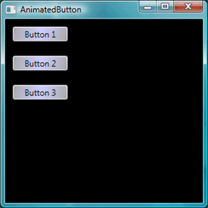
<Window x:Class="AnimatedButton.Window1"
  xmlns="http://schemas.microsoft.com/winfx/2006/xaml/presentation"
  xmlns:x="http://schemas.microsoft.com/winfx/2006/xaml"
  Title="AnimatedButton" Height="300" Width="300"
  Background="Black">
  <!-- Buttons arranged vertically inside a StackPanel. -->
  <StackPanel HorizontalAlignment="Left">
      <Button>Button 1</Button>
      <Button>Button 2</Button>
      <Button>Button 3</Button>
  </StackPanel>
</Window>
F5 キーを押してアプリケーションを実行します。次の図のような一連のボタンが表示されます。

基本的なボタンを作成したら、Window1.xaml ファイルでの作業が完了しました。 チュートリアルの残りの部分では、app.xaml ファイルに焦点を当て、ボタンのスタイルとテンプレートを定義します。
基本プロパティの設定
次に、これらのボタンにいくつかのプロパティを設定して、ボタンの外観とレイアウトを制御してみましょう。 ボタンのプロパティを個別に設定するのではなく、リソースを使用してアプリケーション全体のボタン プロパティを定義します。 アプリケーション リソースは概念的には Web ページの外部カスケード スタイル シート (CSS) に似ています。ただし、このチュートリアルの最後に示すように、リソースはカスケード スタイル シート (CSS) よりもはるかに強力です。 リソースの詳細については、「 XAML リソース」を参照してください。
スタイルを使用してボタンの基本プロパティを設定するには
Application.Resources ブロックを定義します。 app.xaml を開き、次の強調表示されたマークアップがまだ存在しない場合は追加します。
<Application x:Class="AnimatedButton.App"
  xmlns="http://schemas.microsoft.com/winfx/2006/xaml/presentation"
  xmlns:x="http://schemas.microsoft.com/winfx/2006/xaml"
  StartupUri="Window1.xaml"
  >
  <Application.Resources>
    <!-- Resources for the entire application can be defined here. -->
  </Application.Resources>
</Application>
リソース スコープは、リソースを定義する場所によって決まります。 app.xaml ファイルの
Application.Resourcesでリソースを定義すると、アプリケーション内のどこからでもリソースを使用できるようになります。 リソースのスコープの定義の詳細については、「 XAML リソース」を参照してください。スタイルを作成し、それを使用して基本的なプロパティ値を定義します 。
Application.Resourcesブロックに次のマークアップを追加します。 このマークアップは、アプリケーション内のすべてのボタンに適用される Style を作成し、ボタンの Width を 90 に、 Margin を 10 に設定します。<Application.Resources> <Style TargetType="Button"> <Setter Property="Width" Value="90" /> <Setter Property="Margin" Value="10" /> </Style> </Application.Resources>TargetType プロパティは、スタイルがButton型のすべてのオブジェクトに適用されることを指定します。 各 Setter は、 Styleに対して異なるプロパティ値を設定します。 そのため、この時点で、アプリケーション内のすべてのボタンの幅は 90、余白は 10 です。 F5 キーを押してアプリケーションを実行すると、次のウィンドウが表示されます。

対象となるオブジェクトを微調整するさまざまな方法、複雑なプロパティ値の指定、他のスタイルの入力としてスタイルを使用する方法など、スタイルでできることは他にもあります。 詳細については、「 スタイル設定とテンプレート」を参照してください。
スタイル プロパティの値をリソースに設定します。 リソースを使用すると、一般的に定義されたオブジェクトと値を簡単に再利用できます。 コードをよりモジュール化するために、リソースを使用して複雑な値を定義すると特に便利です。 次の強調表示されたマークアップを app.xaml に追加します。
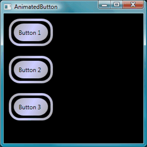
<Application.Resources> <LinearGradientBrush x:Key="GrayBlueGradientBrush" StartPoint="0,0" EndPoint="1,1"> <GradientStop Color="DarkGray" Offset="0" /> <GradientStop Color="#CCCCFF" Offset="0.5" /> <GradientStop Color="DarkGray" Offset="1" /> </LinearGradientBrush> <Style TargetType="{x:Type Button}"> <Setter Property="Background" Value="{StaticResource GrayBlueGradientBrush}" /> <Setter Property="Width" Value="80" /> <Setter Property="Margin" Value="10" /> </Style> </Application.Resources>Application.Resourcesブロックのすぐ下に、"GrayBlueGradientBrush" というリソースを作成しました。 このリソースは、水平方向のグラデーションを定義します。 このリソースは、 Background プロパティのボタン スタイル セッター内を含め、アプリケーション内のどこからでもプロパティ値として使用できます。 これで、すべてのボタンには、このグラデーションの Background プロパティ値があります。F5 キーを押してアプリケーションを実行します。 次のような表示になります。
ボタンの外観を定義するテンプレートを作成する
このセクションでは、ボタンの外観 (プレゼンテーション) をカスタマイズするテンプレートを作成します。 ボタンのプレゼンテーションは、四角形やその他のコンポーネントを含む複数のオブジェクトで構成され、ボタンに一意の外観を与えます。
これまで、アプリケーションでのボタンの外観の制御は、ボタンのプロパティの変更に限定されていました。 ボタンの外観をより根本的に変更する場合はどうなりますか? テンプレートを使用すると、オブジェクトのプレゼンテーションを強力に制御できます。 テンプレートはスタイル内で使用できるため、スタイルが適用されるすべてのオブジェクト (このチュートリアルではボタン) にテンプレートを適用できます。
テンプレートを使用してボタンの外観を定義するには
テンプレートを設定します。ButtonなどのコントロールにはTemplateプロパティがあるため、Styleを使用してSetterで設定した他のプロパティ値と同様に、テンプレート プロパティ値を定義できます。 次の強調表示されたマークアップをボタン スタイルに追加します。
<Application.Resources>
  <LinearGradientBrush x:Key="GrayBlueGradientBrush"
    StartPoint="0,0" EndPoint="1,1">
    <GradientStop Color="DarkGray" Offset="0" />
    <GradientStop Color="#CCCCFF" Offset="0.5" />
    <GradientStop Color="DarkGray" Offset="1" />
  </LinearGradientBrush>
  <Style TargetType="{x:Type Button}">
    <Setter Property="Background" Value="{StaticResource GrayBlueGradientBrush}" />
    <Setter Property="Width" Value="80" />
    <Setter Property="Margin" Value="10" />
    <Setter Property="Template">
      <Setter.Value>
        <!-- The button template is defined here. -->
      </Setter.Value>
    </Setter>
  </Style>
</Application.Resources>
[変更] ボタンのプレゼンテーション: この時点で、テンプレートを定義する必要があります。 次の強調表示されたマークアップを追加します。 このマークアップは、丸いエッジを持つ 2 つの Rectangle 要素を指定し、その後に DockPanelを指定します。 DockPanelは、ボタンのContentPresenterをホストするために使用されます。 ContentPresenterには、ボタンの内容が表示されます。 このチュートリアルでは、コンテンツはテキスト ("ボタン 1"、"ボタン 2"、"ボタン 3") です。 すべてのテンプレート コンポーネント (四角形と DockPanel) は、 Grid内に配置されます。
<Setter.Value>
  <ControlTemplate TargetType="Button">
    <Grid Width="{TemplateBinding Width}" Height="{TemplateBinding Height}" ClipToBounds="True">
      <!-- Outer Rectangle with rounded corners. -->
      <Rectangle x:Name="outerRectangle" HorizontalAlignment="Stretch" VerticalAlignment="Stretch" Stroke="{TemplateBinding Background}" RadiusX="20" RadiusY="20" StrokeThickness="5" Fill="Transparent" />
      <!-- Inner Rectangle with rounded corners. -->
      <Rectangle x:Name="innerRectangle" HorizontalAlignment="Stretch" VerticalAlignment="Stretch" Stroke="Transparent" StrokeThickness="20" Fill="{TemplateBinding Background}" RadiusX="20" RadiusY="20" />
      <!-- Present Content (text) of the button. -->
      <DockPanel Name="myContentPresenterDockPanel">
        <ContentPresenter x:Name="myContentPresenter" Margin="20" Content="{TemplateBinding  Content}" TextBlock.Foreground="Black" />
      </DockPanel>
    </Grid>
  </ControlTemplate>
</Setter.Value>
F5 キーを押してアプリケーションを実行します。 次のような表示になります。
テンプレートに glasseffect を追加します 。次にガラスを追加します。 まず、ガラスグラデーション効果を作成するいくつかのリソースを作成します。
Application.Resourcesブロック内の任意の場所に、次のグラデーション リソースを追加します。<Application.Resources> <GradientStopCollection x:Key="MyGlassGradientStopsResource"> <GradientStop Color="WhiteSmoke" Offset="0.2" /> <GradientStop Color="Transparent" Offset="0.4" /> <GradientStop Color="WhiteSmoke" Offset="0.5" /> <GradientStop Color="Transparent" Offset="0.75" /> <GradientStop Color="WhiteSmoke" Offset="0.9" /> <GradientStop Color="Transparent" Offset="1" /> </GradientStopCollection> <LinearGradientBrush x:Key="MyGlassBrushResource" StartPoint="0,0" EndPoint="1,1" Opacity="0.75" GradientStops="{StaticResource MyGlassGradientStopsResource}" /> <!-- Styles and other resources below here. -->これらのリソースは、ボタン テンプレートのFillに挿入する四角形のGridとして使用されます。 次の強調表示されたマークアップをテンプレートに追加します。
<Setter.Value>
  <ControlTemplate TargetType="{x:Type Button}">
    <Grid Width="{TemplateBinding Width}" Height="{TemplateBinding Height}"
      ClipToBounds="True">

    <!-- Outer Rectangle with rounded corners. -->
    <Rectangle x:Name="outerRectangle" HorizontalAlignment="Stretch"
      VerticalAlignment="Stretch" Stroke="{TemplateBinding Background}"
      RadiusX="20" RadiusY="20" StrokeThickness="5" Fill="Transparent" />

    <!-- Inner Rectangle with rounded corners. -->
    <Rectangle x:Name="innerRectangle" HorizontalAlignment="Stretch"
      VerticalAlignment="Stretch" Stroke="Transparent" StrokeThickness="20"
      Fill="{TemplateBinding Background}" RadiusX="20" RadiusY="20" />

    <!-- Glass Rectangle -->
    <Rectangle x:Name="glassCube" HorizontalAlignment="Stretch"
      VerticalAlignment="Stretch"
      StrokeThickness="2" RadiusX="10" RadiusY="10" Opacity="0"
      Fill="{StaticResource MyGlassBrushResource}"
      RenderTransformOrigin="0.5,0.5">
      <Rectangle.Stroke>
        <LinearGradientBrush StartPoint="0.5,0" EndPoint="0.5,1">
          <LinearGradientBrush.GradientStops>
            <GradientStop Offset="0.0" Color="LightBlue" />
            <GradientStop Offset="1.0" Color="Gray" />
          </LinearGradientBrush.GradientStops>
        </LinearGradientBrush>
      </Rectangle.Stroke>
      <!-- These transforms have no effect as they are declared here.
      The reason the transforms are included is to be targets
      for animation (see later). -->
      <Rectangle.RenderTransform>
        <TransformGroup>
          <ScaleTransform />
          <RotateTransform />
        </TransformGroup>
      </Rectangle.RenderTransform>
      <!-- A BevelBitmapEffect is applied to give the button a "Beveled" look. -->
      <Rectangle.BitmapEffect>
        <BevelBitmapEffect />
      </Rectangle.BitmapEffect>
    </Rectangle>

    <!-- Present Text of the button. -->
    <DockPanel Name="myContentPresenterDockPanel">
      <ContentPresenter x:Name="myContentPresenter" Margin="20"
        Content="{TemplateBinding  Content}" TextBlock.Foreground="Black" />
    </DockPanel>
  </Grid>
</ControlTemplate>
</Setter.Value>
"glassCube" のOpacityプロパティを持つ四角形の
x:Nameは 0 であるため、サンプルを実行すると、ガラスの四角形が上に重なって表示されません。 これは、ユーザーがボタンを操作するときに、後でテンプレートにトリガーを追加するためです。 ただし、 Opacity の値を 1 に変更し、アプリケーションを実行すると、ボタンがどのように表示されるかを確認できます。 次の図を参照してください。 次の手順に進む前に、 Opacity を 0 に戻します。XAML
ボタンの対話機能の作成
このセクションでは、プロパティ トリガーとイベント トリガーを作成して、プロパティ値を変更し、ボタンの上にマウス ポインターを移動してクリックするなどのユーザー 操作に応じてアニメーションを実行します。
対話機能を追加する簡単な方法 (マウス オーバー、マウス を離れる、クリックなど) は、テンプレートまたはスタイル内でトリガーを定義することです。
Triggerを作成するには、次のようなプロパティ "condition" を定義します。ボタンIsMouseOverプロパティ値はtrueと等しくなります。 次に、トリガー条件が true のときに実行されるセッター (アクション) を定義します。
ボタンのインタラクティブ機能を作成するには
テンプレート トリガーを追加します。 強調表示されたマークアップをテンプレートに追加します。
<Setter.Value>
  <ControlTemplate TargetType="{x:Type Button}">
    <Grid Width="{TemplateBinding Width}"
      Height="{TemplateBinding Height}" ClipToBounds="True">

      <!-- Outer Rectangle with rounded corners. -->
      <Rectangle x:Name="outerRectangle" HorizontalAlignment="Stretch"
      VerticalAlignment="Stretch" Stroke="{TemplateBinding Background}"
      RadiusX="20" RadiusY="20" StrokeThickness="5" Fill="Transparent" />

      <!-- Inner Rectangle with rounded corners. -->
      <Rectangle x:Name="innerRectangle" HorizontalAlignment="Stretch"
        VerticalAlignment="Stretch" Stroke="Transparent"
        StrokeThickness="20"
        Fill="{TemplateBinding Background}" RadiusX="20" RadiusY="20"
      />

      <!-- Glass Rectangle -->
      <Rectangle x:Name="glassCube" HorizontalAlignment="Stretch"
        VerticalAlignment="Stretch"
        StrokeThickness="2" RadiusX="10" RadiusY="10" Opacity="0"
        Fill="{StaticResource MyGlassBrushResource}"
        RenderTransformOrigin="0.5,0.5">
        <Rectangle.Stroke>
          <LinearGradientBrush StartPoint="0.5,0" EndPoint="0.5,1">
            <LinearGradientBrush.GradientStops>
              <GradientStop Offset="0.0" Color="LightBlue" />
              <GradientStop Offset="1.0" Color="Gray" />
            </LinearGradientBrush.GradientStops>
          </LinearGradientBrush>
        </Rectangle.Stroke>

        <!-- These transforms have no effect as they
             are declared here.
             The reason the transforms are included is to be targets
             for animation (see later). -->
        <Rectangle.RenderTransform>
          <TransformGroup>
            <ScaleTransform />
            <RotateTransform />
          </TransformGroup>
        </Rectangle.RenderTransform>

          <!-- A BevelBitmapEffect is applied to give the button a
               "Beveled" look. -->
        <Rectangle.BitmapEffect>
          <BevelBitmapEffect />
        </Rectangle.BitmapEffect>
      </Rectangle>

      <!-- Present Text of the button. -->
      <DockPanel Name="myContentPresenterDockPanel">
        <ContentPresenter x:Name="myContentPresenter" Margin="20"
          Content="{TemplateBinding  Content}" TextBlock.Foreground="Black" />
      </DockPanel>
    </Grid>

    <ControlTemplate.Triggers>       <!-- Set action triggers for the buttons and define            what the button does in response to those triggers. -->     </ControlTemplate.Triggers>
  </ControlTemplate>
</Setter.Value>
プロパティ トリガーを追加します。 強調表示されたマークアップを
ControlTemplate.Triggersブロックに追加します。<ControlTemplate.Triggers> <!-- Set properties when mouse pointer is over the button. --> <Trigger Property="IsMouseOver" Value="True"> <!-- Below are three property settings that occur when the condition is met (user mouses over button). --> <!-- Change the color of the outer rectangle when user mouses over it. --> <Setter Property ="Rectangle.Stroke" TargetName="outerRectangle" Value="{DynamicResource {x:Static SystemColors.HighlightBrushKey}}" /> <!-- Sets the glass opacity to 1, therefore, the glass "appears" when user mouses over it. --> <Setter Property="Rectangle.Opacity" Value="1" TargetName="glassCube" /> <!-- Makes the text slightly blurry as though you were looking at it through blurry glass. --> <Setter Property="ContentPresenter.BitmapEffect" TargetName="myContentPresenter"> <Setter.Value> <BlurBitmapEffect Radius="1" /> </Setter.Value> </Setter> </Trigger> <ControlTemplate.Triggers/>F5 キーを押してアプリケーションを実行し、ボタンの上にマウス ポインターを置くと効果が表示されます。
フォーカス トリガーを追加します。 次に、ボタンにフォーカスがある場合 (ユーザーがクリックした後など) を処理するために、同様のセッターをいくつか追加します。
<ControlTemplate.Triggers>

  <!-- Set properties when mouse pointer is over the button. -->
  <Trigger Property="IsMouseOver" Value="True">

    <!-- Below are three property settings that occur when the
         condition is met (user mouses over button).  -->
    <!-- Change the color of the outer rectangle when user          mouses over it. -->
    <Setter Property ="Rectangle.Stroke" TargetName="outerRectangle"
      Value="{DynamicResource {x:Static SystemColors.HighlightBrushKey}}" />

    <!-- Sets the glass opacity to 1, therefore, the          glass "appears" when user mouses over it. -->
    <Setter Property="Rectangle.Opacity" Value="1"       TargetName="glassCube" />

    <!-- Makes the text slightly blurry as though you were          looking at it through blurry glass. -->
    <Setter Property="ContentPresenter.BitmapEffect"       TargetName="myContentPresenter">
      <Setter.Value>
        <BlurBitmapEffect Radius="1" />
      </Setter.Value>
    </Setter>
  </Trigger>
  <!-- Set properties when button has focus. -->   <Trigger Property="IsFocused" Value="true">     <Setter Property="Rectangle.Opacity" Value="1"       TargetName="glassCube" />     <Setter Property="Rectangle.Stroke" TargetName="outerRectangle"       Value="{DynamicResource {x:Static SystemColors.HighlightBrushKey}}" />     <Setter Property="Rectangle.Opacity" Value="1" TargetName="glassCube" />   </Trigger>

</ControlTemplate.Triggers>
F5 キーを押してアプリケーションを実行し、いずれかのボタンをクリックします。 ボタンはフォーカスを持っているため、クリックした後も強調表示されたままであることに注意してください。 別のボタンをクリックすると、新しいボタンにフォーカスが移動し、最後のボタンはフォーカスを失います。
アニメーションを追加するMouseEnterMouseLeave:次に、トリガーにいくつかのアニメーションを追加します。
ControlTemplate.Triggersブロック内の任意の場所に次のマークアップを追加します。<!-- Animations that start when mouse enters and leaves button. --> <EventTrigger RoutedEvent="Mouse.MouseEnter"> <EventTrigger.Actions> <BeginStoryboard Name="mouseEnterBeginStoryboard"> <Storyboard> <!-- This animation makes the glass rectangle shrink in the X direction. --> <DoubleAnimation Storyboard.TargetName="glassCube" Storyboard.TargetProperty= "(Rectangle.RenderTransform).(TransformGroup.Children)[0].(ScaleTransform.ScaleX)" By="-0.1" Duration="0:0:0.5" /> <!-- This animation makes the glass rectangle shrink in the Y direction. --> <DoubleAnimation Storyboard.TargetName="glassCube" Storyboard.TargetProperty= "(Rectangle.RenderTransform).(TransformGroup.Children)[0].(ScaleTransform.ScaleY)" By="-0.1" Duration="0:0:0.5" /> </Storyboard> </BeginStoryboard> </EventTrigger.Actions> </EventTrigger> <EventTrigger RoutedEvent="Mouse.MouseLeave"> <EventTrigger.Actions> <!-- Stopping the storyboard sets all animated properties back to default. --> <StopStoryboard BeginStoryboardName="mouseEnterBeginStoryboard" /> </EventTrigger.Actions> </EventTrigger>マウス ポインターがボタンの上に移動すると、ガラスの四角形が縮小し、ポインターが離れると通常のサイズに戻ります。
ポインターがボタンの上に移動したときにトリガーされるアニメーションが 2 つあります(MouseEnter イベントが発生します)。 これらのアニメーションは、X 軸と Y 軸に沿ってガラスの四角形を縮小します。 DoubleAnimationとDurationのBy要素のプロパティに注目してください。 Durationは、アニメーションが 5 分の 1 秒以上発生することを指定し、Byはガラスが 10%縮小することを指定します。
2 番目のイベント トリガー (MouseLeave) は、最初のイベント トリガーを停止するだけです。 Storyboardを停止すると、アニメーション化されたすべてのプロパティが既定値に戻ります。 したがって、ユーザーがボタンからポインターを移動すると、ボタンはマウス ポインターがボタンの上に移動する前の状態に戻ります。 アニメーションの詳細については、「 アニメーションの概要」を参照してください。
ボタンがクリックされたときのアニメーションを追加します 。最後の手順では、ユーザーがボタンをクリックしたときのトリガーを追加します。
ControlTemplate.Triggersブロック内の任意の場所に次のマークアップを追加します。<!-- Animation fires when button is clicked, causing glass to spin. --> <EventTrigger RoutedEvent="Button.Click"> <EventTrigger.Actions> <BeginStoryboard> <Storyboard> <DoubleAnimation Storyboard.TargetName="glassCube" Storyboard.TargetProperty= "(Rectangle.RenderTransform).(TransformGroup.Children)[1].(RotateTransform.Angle)" By="360" Duration="0:0:0.5" /> </Storyboard> </BeginStoryboard> </EventTrigger.Actions> </EventTrigger>F5 キーを押してアプリケーションを実行し、いずれかのボタンをクリックします。 ボタンをクリックすると、ガラスの四角形が回転します。
概要
このチュートリアルでは、次の演習を実行しました。
Styleを使用して、アプリケーション全体のボタンの基本プロパティを制御します。
Style セッターのプロパティ値に使用するグラデーションなどのリソースを作成しました。
ボタンにテンプレートを適用して、アプリケーション全体のボタンの外観をカスタマイズしました。
アニメーション効果を含むユーザー アクション ( MouseEnter、 MouseLeave、 Clickなど) に応じてボタンの動作をカスタマイズしました。
こちらも参照ください
GitHub で Microsoft と共同作業する
このコンテンツのソースは GitHub にあります。そこで、issue や pull request を作成および確認することもできます。 詳細については、共同作成者ガイドを参照してください。
.NET Desktop feedback