Windows Presentation Foundation (WPF) を使用すると、独自の再利用可能なテンプレートを使用して、既存のコントロールの視覚的な構造と動作をカスタマイズできます。 テンプレートは、アプリケーション、ウィンドウ、ページにグローバルに適用することも、コントロールに直接適用することもできます。 新しいコントロールを作成する必要があるほとんどのシナリオは、代わりに既存のコントロール用の新しいテンプレートを作成することでカバーできます。
この記事では、ControlTemplate コントロールの新しいButtonの作成について説明します。
ControlTemplate を作成するタイミング
コントロールには、 Background、 Foreground、 FontFamilyなど、多くのプロパティがあります。 これらのプロパティはコントロールの外観のさまざまな側面を制御しますが、これらのプロパティを設定することで行うことができる変更は制限されます。 たとえば、Foreground プロパティを青に設定し、FontStyleでCheckBoxを斜体に設定できます。 コントロールの他のプロパティの設定以外にコントロールの外観をカスタマイズする場合は、 ControlTemplateを作成します。
ほとんどのユーザー インターフェイスでは、ボタンの一般的な外観は同じです。一部のテキストを含む四角形です。 丸められたボタンを作成する場合は、ボタンから継承するか、ボタンの機能を再作成する新しいコントロールを作成できます。 さらに、新しいユーザー コントロールは循環ビジュアルを提供します。
既存のコントロールのビジュアル レイアウトをカスタマイズすることで、新しいコントロールの作成を回避できます。 丸みを帯びたボタンを使用すると、目的のビジュアル レイアウトで ControlTemplate を作成できます。
一方、新しい機能、さまざまなプロパティ、新しい設定を持つコントロールが必要な場合は、新しい UserControlを作成します。
[前提条件]
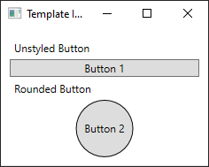
新しい WPF アプリケーションを作成し、MainWindow.xaml (または任意の別のウィンドウ) で、<Window> 要素に次のプロパティを設定します。
| プロパティ | 価値 |
|---|---|
| Title | Template Intro Sample |
| SizeToContent | WidthAndHeight |
| MinWidth | 250 |
<Window> 要素の内容を次の XAML に設定します。
<StackPanel Margin="10">
    <Label>Unstyled Button</Label>
    <Button>Button 1</Button>
    <Label>Rounded Button</Label>
    <Button>Button 2</Button>
</StackPanel>
最後に、 MainWindow.xaml ファイルは次のようになります。
<Window x:Class="IntroToStylingAndTemplating.Window1"
        xmlns="http://schemas.microsoft.com/winfx/2006/xaml/presentation"
        xmlns:x="http://schemas.microsoft.com/winfx/2006/xaml"
        xmlns:d="http://schemas.microsoft.com/expression/blend/2008"
        xmlns:mc="http://schemas.openxmlformats.org/markup-compatibility/2006"
        xmlns:local="clr-namespace:IntroToStylingAndTemplating"
        mc:Ignorable="d"
        Title="Template Intro Sample" SizeToContent="WidthAndHeight" MinWidth="250">
    <StackPanel Margin="10">
        <Label>Unstyled Button</Label>
        <Button>Button 1</Button>
        <Label>Rounded Button</Label>
        <Button>Button 2</Button>
    </StackPanel>
</Window>
アプリケーションを実行すると、次のようになります。

ControlTemplate を作成する
ControlTemplateを宣言する最も一般的な方法は、XAML ファイルの Resources セクションのリソースです。 テンプレートはリソースであるため、すべてのリソースに適用されるのと同じスコープ規則に従います。 簡単に言えば、テンプレートを宣言する場所は、テンプレートを適用できる場所に影響します。 たとえば、アプリケーション定義 XAML ファイルのルート要素でテンプレートを宣言する場合、テンプレートはアプリケーション内の任意の場所で使用できます。 ウィンドウでテンプレートを定義すると、そのウィンドウ内のコントロールのみがテンプレートを使用できます。
最初に、Window.Resources ファイルに 要素を追加します。
<Window x:Class="IntroToStylingAndTemplating.Window2"
        xmlns="http://schemas.microsoft.com/winfx/2006/xaml/presentation"
        xmlns:x="http://schemas.microsoft.com/winfx/2006/xaml"
        xmlns:d="http://schemas.microsoft.com/expression/blend/2008"
        xmlns:mc="http://schemas.openxmlformats.org/markup-compatibility/2006"
        xmlns:local="clr-namespace:IntroToStylingAndTemplating"
        mc:Ignorable="d"
        Title="Template Intro Sample" SizeToContent="WidthAndHeight" MinWidth="250">
    <Window.Resources>

    </Window.Resources>
    <StackPanel Margin="10">
        <Label>Unstyled Button</Label>
        <Button>Button 1</Button>
        <Label>Rounded Button</Label>
        <Button>Button 2</Button>
    </StackPanel>
</Window>
次のプロパティを設定して、新しい <ControlTemplate> を作成します。
| プロパティ | 価値 |
|---|---|
| x:Key | roundbutton |
| TargetType | Button |
このコントロール テンプレートは単純です。
- コントロールのルート要素、 Grid
- ボタンの丸い外観を描画するEllipse
- ContentPresenter ユーザー指定のボタンコンテンツを表示する
<ControlTemplate x:Key="roundbutton" TargetType="Button">
    <Grid>
        <Ellipse Fill="{TemplateBinding Background}" Stroke="{TemplateBinding Foreground}" />
        <ContentPresenter HorizontalAlignment="Center" VerticalAlignment="Center" />
    </Grid>
</ControlTemplate>
テンプレートバインディング
新しい ControlTemplateを作成する場合でも、パブリック プロパティを使用してコントロールの外観を変更できます。 TemplateBinding のマークアップ拡張機能は、ControlTemplate 内の要素のプロパティを、コントロールで定義されたパブリック プロパティにバインドする機能です。 TemplateBinding を使用する場合は、コントロールのプロパティがテンプレートのパラメーターとして機能するように設定します。 つまり、コントロールのプロパティが設定されると、その値が TemplateBinding を持つ要素に渡されます。
楕円
Stroke <要素の>プロパティとプロパティがコントロールのForegroundプロパティとBackgroundプロパティにバインドされていることに注意してください。
コンテンツプレゼンター
<ContentPresenter> 要素もテンプレートに追加されます。 このテンプレートはボタン用に設計されているため、ボタンが ContentControlから継承されることを考慮してください。 このボタンは、要素の内容を示します。 プレーン テキストや別のコントロールなど、ボタンの内部に何でも設定できます。 次の両方が有効なボタンです。
<Button>My Text</Button>

<!-- and -->

<Button>
    <CheckBox>Checkbox in a button</CheckBox>
</Button>
前の両方の例では、テキストとチェック ボックスが Button.Content プロパティとして設定されています。 何らかのコンテンツとして設定されたものは、<ContentPresenter>を通して表示可能であり、それがテンプレートの役割です。
ControlTemplateがContentControlなどのButton型に適用されている場合、要素ツリーでContentPresenterが検索されます。
ContentPresenterが見つかった場合、テンプレートはコントロールのContent プロパティをContentPresenterに自動的にバインドします。
テンプレートを使用する
この記事の冒頭で宣言されたボタンを見つけます。
<StackPanel Margin="10">
    <Label>Unstyled Button</Label>
    <Button>Button 1</Button>
    <Label>Rounded Button</Label>
    <Button>Button 2</Button>
</StackPanel>
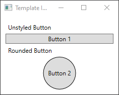
2 番目のボタンの Template プロパティを roundbutton リソースに設定します。
<StackPanel Margin="10">
    <Label>Unstyled Button</Label>
    <Button>Button 1</Button>
    <Label>Rounded Button</Label>
    <Button Template="{StaticResource roundbutton}">Button 2</Button>
</StackPanel>
プロジェクトを実行して結果を確認すると、ボタンの背景が丸くなっていることがわかります。

ボタンが円ではなく、傾斜していることに気付いたかもしれません。 <Ellipse>要素の動作により、常に拡張されて使用可能な領域を埋めます。 ボタンの width プロパティと height プロパティを同じ値に変更して、円を均一にします。
<StackPanel Margin="10">
    <Label>Unstyled Button</Label>
    <Button>Button 1</Button>
    <Label>Rounded Button</Label>
    <Button Template="{StaticResource roundbutton}" Width="65" Height="65">Button 2</Button>
</StackPanel>

トリガーを追加する
テンプレートが適用されたボタンの外観は異なりますが、他のボタンと同じように動作します。 ボタンを押すと、 Click イベントが発生します。 ただし、マウスをボタンの上に移動しても、ボタンのビジュアルは変更されないことに気付いたかもしれません。 これらの視覚的な相互作用はすべて、テンプレートによって定義されます。
WPF が提供する動的イベントおよびプロパティ システムを使用すると、値の特定のプロパティを監視し、必要に応じてテンプレートのスタイルを変更できます。 この例では、ボタンの IsMouseOver プロパティを確認します。 マウスがコントロールの上にある場合は、新しい色で<Ellipse>のスタイルを設定します。 この種類のトリガーは PropertyTrigger と呼ばれます。
これを機能させるには、参照できる名前を <Ellipse> に追加する必要があります。 backgroundElement の名前を指定します。
<Ellipse x:Name="backgroundElement" Fill="{TemplateBinding Background}" Stroke="{TemplateBinding Foreground}" />
次に、Trigger コレクションに新しいを追加します。 トリガーはIsMouseOverイベントを監視し、trueの値を確認します。
<ControlTemplate x:Key="roundbutton" TargetType="Button">
    <Grid>
        <Ellipse x:Name="backgroundElement" Fill="{TemplateBinding Background}" Stroke="{TemplateBinding Foreground}" />
        <ContentPresenter HorizontalAlignment="Center" VerticalAlignment="Center" />
    </Grid>
    <ControlTemplate.Triggers>
        <Trigger Property="IsMouseOver" Value="true">

        </Trigger>
    </ControlTemplate.Triggers>
</ControlTemplate>
次に、<Trigger> に <Setter> を追加し、> の Fill プロパティを新しい色に変更します。
<Trigger Property="IsMouseOver" Value="true">
    <Setter Property="Fill" TargetName="backgroundElement" Value="AliceBlue"/>
</Trigger>
プロジェクトを実行します。 ボタンの上にマウスを移動すると、 <Ellipse> の色が変わります。
VisualState を使用する
表示状態は、コントロールによって定義およびトリガーされます。 たとえば、マウスをコントロールの上に移動すると、 CommonStates.MouseOver 状態がトリガーされます。 コントロールの現在の状態に基づいて、プロパティの変更をアニメーション化できます。 前のセクションでは、<PropertyTrigger> を使用して、AliceBlue プロパティがIsMouseOverされたときに、ボタンの背景をtrueに変更しました。 代わりに、この色の変化をアニメーション化する視覚的な状態を作成し、スムーズな遷移を提供します。
VisualStates の詳細については、「WPF のスタイルとテンプレート」を参照してください。
<PropertyTrigger>をアニメーション表示状態に変換するには、まず、テンプレートから <ControlTemplate.Triggers> 要素を削除します。
<ControlTemplate x:Key="roundbutton" TargetType="Button">
    <Grid>
        <Ellipse x:Name="backgroundElement" Fill="{TemplateBinding Background}" Stroke="{TemplateBinding Foreground}" />
        <ContentPresenter HorizontalAlignment="Center" VerticalAlignment="Center" />
    </Grid>
</ControlTemplate>
次に、コントロール テンプレートの <Grid> ルートで、<VisualStateManager.VisualStateGroups> 要素を < の CommonStates と共に追加します。
NormalとMouseOverの 2 つの状態を定義します。
<ControlTemplate x:Key="roundbutton" TargetType="Button">
    <Grid>
        <VisualStateManager.VisualStateGroups>
            <VisualStateGroup Name="CommonStates">
                <VisualState Name="Normal">
                </VisualState>
                <VisualState Name="MouseOver">
                </VisualState>
            </VisualStateGroup>
        </VisualStateManager.VisualStateGroups>
        <Ellipse x:Name="backgroundElement" Fill="{TemplateBinding Background}" Stroke="{TemplateBinding Foreground}" />
        <ContentPresenter HorizontalAlignment="Center" VerticalAlignment="Center" />
    </Grid>
</ControlTemplate>
<VisualState> で定義されているすべてのアニメーションは、その状態がトリガーされたときに適用されます。 各状態のアニメーションを作成します。 アニメーションは<Storyboard> 要素内に配置されます。 ストーリーボードの詳細については、「 ストーリーボードの概要」を参照してください。
正常
この状態は、楕円の塗りつぶしをアニメーション化し、コントロールの
Backgroundの色に復元します。<Storyboard> <ColorAnimation Storyboard.TargetName="backgroundElement" Storyboard.TargetProperty="(Shape.Fill).(SolidColorBrush.Color)" To="{TemplateBinding Background}" Duration="0:0:0.3"/> </Storyboard>マウスオーバー
この状態は、楕円
Background色を新しい色 (Yellow) にアニメーション化します。<Storyboard> <ColorAnimation Storyboard.TargetName="backgroundElement" Storyboard.TargetProperty="(Shape.Fill).(SolidColorBrush.Color)" To="Yellow" Duration="0:0:0.3"/> </Storyboard>
<ControlTemplate>は次のようになります。
<ControlTemplate x:Key="roundbutton" TargetType="Button">
<Grid>
<VisualStateManager.VisualStateGroups>
<VisualStateGroup Name="CommonStates">
<VisualState Name="Normal">
<Storyboard>
    <ColorAnimation Storyboard.TargetName="backgroundElement"
        Storyboard.TargetProperty="(Shape.Fill).(SolidColorBrush.Color)"
        To="{TemplateBinding Background}"
        Duration="0:0:0.3"/>
</Storyboard>
</VisualState>
<VisualState Name="MouseOver">
<Storyboard>
    <ColorAnimation Storyboard.TargetName="backgroundElement"
        Storyboard.TargetProperty="(Shape.Fill).(SolidColorBrush.Color)"
        To="Yellow"
        Duration="0:0:0.3"/>
</Storyboard>
</VisualState>
</VisualStateGroup>
</VisualStateManager.VisualStateGroups>
<Ellipse Name="backgroundElement" Fill="{TemplateBinding Background}" Stroke="{TemplateBinding Foreground}" />
<ContentPresenter x:Name="contentPresenter" HorizontalAlignment="Center" VerticalAlignment="Center" />
</Grid>
</ControlTemplate>
プロジェクトを実行します。 ボタンの上にマウスを移動すると、 <Ellipse> の色がアニメーション化されます。
次のステップ
GitHub で Microsoft と共同作業する
このコンテンツのソースは GitHub にあります。そこで、issue や pull request を作成および確認することもできます。 詳細については、共同作成者ガイドを参照してください。
.NET Desktop feedback