カスタム コントロールのデザイン時エクスペリエンスは、関連付けられているカスタム デザイナーを作成することで拡張できます。
注意事項
このコンテンツは.NET Framework 用に作成されました。 .NET 6 以降のバージョンを使用している場合は、このコンテンツを慎重に使用してください。 Windows フォームのデザイナー システムが変更されたため、.NET Framework 記事以降の
この記事では、カスタム コントロールのカスタム デザイナーを作成する方法について説明します。
MarqueeControl型と、MarqueeControlRootDesignerと呼ばれる関連デザイナー クラスを実装します。
MarqueeControl型は、アニメーション化されたライトと点滅するテキストを含むシアター マーキーに似たディスプレイを実装します。
このコントロールのデザイナーは、デザイン環境と対話して、カスタムのデザイン時エクスペリエンスを提供します。 カスタム デザイナーを使用すると、アニメーション化されたライトと点滅するテキストを組み合わせて、カスタムの MarqueeControl 実装を組み立てることができます。 他の Windows フォーム コントロールと同様に、フォームでアセンブリ コントロールを使用できます。
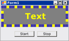
このチュートリアルを完了すると、カスタム コントロールは次のようになります。
完全なコード一覧については、「 方法: Design-Time 機能を利用する Windows フォーム コントロールを作成する」を参照してください。
[前提条件]
このチュートリアルを完了するには、Visual Studio が必要です。
プロジェクトを作成する
最初の手順では、アプリケーション プロジェクトを作成します。 このプロジェクトを使用して、カスタム コントロールをホストするアプリケーションをビルドします。
Visual Studio で、新しい Windows フォーム アプリケーション プロジェクトを作成し、 MarqueeControlTest という名前を付けます。
コントロール ライブラリ プロジェクトを作成する
ソリューションに Windows フォーム コントロール ライブラリ プロジェクトを追加します。 プロジェクトに MarqueeControlLibrary という名前を付けます。
ソリューション エクスプローラーを使用して、選択した言語に応じて、"UserControl1.cs" または "UserControl1.vb" という名前のソース ファイルを削除して、プロジェクトの既定のコントロールを削除します。
UserControl プロジェクトに新しい
MarqueeControlLibrary項目を追加します。 新しいソース ファイルに MarqueeControl の基本名を付けます。ソリューション エクスプローラーを使用して、
MarqueeControlLibraryプロジェクトに新しいフォルダーを作成します。デザイン フォルダーを右クリックし、新しいクラスを追加します。 それに MarqueeControlRootDesigner という名前を付けます。
System.Design アセンブリの型を使用する必要があるため、この参照を
MarqueeControlLibraryプロジェクトに追加します。
カスタム コントロール プロジェクトを参照する
MarqueeControlTest プロジェクトを使用して、カスタム コントロールをテストします。
MarqueeControlLibrary アセンブリにプロジェクト参照を追加すると、テスト プロジェクトはカスタム コントロールを認識します。
MarqueeControlTest プロジェクトで、MarqueeControlLibrary アセンブリへのプロジェクト参照を追加します。
アセンブリを直接参照する代わりに、[参照の追加] ダイアログ ボックスの [MarqueeControlLibrary] タブを使用してください。
カスタム コントロールとそのカスタム デザイナーを定義する
カスタム コントロールは、 UserControl クラスから派生します。 これにより、コントロールに他のコントロールを含めることができ、コントロールに多くのデフォルト機能が提供されます。
カスタム コントロールには、カスタム デザイナーが関連付けられます。 これにより、カスタム コントロール専用に調整された独自のデザイン エクスペリエンスを作成できます。
DesignerAttribute クラスを使用して、コントロールをデザイナーに関連付けます。 カスタム コントロールのデザイン時の動作全体を開発しているため、カスタム デザイナーは IRootDesigner インターフェイスを実装します。
カスタム コントロールとそのカスタム デザイナーを定義するには
MarqueeControlで ソース ファイルを開きます。 ファイルの先頭に、次の名前空間をインポートします。using System; using System.Collections; using System.ComponentModel; using System.ComponentModel.Design; using System.Drawing; using System.Windows.Forms; using System.Windows.Forms.Design;Imports System.Collections Imports System.ComponentModel Imports System.ComponentModel.Design Imports System.Drawing Imports System.Windows.Forms Imports System.Windows.Forms.DesignDesignerAttribute クラス宣言に
MarqueeControlを追加します。 これにより、カスタム コントロールがデザイナーに関連付けられます。[Designer( typeof( MarqueeControlLibrary.Design.MarqueeControlRootDesigner ), typeof( IRootDesigner ) )] public class MarqueeControl : UserControl {<Designer(GetType(MarqueeControlLibrary.Design.MarqueeControlRootDesigner), _ GetType(IRootDesigner))> _ Public Class MarqueeControl Inherits UserControlMarqueeControlRootDesignerで ソース ファイルを開きます。 ファイルの先頭に、次の名前空間をインポートします。using System; using System.Collections; using System.ComponentModel; using System.ComponentModel.Design; using System.Diagnostics; using System.Drawing.Design; using System.Windows.Forms; using System.Windows.Forms.Design;Imports System.Collections Imports System.ComponentModel Imports System.ComponentModel.Design Imports System.Diagnostics Imports System.Drawing.Design Imports System.Windows.Forms Imports System.Windows.Forms.DesignMarqueeControlRootDesignerクラスから継承するようにDocumentDesignerの宣言を変更します。 ToolboxItemFilterAttributeを適用して、デザイナーとツールボックスの相互作用を指定します。注
MarqueeControlRootDesignerクラスの定義は、MarqueeControlLibrary.Design と呼ばれる名前空間で囲まれています。 この宣言により、デザイン関連の型用に予約された特別な名前空間にデザイナーが配置されます。namespace MarqueeControlLibrary.Design { [ToolboxItemFilter("MarqueeControlLibrary.MarqueeBorder", ToolboxItemFilterType.Require)] [ToolboxItemFilter("MarqueeControlLibrary.MarqueeText", ToolboxItemFilterType.Require)] public class MarqueeControlRootDesigner : DocumentDesigner {Namespace MarqueeControlLibrary.Design <ToolboxItemFilter("MarqueeControlLibrary.MarqueeBorder", _ ToolboxItemFilterType.Require), _ ToolboxItemFilter("MarqueeControlLibrary.MarqueeText", _ ToolboxItemFilterType.Require)> _ Public Class MarqueeControlRootDesigner Inherits DocumentDesignerMarqueeControlRootDesignerクラスのコンストラクターを定義します。 コンストラクター本体に WriteLine ステートメントを挿入します。 これはデバッグに役立ちます。public MarqueeControlRootDesigner() { Trace.WriteLine("MarqueeControlRootDesigner ctor"); }Public Sub New() Trace.WriteLine("MarqueeControlRootDesigner ctor") End Sub
カスタム コントロールのインスタンスを作成する
UserControl プロジェクトに新しい
MarqueeControlTest項目を追加します。 新しいソース ファイルに DemoMarqueeControl の基本名を付けます。DemoMarqueeControlで ファイルを開きます。 ファイルの先頭に、MarqueeControlLibrary名前空間をインポートします。Imports MarqueeControlLibraryusing MarqueeControlLibrary;DemoMarqueeControlクラスから継承するようにMarqueeControlの宣言を変更します。プロジェクトをビルドします。
Windows フォーム デザイナーで Form1 を開きます。
ツールボックスで [MarqueeControlTest コンポーネント] タブを見つけて開きます。
DemoMarqueeControlからフォームにをドラッグします。プロジェクトをビルドします。
Design-Time デバッグ用にプロジェクトを設定する
カスタムのデザイン時エクスペリエンスを開発する場合は、コントロールとコンポーネントをデバッグする必要があります。 デザイン時にデバッグできるようにプロジェクトを設定する簡単な方法があります。 詳細については、「 チュートリアル: デザイン時のカスタム Windows フォーム コントロールのデバッグ」を参照してください。
MarqueeControlLibraryプロジェクトを右クリックし、[プロパティ] を選択します。[MarqueeControlLibrary プロパティ ページ] ダイアログ ボックスで、[デバッグ] ページを選択します。
[ Start Action]\(開始アクション \) セクションで、[ 外部プログラムの開始] を選択します。 Visual Studio の個別のインスタンスをデバッグするため、省略記号 (Visual Studio の
![[プロパティ] ウィンドウの省略記号ボタン (...) ボタン)](media/visual-studio-ellipsis-button.png) をクリックして Visual Studio IDE を参照します。 実行可能ファイルの名前は devenv.exeされ、既定の場所にインストールした場合、そのパスは \Microsoft Visual Studio\2019\<edition%%ProgramFiles(x86) になります>\Common7\IDE\devenv.exe。
をクリックして Visual Studio IDE を参照します。 実行可能ファイルの名前は devenv.exeされ、既定の場所にインストールした場合、そのパスは \Microsoft Visual Studio\2019\<edition%%ProgramFiles(x86) になります>\Common7\IDE\devenv.exe。OK を選択してダイアログ ボックスを閉じます。
MarqueeControlLibrary プロジェクトを右クリックし、[ スタートアップ プロジェクトとして設定 ] を選択して、このデバッグ構成を有効にします。
チェックポイント
これで、カスタム コントロールのデザイン時の動作をデバッグする準備ができました。 デバッグ環境が正しく設定されていることを確認したら、カスタム コントロールとカスタム デザイナーの間の関連付けをテストします。
デバッグ環境とデザイナーの関連付けをテストするには
コード エディターで MarqueeControlRootDesigner ソース ファイルを開き、WriteLine ステートメントにブレークポイントを配置します。
F5 キーを押してデバッグ セッションを開始します。
Visual Studio の新しいインスタンスが作成されます。
Visual Studio の新しいインスタンスで、MarqueeControlTest ソリューションを開きます。 [ファイル] メニューから [最近使ったプロジェクト] を選択すると、ソリューションを簡単に見つけることができます。 MarqueeControlTest.sln ソリューション ファイルは、最近使用したファイルとして一覧表示されます。
デザイナーで
DemoMarqueeControlを開きます。Visual Studio のデバッグ インスタンスがフォーカスを取得し、ブレークポイントで実行が停止します。 F5 キーを押してデバッグ セッションを続行します。
この時点で、カスタム コントロールとそれに関連付けられているカスタム デザイナーを開発およびデバッグするためのすべてが整います。 この記事の残りの部分では、コントロールとデザイナーの機能の実装の詳細について説明します。
カスタム コントロールを実装する
MarqueeControlは、少しカスタマイズしたUserControlです。 マーキー アニメーションを開始する Start と、アニメーションを停止する Stop の 2 つのメソッドが公開されています。
MarqueeControlには、IMarqueeWidget インターフェイスを実装する子コントロールが含まれているため、StartとStopは各子コントロールを列挙し、StartMarqueeを実装する各子コントロールに対してStopMarqueeメソッドとIMarqueeWidget メソッドをそれぞれ呼び出します。
MarqueeBorderコントロールとMarqueeText コントロールの外観はレイアウトに依存するため、MarqueeControlはOnLayout メソッドをオーバーライドし、この型の子コントロールに対してPerformLayoutを呼び出します。
これは、 MarqueeControl カスタマイズの範囲です。 ランタイム機能は MarqueeBorder コントロールと MarqueeText コントロールによって実装され、デザイン時の特徴は MarqueeBorderDesigner および MarqueeControlRootDesigner クラスによって実装されます。
カスタム コントロールを実装するには
MarqueeControlで ソース ファイルを開きます。StartおよびStopメソッドを実装します。public void Start() { // The MarqueeControl may contain any number of // controls that implement IMarqueeWidget, so // find each IMarqueeWidget child and call its // StartMarquee method. foreach( Control cntrl in this.Controls ) { if( cntrl is IMarqueeWidget ) { IMarqueeWidget widget = cntrl as IMarqueeWidget; widget.StartMarquee(); } } } public void Stop() { // The MarqueeControl may contain any number of // controls that implement IMarqueeWidget, so find // each IMarqueeWidget child and call its StopMarquee // method. foreach( Control cntrl in this.Controls ) { if( cntrl is IMarqueeWidget ) { IMarqueeWidget widget = cntrl as IMarqueeWidget; widget.StopMarquee(); } } }Public Sub Start() ' The MarqueeControl may contain any number of ' controls that implement IMarqueeWidget, so ' find each IMarqueeWidget child and call its ' StartMarquee method. Dim cntrl As Control For Each cntrl In Me.Controls If TypeOf cntrl Is IMarqueeWidget Then Dim widget As IMarqueeWidget = CType(cntrl, IMarqueeWidget) widget.StartMarquee() End If Next cntrl End Sub Public Sub [Stop]() ' The MarqueeControl may contain any number of ' controls that implement IMarqueeWidget, so find ' each IMarqueeWidget child and call its StopMarquee ' method. Dim cntrl As Control For Each cntrl In Me.Controls If TypeOf cntrl Is IMarqueeWidget Then Dim widget As IMarqueeWidget = CType(cntrl, IMarqueeWidget) widget.StopMarquee() End If Next cntrl End SubOnLayout メソッドをオーバーライドします。
protected override void OnLayout(LayoutEventArgs levent)
{
    base.OnLayout (levent);

    // Repaint all IMarqueeWidget children if the layout
    // has changed.
    foreach( Control cntrl in this.Controls )
    {
        if( cntrl is IMarqueeWidget )
        {
            Control control = cntrl as Control;

            control.PerformLayout();
        }
    }
}
Protected Overrides Sub OnLayout(ByVal levent As LayoutEventArgs) MyBase.OnLayout(levent) ' Repaint all IMarqueeWidget children if the layout ' has changed. Dim cntrl As Control For Each cntrl In Me.Controls If TypeOf cntrl Is IMarqueeWidget Then Dim widget As IMarqueeWidget = CType(cntrl, IMarqueeWidget) cntrl.PerformLayout() End If Next cntrl End Sub
カスタム コントロールの子コントロールを作成する
MarqueeControlは、MarqueeBorder コントロールとMarqueeText コントロールの 2 種類の子コントロールをホストします。
MarqueeBorder:このコントロールは、エッジの周囲に "ライト" の境界線を描画します。 ライトは順番に点滅するため、境界線の周りを移動しているように見えます。 ライトが点滅する速度は、UpdatePeriodと呼ばれるプロパティによって制御されます。 他のいくつかのカスタム プロパティによって、コントロールの外観の他の側面が決まります。StartMarqueeとStopMarqueeと呼ばれる 2 つのメソッドは、アニメーションの開始と停止を制御します。MarqueeText:このコントロールは点滅する文字列を描画します。MarqueeBorderコントロールと同様に、テキストが点滅する速度は、UpdatePeriodプロパティによって制御されます。MarqueeTextコントロールには、StartMarqueeコントロールと共通のStopMarqueeメソッドとMarqueeBorderメソッドもあります。
デザイン時に、 MarqueeControlRootDesigner では、これら 2 つのコントロール型を任意の組み合わせで MarqueeControl に追加できます。
2 つのコントロールの一般的な機能は、 IMarqueeWidgetと呼ばれるインターフェイスに組み込まれます。 これにより、 MarqueeControl はマーキー関連の子コントロールを検出し、特別な処理を行います。
定期的なアニメーション機能を実装するには、BackgroundWorker名前空間のSystem.ComponentModelオブジェクトを使用します。
Timerオブジェクトを使用することもできますが、多数のIMarqueeWidget オブジェクトが存在する場合、1 つの UI スレッドがアニメーションに追いつくことができない可能性があります。
カスタムコントロールに子コントロールを作成するには
MarqueeControlLibraryプロジェクトに新しいクラス 項目を追加します。 新しいソース ファイルにベース名として "IMarqueeWidget" を付けます。IMarqueeWidgetで ソース ファイルを開き、宣言をclassからinterfaceに変更します。// This interface defines the contract for any class that is to // be used in constructing a MarqueeControl. public interface IMarqueeWidget {' This interface defines the contract for any class that is to ' be used in constructing a MarqueeControl. Public Interface IMarqueeWidget次のコードを
IMarqueeWidgetインターフェイスに追加して、マーキー アニメーションを操作する 2 つのメソッドとプロパティを公開します。// This interface defines the contract for any class that is to // be used in constructing a MarqueeControl. public interface IMarqueeWidget { // This method starts the animation. If the control can // contain other classes that implement IMarqueeWidget as // children, the control should call StartMarquee on all // its IMarqueeWidget child controls. void StartMarquee(); // This method stops the animation. If the control can // contain other classes that implement IMarqueeWidget as // children, the control should call StopMarquee on all // its IMarqueeWidget child controls. void StopMarquee(); // This method specifies the refresh rate for the animation, // in milliseconds. int UpdatePeriod { get; set; } }' This interface defines the contract for any class that is to ' be used in constructing a MarqueeControl. Public Interface IMarqueeWidget ' This method starts the animation. If the control can ' contain other classes that implement IMarqueeWidget as ' children, the control should call StartMarquee on all ' its IMarqueeWidget child controls. Sub StartMarquee() ' This method stops the animation. If the control can ' contain other classes that implement IMarqueeWidget as ' children, the control should call StopMarquee on all ' its IMarqueeWidget child controls. Sub StopMarquee() ' This method specifies the refresh rate for the animation, ' in milliseconds. Property UpdatePeriod() As Integer End Interfaceプロジェクトに新しい
MarqueeControlLibrary項目を追加します。 新しいソース ファイルにベース名 "MarqueeText" を付けます。BackgroundWorkerから コントロールに
MarqueeTextコンポーネントをドラッグします。 このコンポーネントを使用すると、MarqueeTextコントロール自体を非同期的に更新できます。[プロパティ] ウィンドウで、BackgroundWorker コンポーネントの
WorkerReportsProgressプロパティとWorkerSupportsCancellationプロパティを true に設定します。 これらの設定により、 BackgroundWorker コンポーネントは定期的に ProgressChanged イベントを発生させ、非同期更新を取り消します。詳細については、「 BackgroundWorker コンポーネント」を参照してください。
MarqueeTextで ソース ファイルを開きます。 ファイルの先頭に、次の名前空間をインポートします。using System; using System.ComponentModel; using System.ComponentModel.Design; using System.Diagnostics; using System.Drawing; using System.Threading; using System.Windows.Forms; using System.Windows.Forms.Design;Imports System.ComponentModel Imports System.ComponentModel.Design Imports System.Diagnostics Imports System.Drawing Imports System.Threading Imports System.Windows.Forms Imports System.Windows.Forms.DesignMarqueeTextから継承し、Label インターフェイスを実装するようにIMarqueeWidgetの宣言を変更します。[ToolboxItemFilter("MarqueeControlLibrary.MarqueeText", ToolboxItemFilterType.Require)] public partial class MarqueeText : Label, IMarqueeWidget {<ToolboxItemFilter("MarqueeControlLibrary.MarqueeText", _ ToolboxItemFilterType.Require)> _ Partial Public Class MarqueeText Inherits Label Implements IMarqueeWidget公開されるプロパティに対応するインスタンス変数を宣言し、コンストラクターで初期化します。
isLitフィールドは、LightColorプロパティによって指定された色でテキストを描画するかどうかを決定します。// When isLit is true, the text is painted in the light color; // When isLit is false, the text is painted in the dark color. // This value changes whenever the BackgroundWorker component // raises the ProgressChanged event. private bool isLit = true; // These fields back the public properties. private int updatePeriodValue = 50; private Color lightColorValue; private Color darkColorValue; // These brushes are used to paint the light and dark // colors of the text. private Brush lightBrush; private Brush darkBrush; // This component updates the control asynchronously. private BackgroundWorker backgroundWorker1; public MarqueeText() { // This call is required by the Windows.Forms Form Designer. InitializeComponent(); // Initialize light and dark colors // to the control's default values. this.lightColorValue = this.ForeColor; this.darkColorValue = this.BackColor; this.lightBrush = new SolidBrush(this.lightColorValue); this.darkBrush = new SolidBrush(this.darkColorValue); }' When isLit is true, the text is painted in the light color; ' When isLit is false, the text is painted in the dark color. ' This value changes whenever the BackgroundWorker component ' raises the ProgressChanged event. Private isLit As Boolean = True ' These fields back the public properties. Private updatePeriodValue As Integer = 50 Private lightColorValue As Color Private darkColorValue As Color ' These brushes are used to paint the light and dark ' colors of the text. Private lightBrush As Brush Private darkBrush As Brush ' This component updates the control asynchronously. Private WithEvents backgroundWorker1 As BackgroundWorker Public Sub New() ' This call is required by the Windows.Forms Form Designer. InitializeComponent() ' Initialize light and dark colors ' to the control's default values. Me.lightColorValue = Me.ForeColor Me.darkColorValue = Me.BackColor Me.lightBrush = New SolidBrush(Me.lightColorValue) Me.darkBrush = New SolidBrush(Me.darkColorValue) End SubIMarqueeWidgetインターフェイスを実装します。StartMarqueeメソッドとStopMarqueeメソッドは、BackgroundWorker コンポーネントのRunWorkerAsyncメソッドとCancelAsync メソッドを呼び出してアニメーションを開始および停止します。Category属性とBrowsable属性が
UpdatePeriodプロパティに適用されるため、"マーキー" という名前の [プロパティ] ウィンドウのカスタム セクションに表示されます。public virtual void StartMarquee() { // Start the updating thread and pass it the UpdatePeriod. this.backgroundWorker1.RunWorkerAsync(this.UpdatePeriod); } public virtual void StopMarquee() { // Stop the updating thread. this.backgroundWorker1.CancelAsync(); } [Category("Marquee")] [Browsable(true)] public int UpdatePeriod { get { return this.updatePeriodValue; } set { if (value > 0) { this.updatePeriodValue = value; } else { throw new ArgumentOutOfRangeException("UpdatePeriod", "must be > 0"); } } }Public Overridable Sub StartMarquee() _ Implements IMarqueeWidget.StartMarquee ' Start the updating thread and pass it the UpdatePeriod. Me.backgroundWorker1.RunWorkerAsync(Me.UpdatePeriod) End Sub Public Overridable Sub StopMarquee() _ Implements IMarqueeWidget.StopMarquee ' Stop the updating thread. Me.backgroundWorker1.CancelAsync() End Sub <Category("Marquee"), Browsable(True)> _ Public Property UpdatePeriod() As Integer _ Implements IMarqueeWidget.UpdatePeriod Get Return Me.updatePeriodValue End Get Set(ByVal Value As Integer) If Value > 0 Then Me.updatePeriodValue = Value Else Throw New ArgumentOutOfRangeException("UpdatePeriod", "must be > 0") End If End Set End Propertyプロパティ アクセサーを実装します。 クライアントには、
LightColorとDarkColorの 2 つのプロパティを公開します。 これらのプロパティには Category 属性と Browsable 属性が適用されるため、プロパティは "Marquee" という名前の [プロパティ] ウィンドウのカスタム セクションに表示されます。[Category("Marquee")] [Browsable(true)] public Color LightColor { get { return this.lightColorValue; } set { // The LightColor property is only changed if the // client provides a different value. Comparing values // from the ToArgb method is the recommended test for // equality between Color structs. if (this.lightColorValue.ToArgb() != value.ToArgb()) { this.lightColorValue = value; this.lightBrush = new SolidBrush(value); } } } [Category("Marquee")] [Browsable(true)] public Color DarkColor { get { return this.darkColorValue; } set { // The DarkColor property is only changed if the // client provides a different value. Comparing values // from the ToArgb method is the recommended test for // equality between Color structs. if (this.darkColorValue.ToArgb() != value.ToArgb()) { this.darkColorValue = value; this.darkBrush = new SolidBrush(value); } } }<Category("Marquee"), Browsable(True)> _ Public Property LightColor() As Color Get Return Me.lightColorValue End Get Set(ByVal Value As Color) ' The LightColor property is only changed if the ' client provides a different value. Comparing values ' from the ToArgb method is the recommended test for ' equality between Color structs. If Me.lightColorValue.ToArgb() <> Value.ToArgb() Then Me.lightColorValue = Value Me.lightBrush = New SolidBrush(Value) End If End Set End Property <Category("Marquee"), Browsable(True)> _ Public Property DarkColor() As Color Get Return Me.darkColorValue End Get Set(ByVal Value As Color) ' The DarkColor property is only changed if the ' client provides a different value. Comparing values ' from the ToArgb method is the recommended test for ' equality between Color structs. If Me.darkColorValue.ToArgb() <> Value.ToArgb() Then Me.darkColorValue = Value Me.darkBrush = New SolidBrush(Value) End If End Set End PropertyBackgroundWorker コンポーネントのDoWorkイベントとProgressChanged イベントのハンドラーを実装します。
DoWork イベント ハンドラーは、
UpdatePeriodによって指定されたミリ秒数スリープ状態になります。その後、コードがProgressChangedを呼び出してアニメーションを停止するまで、CancelAsync イベントが発生します。ProgressChanged イベント ハンドラーは、明るい状態と暗い状態の間でテキストを切り替えて、点滅の外観を表示します。
// This method is called in the worker thread's context,
// so it must not make any calls into the MarqueeText control.
// Instead, it communicates to the control using the
// ProgressChanged event.
//
// The only work done in this event handler is
// to sleep for the number of milliseconds specified
// by UpdatePeriod, then raise the ProgressChanged event.
private void backgroundWorker1_DoWork(
    object sender,
    System.ComponentModel.DoWorkEventArgs e)
{
    BackgroundWorker worker = sender as BackgroundWorker;

    // This event handler will run until the client cancels
    // the background task by calling CancelAsync.
    while (!worker.CancellationPending)
    {
        // The Argument property of the DoWorkEventArgs
        // object holds the value of UpdatePeriod, which
        // was passed as the argument to the RunWorkerAsync
        // method.
        Thread.Sleep((int)e.Argument);

        // The DoWork eventhandler does not actually report
        // progress; the ReportProgress event is used to
        // periodically alert the control to update its state.
        worker.ReportProgress(0);
    }
}

// The ProgressChanged event is raised by the DoWork method.
// This event handler does work that is internal to the
// control. In this case, the text is toggled between its
// light and dark state, and the control is told to
// repaint itself.
private void backgroundWorker1_ProgressChanged(object sender, System.ComponentModel.ProgressChangedEventArgs e)
{
    this.isLit = !this.isLit;
    this.Refresh();
}
' This method is called in the worker thread's context, ' so it must not make any calls into the MarqueeText control. ' Instead, it communicates to the control using the ' ProgressChanged event. ' ' The only work done in this event handler is ' to sleep for the number of milliseconds specified ' by UpdatePeriod, then raise the ProgressChanged event. Private Sub backgroundWorker1_DoWork( _ ByVal sender As Object, _ ByVal e As System.ComponentModel.DoWorkEventArgs) _ Handles backgroundWorker1.DoWork Dim worker As BackgroundWorker = CType(sender, BackgroundWorker) ' This event handler will run until the client cancels ' the background task by calling CancelAsync. While Not worker.CancellationPending ' The Argument property of the DoWorkEventArgs ' object holds the value of UpdatePeriod, which ' was passed as the argument to the RunWorkerAsync ' method. Thread.Sleep(Fix(e.Argument)) ' The DoWork eventhandler does not actually report ' progress; the ReportProgress event is used to ' periodically alert the control to update its state. worker.ReportProgress(0) End While End Sub ' The ProgressChanged event is raised by the DoWork method. ' This event handler does work that is internal to the ' control. In this case, the text is toggled between its ' light and dark state, and the control is told to ' repaint itself. Private Sub backgroundWorker1_ProgressChanged( _ ByVal sender As Object, _ ByVal e As System.ComponentModel.ProgressChangedEventArgs) _ Handles backgroundWorker1.ProgressChanged Me.isLit = Not Me.isLit Me.Refresh() End Subアニメーションを有効にするには、 OnPaint メソッドをオーバーライドします。
protected override void OnPaint(PaintEventArgs e)
{
    // The text is painted in the light or dark color,
    // depending on the current value of isLit.
    this.ForeColor =
        this.isLit ? this.lightColorValue : this.darkColorValue;

    base.OnPaint(e);
}
Protected Overrides Sub OnPaint(ByVal e As PaintEventArgs) ' The text is painted in the light or dark color, ' depending on the current value of isLit. Me.ForeColor = IIf(Me.isLit, Me.lightColorValue, Me.darkColorValue) MyBase.OnPaint(e) End SubF6 キーを押してソリューションをビルドします。
MarqueeBorder 子コントロールを作成する
MarqueeBorder コントロールは、MarqueeText コントロールよりも少し洗練されています。 より多くのプロパティがあり、 OnPaint メソッドのアニメーションはより複雑です。 原則として、 MarqueeText コントロールとよく似ています。
MarqueeBorder コントロールには子コントロールを含めることができるため、Layout イベントを認識する必要があります。
MarqueeBorder コントロールを作成するには
プロジェクトに新しい
MarqueeControlLibrary項目を追加します。 新しいソース ファイルにベース名として "MarqueeBorder" を付けます。BackgroundWorkerから コントロールに
MarqueeBorderコンポーネントをドラッグします。 このコンポーネントを使用すると、MarqueeBorderコントロール自体を非同期的に更新できます。[プロパティ] ウィンドウで、BackgroundWorker コンポーネントの
WorkerReportsProgressプロパティとWorkerSupportsCancellationプロパティを true に設定します。 これらの設定により、 BackgroundWorker コンポーネントは定期的に ProgressChanged イベントを発生させ、非同期更新を取り消します。 詳細については、「 BackgroundWorker コンポーネント」を参照してください。[ プロパティ ] ウィンドウで、[ イベント ] ボタンを選択します。 DoWorkイベントとProgressChangedイベントのハンドラーをアタッチします。
MarqueeBorderで ソース ファイルを開きます。 ファイルの先頭に、次の名前空間をインポートします。using System; using System.ComponentModel; using System.ComponentModel.Design; using System.Diagnostics; using System.Drawing; using System.Drawing.Design; using System.Threading; using System.Windows.Forms; using System.Windows.Forms.Design;Imports System.ComponentModel Imports System.ComponentModel.Design Imports System.Diagnostics Imports System.Drawing Imports System.Drawing.Design Imports System.Threading Imports System.Windows.Forms Imports System.Windows.Forms.DesignMarqueeBorderから継承し、Panel インターフェイスを実装するように、IMarqueeWidgetの宣言を変更します。[Designer(typeof(MarqueeControlLibrary.Design.MarqueeBorderDesigner ))] [ToolboxItemFilter("MarqueeControlLibrary.MarqueeBorder", ToolboxItemFilterType.Require)] public partial class MarqueeBorder : Panel, IMarqueeWidget {<Designer(GetType(MarqueeControlLibrary.Design.MarqueeBorderDesigner)), _ ToolboxItemFilter("MarqueeControlLibrary.MarqueeBorder", _ ToolboxItemFilterType.Require)> _ Partial Public Class MarqueeBorder Inherits Panel Implements IMarqueeWidgetMarqueeBorderコントロールの状態を管理するための 2 つの列挙体を宣言します。MarqueeSpinDirection。これは、ライトが境界線の周りに "スピン" する方向を決定し、MarqueeLightShape(正方形または円形) の形状を決定します。 これらの宣言は、MarqueeBorderクラス宣言の前に配置します。// This defines the possible values for the MarqueeBorder // control's SpinDirection property. public enum MarqueeSpinDirection { CW, CCW } // This defines the possible values for the MarqueeBorder // control's LightShape property. public enum MarqueeLightShape { Square, Circle }' This defines the possible values for the MarqueeBorder ' control's SpinDirection property. Public Enum MarqueeSpinDirection CW CCW End Enum ' This defines the possible values for the MarqueeBorder ' control's LightShape property. Public Enum MarqueeLightShape Square Circle End Enum公開されるプロパティに対応するインスタンス変数を宣言し、コンストラクターで初期化します。
public static int MaxLightSize = 10;

// These fields back the public properties.
private int updatePeriodValue = 50;
private int lightSizeValue = 5;
private int lightPeriodValue = 3;
private int lightSpacingValue = 1;
private Color lightColorValue;
private Color darkColorValue;
private MarqueeSpinDirection spinDirectionValue = MarqueeSpinDirection.CW;
private MarqueeLightShape lightShapeValue = MarqueeLightShape.Square;

// These brushes are used to paint the light and dark
// colors of the marquee lights.
private Brush lightBrush;
private Brush darkBrush;

// This field tracks the progress of the "first" light as it
// "travels" around the marquee border.
private int currentOffset = 0;

// This component updates the control asynchronously.
private System.ComponentModel.BackgroundWorker backgroundWorker1;

public MarqueeBorder()
{
    // This call is required by the Windows.Forms Form Designer.
    InitializeComponent();

    // Initialize light and dark colors
    // to the control's default values.
    this.lightColorValue = this.ForeColor;
    this.darkColorValue = this.BackColor;
    this.lightBrush = new SolidBrush(this.lightColorValue);
    this.darkBrush = new SolidBrush(this.darkColorValue);

    // The MarqueeBorder control manages its own padding,
    // because it requires that any contained controls do
    // not overlap any of the marquee lights.
    int pad = 2 * (this.lightSizeValue + this.lightSpacingValue);
    this.Padding = new Padding(pad, pad, pad, pad);

    SetStyle(ControlStyles.OptimizedDoubleBuffer, true);
}
Public Shared MaxLightSize As Integer = 10 ' These fields back the public properties. Private updatePeriodValue As Integer = 50 Private lightSizeValue As Integer = 5 Private lightPeriodValue As Integer = 3 Private lightSpacingValue As Integer = 1 Private lightColorValue As Color Private darkColorValue As Color Private spinDirectionValue As MarqueeSpinDirection = MarqueeSpinDirection.CW Private lightShapeValue As MarqueeLightShape = MarqueeLightShape.Square ' These brushes are used to paint the light and dark ' colors of the marquee lights. Private lightBrush As Brush Private darkBrush As Brush ' This field tracks the progress of the "first" light as it ' "travels" around the marquee border. Private currentOffset As Integer = 0 ' This component updates the control asynchronously. Private WithEvents backgroundWorker1 As System.ComponentModel.BackgroundWorker Public Sub New() ' This call is required by the Windows.Forms Form Designer. InitializeComponent() ' Initialize light and dark colors ' to the control's default values. Me.lightColorValue = Me.ForeColor Me.darkColorValue = Me.BackColor Me.lightBrush = New SolidBrush(Me.lightColorValue) Me.darkBrush = New SolidBrush(Me.darkColorValue) ' The MarqueeBorder control manages its own padding, ' because it requires that any contained controls do ' not overlap any of the marquee lights. Dim pad As Integer = 2 * (Me.lightSizeValue + Me.lightSpacingValue) Me.Padding = New Padding(pad, pad, pad, pad) SetStyle(ControlStyles.OptimizedDoubleBuffer, True) End SubIMarqueeWidgetインターフェイスを実装します。StartMarqueeメソッドとStopMarqueeメソッドは、BackgroundWorker コンポーネントのRunWorkerAsyncメソッドとCancelAsync メソッドを呼び出してアニメーションを開始および停止します。MarqueeBorderコントロールには子コントロールを含めることができるため、StartMarqueeメソッドはすべての子コントロールを列挙し、StartMarqueeを実装するコントロールにIMarqueeWidgetを呼び出します。StopMarqueeメソッドにも同様の実装があります。public virtual void StartMarquee() { // The MarqueeBorder control may contain any number of // controls that implement IMarqueeWidget, so find // each IMarqueeWidget child and call its StartMarquee // method. foreach (Control cntrl in this.Controls) { if (cntrl is IMarqueeWidget) { IMarqueeWidget widget = cntrl as IMarqueeWidget; widget.StartMarquee(); } } // Start the updating thread and pass it the UpdatePeriod. this.backgroundWorker1.RunWorkerAsync(this.UpdatePeriod); } public virtual void StopMarquee() { // The MarqueeBorder control may contain any number of // controls that implement IMarqueeWidget, so find // each IMarqueeWidget child and call its StopMarquee // method. foreach (Control cntrl in this.Controls) { if (cntrl is IMarqueeWidget) { IMarqueeWidget widget = cntrl as IMarqueeWidget; widget.StopMarquee(); } } // Stop the updating thread. this.backgroundWorker1.CancelAsync(); } [Category("Marquee")] [Browsable(true)] public virtual int UpdatePeriod { get { return this.updatePeriodValue; } set { if (value > 0) { this.updatePeriodValue = value; } else { throw new ArgumentOutOfRangeException("UpdatePeriod", "must be > 0"); } } }Public Overridable Sub StartMarquee() _ Implements IMarqueeWidget.StartMarquee ' The MarqueeBorder control may contain any number of ' controls that implement IMarqueeWidget, so find ' each IMarqueeWidget child and call its StartMarquee ' method. Dim cntrl As Control For Each cntrl In Me.Controls If TypeOf cntrl Is IMarqueeWidget Then Dim widget As IMarqueeWidget = CType(cntrl, IMarqueeWidget) widget.StartMarquee() End If Next cntrl ' Start the updating thread and pass it the UpdatePeriod. Me.backgroundWorker1.RunWorkerAsync(Me.UpdatePeriod) End Sub Public Overridable Sub StopMarquee() _ Implements IMarqueeWidget.StopMarquee ' The MarqueeBorder control may contain any number of ' controls that implement IMarqueeWidget, so find ' each IMarqueeWidget child and call its StopMarquee ' method. Dim cntrl As Control For Each cntrl In Me.Controls If TypeOf cntrl Is IMarqueeWidget Then Dim widget As IMarqueeWidget = CType(cntrl, IMarqueeWidget) widget.StopMarquee() End If Next cntrl ' Stop the updating thread. Me.backgroundWorker1.CancelAsync() End Sub <Category("Marquee"), Browsable(True)> _ Public Overridable Property UpdatePeriod() As Integer _ Implements IMarqueeWidget.UpdatePeriod Get Return Me.updatePeriodValue End Get Set(ByVal Value As Integer) If Value > 0 Then Me.updatePeriodValue = Value Else Throw New ArgumentOutOfRangeException("UpdatePeriod", _ "must be > 0") End If End Set End Propertyプロパティ アクセサーを実装します。
MarqueeBorderコントロールには、外観を制御するためのプロパティがいくつかあります。[Category("Marquee")] [Browsable(true)] public int LightSize { get { return this.lightSizeValue; } set { if (value > 0 && value <= MaxLightSize) { this.lightSizeValue = value; this.DockPadding.All = 2 * value; } else { throw new ArgumentOutOfRangeException("LightSize", "must be > 0 and < MaxLightSize"); } } } [Category("Marquee")] [Browsable(true)] public int LightPeriod { get { return this.lightPeriodValue; } set { if (value > 0) { this.lightPeriodValue = value; } else { throw new ArgumentOutOfRangeException("LightPeriod", "must be > 0 "); } } } [Category("Marquee")] [Browsable(true)] public Color LightColor { get { return this.lightColorValue; } set { // The LightColor property is only changed if the // client provides a different value. Comparing values // from the ToArgb method is the recommended test for // equality between Color structs. if (this.lightColorValue.ToArgb() != value.ToArgb()) { this.lightColorValue = value; this.lightBrush = new SolidBrush(value); } } } [Category("Marquee")] [Browsable(true)] public Color DarkColor { get { return this.darkColorValue; } set { // The DarkColor property is only changed if the // client provides a different value. Comparing values // from the ToArgb method is the recommended test for // equality between Color structs. if (this.darkColorValue.ToArgb() != value.ToArgb()) { this.darkColorValue = value; this.darkBrush = new SolidBrush(value); } } } [Category("Marquee")] [Browsable(true)] public int LightSpacing { get { return this.lightSpacingValue; } set { if (value >= 0) { this.lightSpacingValue = value; } else { throw new ArgumentOutOfRangeException("LightSpacing", "must be >= 0"); } } } [Category("Marquee")] [Browsable(true)] [EditorAttribute(typeof(LightShapeEditor), typeof(System.Drawing.Design.UITypeEditor))] public MarqueeLightShape LightShape { get { return this.lightShapeValue; } set { this.lightShapeValue = value; } } [Category("Marquee")] [Browsable(true)] public MarqueeSpinDirection SpinDirection { get { return this.spinDirectionValue; } set { this.spinDirectionValue = value; } }<Category("Marquee"), Browsable(True)> _ Public Property LightSize() As Integer Get Return Me.lightSizeValue End Get Set(ByVal Value As Integer) If Value > 0 AndAlso Value <= MaxLightSize Then Me.lightSizeValue = Value Me.DockPadding.All = 2 * Value Else Throw New ArgumentOutOfRangeException("LightSize", _ "must be > 0 and < MaxLightSize") End If End Set End Property <Category("Marquee"), Browsable(True)> _ Public Property LightPeriod() As Integer Get Return Me.lightPeriodValue End Get Set(ByVal Value As Integer) If Value > 0 Then Me.lightPeriodValue = Value Else Throw New ArgumentOutOfRangeException("LightPeriod", _ "must be > 0 ") End If End Set End Property <Category("Marquee"), Browsable(True)> _ Public Property LightColor() As Color Get Return Me.lightColorValue End Get Set(ByVal Value As Color) ' The LightColor property is only changed if the ' client provides a different value. Comparing values ' from the ToArgb method is the recommended test for ' equality between Color structs. If Me.lightColorValue.ToArgb() <> Value.ToArgb() Then Me.lightColorValue = Value Me.lightBrush = New SolidBrush(Value) End If End Set End Property <Category("Marquee"), Browsable(True)> _ Public Property DarkColor() As Color Get Return Me.darkColorValue End Get Set(ByVal Value As Color) ' The DarkColor property is only changed if the ' client provides a different value. Comparing values ' from the ToArgb method is the recommended test for ' equality between Color structs. If Me.darkColorValue.ToArgb() <> Value.ToArgb() Then Me.darkColorValue = Value Me.darkBrush = New SolidBrush(Value) End If End Set End Property <Category("Marquee"), Browsable(True)> _ Public Property LightSpacing() As Integer Get Return Me.lightSpacingValue End Get Set(ByVal Value As Integer) If Value >= 0 Then Me.lightSpacingValue = Value Else Throw New ArgumentOutOfRangeException("LightSpacing", _ "must be >= 0") End If End Set End Property <Category("Marquee"), Browsable(True), _ EditorAttribute(GetType(LightShapeEditor), _ GetType(System.Drawing.Design.UITypeEditor))> _ Public Property LightShape() As MarqueeLightShape Get Return Me.lightShapeValue End Get Set(ByVal Value As MarqueeLightShape) Me.lightShapeValue = Value End Set End Property <Category("Marquee"), Browsable(True)> _ Public Property SpinDirection() As MarqueeSpinDirection Get Return Me.spinDirectionValue End Get Set(ByVal Value As MarqueeSpinDirection) Me.spinDirectionValue = Value End Set End PropertyBackgroundWorker コンポーネントのDoWorkイベントとProgressChanged イベントのハンドラーを実装します。
DoWork イベント ハンドラーは、
UpdatePeriodによって指定されたミリ秒数スリープ状態になります。その後、コードがProgressChangedを呼び出してアニメーションを停止するまで、CancelAsync イベントが発生します。ProgressChanged イベント ハンドラーは、他のライトの明るい/暗い状態が決定される "基本" ライトの位置をインクリメントし、Refresh メソッドを呼び出してコントロール自体を再描画します。
// This method is called in the worker thread's context,
// so it must not make any calls into the MarqueeBorder
// control. Instead, it communicates to the control using
// the ProgressChanged event.
//
// The only work done in this event handler is
// to sleep for the number of milliseconds specified
// by UpdatePeriod, then raise the ProgressChanged event.
private void backgroundWorker1_DoWork(object sender, System.ComponentModel.DoWorkEventArgs e)
{
    BackgroundWorker worker = sender as BackgroundWorker;

    // This event handler will run until the client cancels
    // the background task by calling CancelAsync.
    while (!worker.CancellationPending)
    {
        // The Argument property of the DoWorkEventArgs
        // object holds the value of UpdatePeriod, which
        // was passed as the argument to the RunWorkerAsync
        // method.
        Thread.Sleep((int)e.Argument);

        // The DoWork eventhandler does not actually report
        // progress; the ReportProgress event is used to
        // periodically alert the control to update its state.
        worker.ReportProgress(0);
    }
}

// The ProgressChanged event is raised by the DoWork method.
// This event handler does work that is internal to the
// control. In this case, the currentOffset is incremented,
// and the control is told to repaint itself.
private void backgroundWorker1_ProgressChanged(
    object sender,
    System.ComponentModel.ProgressChangedEventArgs e)
{
    this.currentOffset++;
    this.Refresh();
}
' This method is called in the worker thread's context, ' so it must not make any calls into the MarqueeBorder ' control. Instead, it communicates to the control using ' the ProgressChanged event. ' ' The only work done in this event handler is ' to sleep for the number of milliseconds specified ' by UpdatePeriod, then raise the ProgressChanged event. Private Sub backgroundWorker1_DoWork( _ ByVal sender As Object, _ ByVal e As System.ComponentModel.DoWorkEventArgs) _ Handles backgroundWorker1.DoWork Dim worker As BackgroundWorker = CType(sender, BackgroundWorker) ' This event handler will run until the client cancels ' the background task by calling CancelAsync. While Not worker.CancellationPending ' The Argument property of the DoWorkEventArgs ' object holds the value of UpdatePeriod, which ' was passed as the argument to the RunWorkerAsync ' method. Thread.Sleep(Fix(e.Argument)) ' The DoWork eventhandler does not actually report ' progress; the ReportProgress event is used to ' periodically alert the control to update its state. worker.ReportProgress(0) End While End Sub ' The ProgressChanged event is raised by the DoWork method. ' This event handler does work that is internal to the ' control. In this case, the currentOffset is incremented, ' and the control is told to repaint itself. Private Sub backgroundWorker1_ProgressChanged( _ ByVal sender As Object, _ ByVal e As System.ComponentModel.ProgressChangedEventArgs) _ Handles backgroundWorker1.ProgressChanged Me.currentOffset += 1 Me.Refresh() End Subヘルパー メソッド、
IsLit、およびDrawLightを実装します。IsLitメソッドは、特定の位置にあるライトの色を決定します。 "点灯しているライトはLightColorプロパティによって指定された色で描画され、消えたライトはDarkColorプロパティによって指定された色で描画されます。"DrawLightメソッドは、適切な色、形状、位置を使用して光を描画します。// This method determines if the marquee light at lightIndex // should be lit. The currentOffset field specifies where // the "first" light is located, and the "position" of the // light given by lightIndex is computed relative to this // offset. If this position modulo lightPeriodValue is zero, // the light is considered to be on, and it will be painted // with the control's lightBrush. protected virtual bool IsLit(int lightIndex) { int directionFactor = (this.spinDirectionValue == MarqueeSpinDirection.CW ? -1 : 1); return ( (lightIndex + directionFactor * this.currentOffset) % this.lightPeriodValue == 0 ); } protected virtual void DrawLight( Graphics g, Brush brush, int xPos, int yPos) { switch (this.lightShapeValue) { case MarqueeLightShape.Square: { g.FillRectangle(brush, xPos, yPos, this.lightSizeValue, this.lightSizeValue); break; } case MarqueeLightShape.Circle: { g.FillEllipse(brush, xPos, yPos, this.lightSizeValue, this.lightSizeValue); break; } default: { Trace.Assert(false, "Unknown value for light shape."); break; } } }' This method determines if the marquee light at lightIndex ' should be lit. The currentOffset field specifies where ' the "first" light is located, and the "position" of the ' light given by lightIndex is computed relative to this ' offset. If this position modulo lightPeriodValue is zero, ' the light is considered to be on, and it will be painted ' with the control's lightBrush. Protected Overridable Function IsLit(ByVal lightIndex As Integer) As Boolean Dim directionFactor As Integer = _ IIf(Me.spinDirectionValue = MarqueeSpinDirection.CW, -1, 1) Return (lightIndex + directionFactor * Me.currentOffset) Mod Me.lightPeriodValue = 0 End Function Protected Overridable Sub DrawLight( _ ByVal g As Graphics, _ ByVal brush As Brush, _ ByVal xPos As Integer, _ ByVal yPos As Integer) Select Case Me.lightShapeValue Case MarqueeLightShape.Square g.FillRectangle( _ brush, _ xPos, _ yPos, _ Me.lightSizeValue, _ Me.lightSizeValue) Exit Select Case MarqueeLightShape.Circle g.FillEllipse( _ brush, _ xPos, _ yPos, _ Me.lightSizeValue, _ Me.lightSizeValue) Exit Select Case Else Trace.Assert(False, "Unknown value for light shape.") Exit Select End Select End SubOnLayoutメソッドとOnPaint メソッドをオーバーライドします。
OnPaintメソッドは、
MarqueeBorderコントロールの端に沿ってライトを描画します。OnPaint メソッドは
MarqueeBorderコントロールの寸法に依存するため、レイアウトが変更されるたびに呼び出す必要があります。 これを実現するには、 OnLayout をオーバーライドし、 Refreshを呼び出します。protected override void OnLayout(LayoutEventArgs levent) { base.OnLayout(levent); // Repaint when the layout has changed. this.Refresh(); } // This method paints the lights around the border of the // control. It paints the top row first, followed by the // right side, the bottom row, and the left side. The color // of each light is determined by the IsLit method and // depends on the light's position relative to the value // of currentOffset. protected override void OnPaint(PaintEventArgs e) { Graphics g = e.Graphics; g.Clear(this.BackColor); base.OnPaint(e); // If the control is large enough, draw some lights. if (this.Width > MaxLightSize && this.Height > MaxLightSize) { // The position of the next light will be incremented // by this value, which is equal to the sum of the // light size and the space between two lights. int increment = this.lightSizeValue + this.lightSpacingValue; // Compute the number of lights to be drawn along the // horizontal edges of the control. int horizontalLights = (this.Width - increment) / increment; // Compute the number of lights to be drawn along the // vertical edges of the control. int verticalLights = (this.Height - increment) / increment; // These local variables will be used to position and // paint each light. int xPos = 0; int yPos = 0; int lightCounter = 0; Brush brush; // Draw the top row of lights. for (int i = 0; i < horizontalLights; i++) { brush = IsLit(lightCounter) ? this.lightBrush : this.darkBrush; DrawLight(g, brush, xPos, yPos); xPos += increment; lightCounter++; } // Draw the lights flush with the right edge of the control. xPos = this.Width - this.lightSizeValue; // Draw the right column of lights. for (int i = 0; i < verticalLights; i++) { brush = IsLit(lightCounter) ? this.lightBrush : this.darkBrush; DrawLight(g, brush, xPos, yPos); yPos += increment; lightCounter++; } // Draw the lights flush with the bottom edge of the control. yPos = this.Height - this.lightSizeValue; // Draw the bottom row of lights. for (int i = 0; i < horizontalLights; i++) { brush = IsLit(lightCounter) ? this.lightBrush : this.darkBrush; DrawLight(g, brush, xPos, yPos); xPos -= increment; lightCounter++; } // Draw the lights flush with the left edge of the control. xPos = 0; // Draw the left column of lights. for (int i = 0; i < verticalLights; i++) { brush = IsLit(lightCounter) ? this.lightBrush : this.darkBrush; DrawLight(g, brush, xPos, yPos); yPos -= increment; lightCounter++; } } }Protected Overrides Sub OnLayout(ByVal levent As LayoutEventArgs) MyBase.OnLayout(levent) ' Repaint when the layout has changed. Me.Refresh() End Sub ' This method paints the lights around the border of the ' control. It paints the top row first, followed by the ' right side, the bottom row, and the left side. The color ' of each light is determined by the IsLit method and ' depends on the light's position relative to the value ' of currentOffset. Protected Overrides Sub OnPaint(ByVal e As PaintEventArgs) Dim g As Graphics = e.Graphics g.Clear(Me.BackColor) MyBase.OnPaint(e) ' If the control is large enough, draw some lights. If Me.Width > MaxLightSize AndAlso Me.Height > MaxLightSize Then ' The position of the next light will be incremented ' by this value, which is equal to the sum of the ' light size and the space between two lights. Dim increment As Integer = _ Me.lightSizeValue + Me.lightSpacingValue ' Compute the number of lights to be drawn along the ' horizontal edges of the control. Dim horizontalLights As Integer = _ (Me.Width - increment) / increment ' Compute the number of lights to be drawn along the ' vertical edges of the control. Dim verticalLights As Integer = _ (Me.Height - increment) / increment ' These local variables will be used to position and ' paint each light. Dim xPos As Integer = 0 Dim yPos As Integer = 0 Dim lightCounter As Integer = 0 Dim brush As Brush ' Draw the top row of lights. Dim i As Integer For i = 0 To horizontalLights - 1 brush = IIf(IsLit(lightCounter), Me.lightBrush, Me.darkBrush) DrawLight(g, brush, xPos, yPos) xPos += increment lightCounter += 1 Next i ' Draw the lights flush with the right edge of the control. xPos = Me.Width - Me.lightSizeValue ' Draw the right column of lights. 'Dim i As Integer For i = 0 To verticalLights - 1 brush = IIf(IsLit(lightCounter), Me.lightBrush, Me.darkBrush) DrawLight(g, brush, xPos, yPos) yPos += increment lightCounter += 1 Next i ' Draw the lights flush with the bottom edge of the control. yPos = Me.Height - Me.lightSizeValue ' Draw the bottom row of lights. 'Dim i As Integer For i = 0 To horizontalLights - 1 brush = IIf(IsLit(lightCounter), Me.lightBrush, Me.darkBrush) DrawLight(g, brush, xPos, yPos) xPos -= increment lightCounter += 1 Next i ' Draw the lights flush with the left edge of the control. xPos = 0 ' Draw the left column of lights. 'Dim i As Integer For i = 0 To verticalLights - 1 brush = IIf(IsLit(lightCounter), Me.lightBrush, Me.darkBrush) DrawLight(g, brush, xPos, yPos) yPos -= increment lightCounter += 1 Next i End If End Sub
カスタム デザイナーを作成してプロパティをシャドウおよびフィルター処理する
MarqueeControlRootDesigner クラスは、ルート デザイナーの実装を提供します。
MarqueeControlで動作するこのデザイナーに加えて、MarqueeBorder コントロールに特に関連付けられているカスタム デザイナーが必要です。 このデザイナーは、カスタム ルート デザイナーのコンテキストで適切なカスタム動作を提供します。
具体的には、 MarqueeBorderDesigner は、 MarqueeBorder コントロールの特定のプロパティを "シャドウ" してフィルター処理し、デザイン環境との相互作用を変更します。
コンポーネントのプロパティ アクセサーの呼び出しをインターセプトすることは、"シャドウ" と呼ばれます。これにより、デザイナーはユーザーによって設定された値を追跡し、必要に応じてその値を設計されているコンポーネントに渡すことができます。
この例では、 Visible プロパティと Enabled プロパティは MarqueeBorderDesignerによって影付けされるため、ユーザーはデザイン時に MarqueeBorder コントロールを非表示または無効にできなくなります。
デザイナーは、プロパティを追加および削除することもできます。 この例では、Padding プロパティで指定されたライトのサイズに基づいてMarqueeBorder コントロールによってパディングがプログラムによって設定されるため、LightSize プロパティはデザイン時に削除されます。
MarqueeBorderDesignerの基本クラスはComponentDesignerであり、デザイン時にコントロールによって公開される属性、プロパティ、およびイベントを変更できるメソッドがあります。
これらのメソッドを使用してコンポーネントのパブリック インターフェイスを変更する場合は、次の規則に従います。
PreFilterメソッド内の項目のみを追加または削除するPostFilterメソッド内の既存の項目のみを変更する常に、
PreFilterメソッドで最初に基本実装を呼び出します常に、
PostFilterメソッドで最後に基本実装を呼び出す
これらの規則に従って、設計時環境のすべての設計者が、設計されているすべてのコンポーネントの一貫性のあるビューを持つことが保証されます。
ComponentDesigner クラスは、シャドウされたプロパティの値を管理するためのディクショナリを提供します。これによって、特定のインスタンス変数を作成する必要が軽減されます。
プロパティをシャドウおよびフィルター処理するカスタム デザイナーを作成するには
デザイン フォルダーを右クリックし、新しいクラスを追加します。 ソース ファイルに MarqueeBorderDesigner の基本名を付けます。
コード エディターで MarqueeBorderDesigner ソース ファイルを開きます。 ファイルの先頭に、次の名前空間をインポートします。
using System;
using System.Collections;
using System.ComponentModel;
using System.ComponentModel.Design;
using System.Diagnostics;
using System.Windows.Forms;
using System.Windows.Forms.Design;
Imports System.Collections Imports System.ComponentModel Imports System.ComponentModel.Design Imports System.Diagnostics Imports System.Windows.Forms Imports System.Windows.Forms.DesignMarqueeBorderDesignerから継承するようにParentControlDesignerの宣言を変更します。MarqueeBorderコントロールには子コントロールを含めることができるため、MarqueeBorderDesignerは親子の相互作用を処理するParentControlDesignerから継承します。namespace MarqueeControlLibrary.Design { public class MarqueeBorderDesigner : ParentControlDesigner {Namespace MarqueeControlLibrary.Design Public Class MarqueeBorderDesigner Inherits ParentControlDesignerPreFilterPropertiesの基本実装をオーバーライドします。
protected override void PreFilterProperties(IDictionary properties)
{
    base.PreFilterProperties(properties);

    if (properties.Contains("Padding"))
    {
        properties.Remove("Padding");
    }

    properties["Visible"] = TypeDescriptor.CreateProperty(
        typeof(MarqueeBorderDesigner),
        (PropertyDescriptor)properties["Visible"],
        new Attribute[0]);

    properties["Enabled"] = TypeDescriptor.CreateProperty(
        typeof(MarqueeBorderDesigner),
        (PropertyDescriptor)properties["Enabled"],
        new Attribute[0]);
}
Protected Overrides Sub PreFilterProperties( _ ByVal properties As IDictionary) MyBase.PreFilterProperties(properties) If properties.Contains("Padding") Then properties.Remove("Padding") End If properties("Visible") = _ TypeDescriptor.CreateProperty(GetType(MarqueeBorderDesigner), _ CType(properties("Visible"), PropertyDescriptor), _ New Attribute(-1) {}) properties("Enabled") = _ TypeDescriptor.CreateProperty(GetType(MarqueeBorderDesigner), _ CType(properties("Enabled"), _ PropertyDescriptor), _ New Attribute(-1) {}) End SubEnabledプロパティとVisibleプロパティを実装します。 これらの実装は、コントロールのプロパティをシャドウします。
public bool Visible
{
    get
    {
        return (bool)ShadowProperties["Visible"];
    }
    set
    {
        this.ShadowProperties["Visible"] = value;
    }
}

public bool Enabled
{
    get
    {
        return (bool)ShadowProperties["Enabled"];
    }
    set
    {
        this.ShadowProperties["Enabled"] = value;
    }
}
Public Property Visible() As Boolean Get Return CBool(ShadowProperties("Visible")) End Get Set(ByVal Value As Boolean) Me.ShadowProperties("Visible") = Value End Set End Property Public Property Enabled() As Boolean Get Return CBool(ShadowProperties("Enabled")) End Get Set(ByVal Value As Boolean) Me.ShadowProperties("Enabled") = Value End Set End Property
コンポーネントの変更を処理する
MarqueeControlRootDesigner クラスは、MarqueeControl インスタンスのカスタム デザイン時エクスペリエンスを提供します。 デザイン時の機能のほとんどは、 DocumentDesigner クラスから継承されます。 コードには、コンポーネントの変更の処理とデザイナー動詞の追加という 2 つの特定のカスタマイズが実装されます。
ユーザーが MarqueeControl インスタンスを設計すると、ルート デザイナーは MarqueeControl とその子コントロールへの変更を追跡します。 デザイン時環境では、コンポーネントの状態への変更を追跡するための便利なサービス ( IComponentChangeService) が提供されます。
このサービスへの参照を取得するには、 GetService メソッドを使用して環境にクエリを実行します。 クエリが成功した場合、デザイナーは ComponentChanged イベントのハンドラーをアタッチし、デザイン時に一貫性のある状態を維持するために必要なすべてのタスクを実行できます。
MarqueeControlRootDesigner クラスの場合は、Refreshに含まれる各IMarqueeWidget オブジェクトに対してMarqueeControl メソッドを呼び出します。 これにより、親のIMarqueeWidgetなどのプロパティが変更されたときに、Size オブジェクトが適切に再描画されます。
コンポーネントの変更を処理するには
MarqueeControlRootDesignerでソース ファイルを開き、Initialize メソッドをオーバーライドします。 Initializeの基本実装を呼び出し、IComponentChangeServiceのクエリを実行します。base.Initialize(component); IComponentChangeService cs = GetService(typeof(IComponentChangeService)) as IComponentChangeService; if (cs != null) { cs.ComponentChanged += new ComponentChangedEventHandler(OnComponentChanged); }MyBase.Initialize(component) Dim cs As IComponentChangeService = _ CType(GetService(GetType(IComponentChangeService)), _ IComponentChangeService) If (cs IsNot Nothing) Then AddHandler cs.ComponentChanged, AddressOf OnComponentChanged End IfOnComponentChanged イベント ハンドラーを実装します。 送信コンポーネントの型をテストし、
IMarqueeWidgetの場合は、その Refresh メソッドを呼び出します。private void OnComponentChanged( object sender, ComponentChangedEventArgs e) { if (e.Component is IMarqueeWidget) { this.Control.Refresh(); } }Private Sub OnComponentChanged( _ ByVal sender As Object, _ ByVal e As ComponentChangedEventArgs) If TypeOf e.Component Is IMarqueeWidget Then Me.Control.Refresh() End If End Sub
カスタム デザイナーにデザイナー動詞を追加する
デザイナー動詞は、イベント ハンドラーにリンクされたメニュー コマンドです。 デザイナー動詞は、デザイン時にコンポーネントのショートカット メニューに追加されます。 詳細については、DesignerVerbを参照してください。
デザイナーには、テストの 実行 と テストの停止という 2 つのデザイナー動詞を追加します。 これらの動詞を使用すると、デザイン時の MarqueeControl の実行時の動作を表示できます。 これらの動詞は、 MarqueeControlRootDesignerに追加されます。
テストの実行が呼び出されると、動詞イベント ハンドラーはStartMarqueeのMarqueeControl メソッドを呼び出します。
Stop Test が呼び出されると、動詞イベント ハンドラーはStopMarqueeのMarqueeControl メソッドを呼び出します。
StartMarqueeメソッドとStopMarquee メソッドの実装では、IMarqueeWidgetを実装する包含コントロールに対してこれらのメソッドが呼び出されるため、含まれるIMarqueeWidgetコントロールもテストに参加します。
カスタム デザイナーにデザイナー用動詞を追加する方法
MarqueeControlRootDesignerクラスに、OnVerbRunTestとOnVerbStopTestという名前のイベント ハンドラーを追加します。private void OnVerbRunTest(object sender, EventArgs e) { MarqueeControl c = this.Control as MarqueeControl; c.Start(); } private void OnVerbStopTest(object sender, EventArgs e) { MarqueeControl c = this.Control as MarqueeControl; c.Stop(); }Private Sub OnVerbRunTest( _ ByVal sender As Object, _ ByVal e As EventArgs) Dim c As MarqueeControl = CType(Me.Control, MarqueeControl) c.Start() End Sub Private Sub OnVerbStopTest( _ ByVal sender As Object, _ ByVal e As EventArgs) Dim c As MarqueeControl = CType(Me.Control, MarqueeControl) c.Stop() End Subこれらのイベント ハンドラーを対応するデザイナー動詞に接続します。
MarqueeControlRootDesignerは基底クラスから DesignerVerbCollection を継承します。 2 つの新しい DesignerVerb オブジェクトを作成し、 Initialize メソッドでこのコレクションに追加します。this.Verbs.Add( new DesignerVerb("Run Test", new EventHandler(OnVerbRunTest)) ); this.Verbs.Add( new DesignerVerb("Stop Test", new EventHandler(OnVerbStopTest)) );Me.Verbs.Add(New DesignerVerb("Run Test", _ New EventHandler(AddressOf OnVerbRunTest))) Me.Verbs.Add(New DesignerVerb("Stop Test", _ New EventHandler(AddressOf OnVerbStopTest)))
カスタム UITypeEditor を作成する
ユーザーのカスタム デザイン時エクスペリエンスを作成する場合、多くの場合、[プロパティ] ウィンドウとのカスタム操作を作成することが望ましいです。 これを行うには、 UITypeEditorを作成します。
MarqueeBorder コントロールは、[プロパティ] ウィンドウで複数のプロパティを公開します。 これらのプロパティのうち、 MarqueeSpinDirection と MarqueeLightShape の 2 つを列挙体で表します。 UI 型エディターの使用方法を示すために、 MarqueeLightShape プロパティには UITypeEditor クラスが関連付けられます。
カスタム UI タイプ エディターを作成するには
MarqueeBorderで ソース ファイルを開きます。MarqueeBorderクラスの定義で、LightShapeEditorから派生する UITypeEditor というクラスを宣言します。// This class demonstrates the use of a custom UITypeEditor. // It allows the MarqueeBorder control's LightShape property // to be changed at design time using a customized UI element // that is invoked by the Properties window. The UI is provided // by the LightShapeSelectionControl class. internal class LightShapeEditor : UITypeEditor {' This class demonstrates the use of a custom UITypeEditor. ' It allows the MarqueeBorder control's LightShape property ' to be changed at design time using a customized UI element ' that is invoked by the Properties window. The UI is provided ' by the LightShapeSelectionControl class. Friend Class LightShapeEditor Inherits UITypeEditorIWindowsFormsEditorServiceと呼ばれる
editorServiceインスタンス変数を宣言します。private IWindowsFormsEditorService editorService = null;Private editorService As IWindowsFormsEditorService = NothingGetEditStyle メソッドをオーバーライドします。 この実装では、 DropDownが返され、
LightShapeEditorの表示方法が設計環境に指示されます。public override UITypeEditorEditStyle GetEditStyle( System.ComponentModel.ITypeDescriptorContext context) { return UITypeEditorEditStyle.DropDown; }Public Overrides Function GetEditStyle( _ ByVal context As System.ComponentModel.ITypeDescriptorContext) _ As UITypeEditorEditStyle Return UITypeEditorEditStyle.DropDown End FunctionEditValue メソッドをオーバーライドします。 この実装は、 IWindowsFormsEditorService オブジェクトのデザイン環境に対してクエリを実行します。 成功した場合は、
LightShapeSelectionControlが作成されます。 DropDownControlを開始するために、LightShapeEditorメソッドが呼び出されます。 この呼び出しからの戻り値は、デザイン環境に返されます。public override object EditValue( ITypeDescriptorContext context, IServiceProvider provider, object value) { if (provider != null) { editorService = provider.GetService( typeof(IWindowsFormsEditorService)) as IWindowsFormsEditorService; } if (editorService != null) { LightShapeSelectionControl selectionControl = new LightShapeSelectionControl( (MarqueeLightShape)value, editorService); editorService.DropDownControl(selectionControl); value = selectionControl.LightShape; } return value; }Public Overrides Function EditValue( _ ByVal context As ITypeDescriptorContext, _ ByVal provider As IServiceProvider, _ ByVal value As Object) As Object If (provider IsNot Nothing) Then editorService = _ CType(provider.GetService(GetType(IWindowsFormsEditorService)), _ IWindowsFormsEditorService) End If If (editorService IsNot Nothing) Then Dim selectionControl As _ New LightShapeSelectionControl( _ CType(value, MarqueeLightShape), _ editorService) editorService.DropDownControl(selectionControl) value = selectionControl.LightShape End If Return value End Function
カスタム UITypeEditor のビュー コントロールを作成する
MarqueeLightShape プロパティは、SquareとCircleの 2 種類のライト シェイプをサポートしています。 これらの値を [プロパティ] ウィンドウにグラフィカルに表示する目的でのみ使用されるカスタム コントロールを作成します。 このカスタム コントロールは、プロパティ ウィンドウを操作するために UITypeEditor によって使用されます。
カスタム UI タイプ エディターのビュー コントロールを作成するには
UserControl プロジェクトに新しい
MarqueeControlLibrary項目を追加します。 新しいソース ファイルに LightShapeSelectionControl の基本名を付けます。Panelから 2 つの コントロールを
LightShapeSelectionControlにドラッグします。squarePanelとcirclePanelに名前を付けます。 並べて配置します。 両方のSize コントロールの Panel プロパティを (60, 60) に設定します。 Location コントロールのsquarePanelプロパティを (8, 10) に設定します。 Location コントロールのcirclePanelプロパティを (80, 10) に設定します。 最後に、SizeのLightShapeSelectionControlプロパティを (150, 80) に設定します。LightShapeSelectionControlで ソース ファイルを開きます。 ファイルの先頭に、 System.Windows.Forms.Design 名前空間をインポートします。Imports System.Windows.Forms.Designusing System.Windows.Forms.Design;Clickコントロールと
squarePanelコントロールのcirclePanelイベント ハンドラーを実装します。 これらのメソッドは、 CloseDropDown を呼び出して、カスタム UITypeEditor 編集セッションを終了します。private void squarePanel_Click(object sender, EventArgs e) { this.lightShapeValue = MarqueeLightShape.Square; this.Invalidate( false ); this.editorService.CloseDropDown(); } private void circlePanel_Click(object sender, EventArgs e) { this.lightShapeValue = MarqueeLightShape.Circle; this.Invalidate( false ); this.editorService.CloseDropDown(); }Private Sub squarePanel_Click( _ ByVal sender As Object, _ ByVal e As EventArgs) Me.lightShapeValue = MarqueeLightShape.Square Me.Invalidate(False) Me.editorService.CloseDropDown() End Sub Private Sub circlePanel_Click( _ ByVal sender As Object, _ ByVal e As EventArgs) Me.lightShapeValue = MarqueeLightShape.Circle Me.Invalidate(False) Me.editorService.CloseDropDown() End SubIWindowsFormsEditorServiceと呼ばれる
editorServiceインスタンス変数を宣言します。Private editorService As IWindowsFormsEditorServiceprivate IWindowsFormsEditorService editorService;MarqueeLightShapeと呼ばれるlightShapeValueインスタンス変数を宣言します。private MarqueeLightShape lightShapeValue = MarqueeLightShape.Square;Private lightShapeValue As MarqueeLightShape = MarqueeLightShape.SquareLightShapeSelectionControlコンストラクターで、Click イベント ハンドラーをsquarePanelコントロールとcirclePanelコントロールのClick イベントにアタッチします。 また、デザイン環境からMarqueeLightShapeフィールドにlightShapeValue値を割り当てるコンストラクター オーバーロードを定義します。// This constructor takes a MarqueeLightShape value from the // design-time environment, which will be used to display // the initial state. public LightShapeSelectionControl( MarqueeLightShape lightShape, IWindowsFormsEditorService editorService ) { // This call is required by the designer. InitializeComponent(); // Cache the light shape value provided by the // design-time environment. this.lightShapeValue = lightShape; // Cache the reference to the editor service. this.editorService = editorService; // Handle the Click event for the two panels. this.squarePanel.Click += new EventHandler(squarePanel_Click); this.circlePanel.Click += new EventHandler(circlePanel_Click); }' This constructor takes a MarqueeLightShape value from the ' design-time environment, which will be used to display ' the initial state. Public Sub New( _ ByVal lightShape As MarqueeLightShape, _ ByVal editorService As IWindowsFormsEditorService) ' This call is required by the Windows.Forms Form Designer. InitializeComponent() ' Cache the light shape value provided by the ' design-time environment. Me.lightShapeValue = lightShape ' Cache the reference to the editor service. Me.editorService = editorService ' Handle the Click event for the two panels. AddHandler Me.squarePanel.Click, AddressOf squarePanel_Click AddHandler Me.circlePanel.Click, AddressOf circlePanel_Click End SubDispose メソッドで、Click イベント ハンドラーをデタッチします。
protected override void Dispose( bool disposing )
{
    if( disposing )
    {
        // Be sure to unhook event handlers
        // to prevent "lapsed listener" leaks.
        this.squarePanel.Click -=
            new EventHandler(squarePanel_Click);
        this.circlePanel.Click -=
            new EventHandler(circlePanel_Click);

        if(components != null)
        {
            components.Dispose();
        }
    }
    base.Dispose( disposing );
}
Protected Overrides Sub Dispose(ByVal disposing As Boolean) If disposing Then ' Be sure to unhook event handlers ' to prevent "lapsed listener" leaks. RemoveHandler Me.squarePanel.Click, AddressOf squarePanel_Click RemoveHandler Me.circlePanel.Click, AddressOf circlePanel_Click If (components IsNot Nothing) Then components.Dispose() End If End If MyBase.Dispose(disposing) End Subソリューション エクスプローラーで、[すべてのファイルを表示] ボタンをクリックします。 LightShapeSelectionControl.Designer.csまたはLightShapeSelectionControl.Designer.vb ファイルを開き、 Dispose メソッドの既定の定義を削除します。
LightShapeプロパティを実装します。// LightShape is the property for which this control provides // a custom user interface in the Properties window. public MarqueeLightShape LightShape { get { return this.lightShapeValue; } set { if( this.lightShapeValue != value ) { this.lightShapeValue = value; } } }' LightShape is the property for which this control provides ' a custom user interface in the Properties window. Public Property LightShape() As MarqueeLightShape Get Return Me.lightShapeValue End Get Set(ByVal Value As MarqueeLightShape) If Me.lightShapeValue <> Value Then Me.lightShapeValue = Value End If End Set End PropertyOnPaint メソッドをオーバーライドします。 この実装では、塗りつぶされた四角形と円が描画されます。 また、1 つまたは複数の図形の周囲に罫線を描画することで、選択した値が強調表示されます。
protected override void OnPaint(PaintEventArgs e)
{
    base.OnPaint (e);

    using(
        Graphics gSquare = this.squarePanel.CreateGraphics(),
        gCircle = this.circlePanel.CreateGraphics() )
    {
        // Draw a filled square in the client area of
        // the squarePanel control.
        gSquare.FillRectangle(
            Brushes.Red,
            0,
            0,
            this.squarePanel.Width,
            this.squarePanel.Height
            );

        // If the Square option has been selected, draw a
        // border inside the squarePanel.
        if( this.lightShapeValue == MarqueeLightShape.Square )
        {
            gSquare.DrawRectangle(
                Pens.Black,
                0,
                0,
                this.squarePanel.Width-1,
                this.squarePanel.Height-1);
        }

        // Draw a filled circle in the client area of
        // the circlePanel control.
        gCircle.Clear( this.circlePanel.BackColor );
        gCircle.FillEllipse(
            Brushes.Blue,
            0,
            0,
            this.circlePanel.Width,
            this.circlePanel.Height
            );

        // If the Circle option has been selected, draw a
        // border inside the circlePanel.
        if( this.lightShapeValue == MarqueeLightShape.Circle )
        {
            gCircle.DrawRectangle(
                Pens.Black,
                0,
                0,
                this.circlePanel.Width-1,
                this.circlePanel.Height-1);
        }
    }
}
Protected Overrides Sub OnPaint(ByVal e As PaintEventArgs) MyBase.OnPaint(e) Dim gCircle As Graphics = Me.circlePanel.CreateGraphics() Try Dim gSquare As Graphics = Me.squarePanel.CreateGraphics() Try ' Draw a filled square in the client area of ' the squarePanel control. gSquare.FillRectangle( _ Brushes.Red, _ 0, _ 0, _ Me.squarePanel.Width, _ Me.squarePanel.Height) ' If the Square option has been selected, draw a ' border inside the squarePanel. If Me.lightShapeValue = MarqueeLightShape.Square Then gSquare.DrawRectangle( _ Pens.Black, _ 0, _ 0, _ Me.squarePanel.Width - 1, _ Me.squarePanel.Height - 1) End If ' Draw a filled circle in the client area of ' the circlePanel control. gCircle.Clear(Me.circlePanel.BackColor) gCircle.FillEllipse( _ Brushes.Blue, _ 0, _ 0, _ Me.circlePanel.Width, _ Me.circlePanel.Height) ' If the Circle option has been selected, draw a ' border inside the circlePanel. If Me.lightShapeValue = MarqueeLightShape.Circle Then gCircle.DrawRectangle( _ Pens.Black, _ 0, _ 0, _ Me.circlePanel.Width - 1, _ Me.circlePanel.Height - 1) End If Finally gSquare.Dispose() End Try Finally gCircle.Dispose() End Try End Sub
デザイナーでカスタム コントロールをテストする
この時点で、 MarqueeControlLibrary プロジェクトをビルドできます。
MarqueeControl クラスから継承するコントロールを作成し、フォームで使用して、実装をテストします。
カスタムの MarqueeControl 実装を作成するには
Windows フォーム デザイナーで
DemoMarqueeControlを開きます。 これにより、DemoMarqueeControl型のインスタンスが作成され、MarqueeControlRootDesigner型のインスタンスに表示されます。ツールボックスで、MarqueeControlLibrary コンポーネント タブを開きます。選択できる
MarqueeBorderコントロールとMarqueeTextコントロールが表示されます。MarqueeBorderコントロールのインスタンスをDemoMarqueeControlデザイン サーフェイスにドラッグします。 このMarqueeBorderコントロールを親コントロールにドッキングします。MarqueeTextコントロールのインスタンスをDemoMarqueeControlデザイン サーフェイスにドラッグします。ソリューションをビルドします。
DemoMarqueeControlを右クリックし、ショートカット メニューから [テストの実行] オプションを選択してアニメーションを開始します。 [ テストの停止 ] をクリックしてアニメーションを停止します。デザイン ビューで Form1 を開きます。
フォームに 2 つの Button コントロールを配置します。
startButtonとstopButtonに名前を付け、Textプロパティの値をそれぞれ Start と Stop に変更します。ツールボックスで、MarqueeControlTest コンポーネント タブを開きます。選択できる
DemoMarqueeControlが表示されます。DemoMarqueeControlのインスタンスを Form1 デザイン サーフェイスにドラッグします。Click イベント ハンドラーで、
StartでStopメソッドとDemoMarqueeControlメソッドを呼び出します。Private Sub startButton_Click(sender As Object, e As System.EventArgs) Me.demoMarqueeControl1.Start() End Sub 'startButton_Click Private Sub stopButton_Click(sender As Object, e As System.EventArgs) Me.demoMarqueeControl1.Stop() End Sub 'stopButton_Clickprivate void startButton_Click(object sender, System.EventArgs e) { this.demoMarqueeControl1.Start(); } private void stopButton_Click(object sender, System.EventArgs e) { this.demoMarqueeControl1.Stop(); }MarqueeControlTestプロジェクトをスタートアップ プロジェクトとして設定し、実行します。 フォームにDemoMarqueeControlが表示されます。 [スタート] ボタンを選択してアニメーションを開始します。 テキストが点滅し、ライトが境界線の周りを移動していることがわかります。
次のステップ
MarqueeControlLibraryでは、カスタム コントロールと関連デザイナーの簡単な実装を示します。 このサンプルは、いくつかの方法でより洗練されたものにすることができます。
デザイナーの
DemoMarqueeControlのプロパティ値を変更します。MarqueBorderコントロールをさらに追加し、親インスタンス内にドッキングして、入れ子になった効果を作成します。UpdatePeriodとライト関連のプロパティのさまざまな設定を試してください。IMarqueeWidgetの独自の実装を作成します。 たとえば、点滅する "ネオン 記号" や、複数の画像を含むアニメーション化された記号を作成できます。デザイン時のエクスペリエンスをさらにカスタマイズします。 EnabledやVisibleよりも多くのプロパティのシャドウを試みたり、新しいプロパティを追加したりできます。 新しいデザイナー動詞を追加して、子コントロールの配置などの一般的なタスクを簡略化します。
MarqueeControlにライセンスを付与します。コントロールをシリアル化する方法と、コントロールに対してコードを生成する方法を制御します。 詳細については、「 動的ソース コードの生成とコンパイル」を参照してください。
こちらも参照ください
GitHub で Microsoft と共同作業する
このコンテンツのソースは GitHub にあります。そこで、issue や pull request を作成および確認することもできます。 詳細については、共同作成者ガイドを参照してください。
.NET Desktop feedback