Note
Access to this page requires authorization. You can try signing in or changing directories.
Access to this page requires authorization. You can try changing directories.
By visually drilling into data, you can identify trends, anomalies, and correlations that might not be immediately apparent. You can use dashboards to perform this exploration to gain a more nuanced understanding of the data and optimize your operations, improve their products and services, and gain a competitive advantage. In some cases, you are interacting with a dashboard and want to explore the data in more detail. The visual exploration feature in Real-Time dashboards allows you to interact with the data in a no-code experience, enabling you to aggregate, and filter the data to extract insights and identify actions to take.
This user flow shows how an insights explorer can use a Real-Time Dashboard to understand real world high granularity data, extract insights, visually drill into specific activities, and identify actions to take.

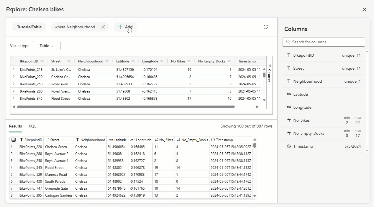
The following animated image shows how one might explore data visually in a Real-Time dashboard:
Steps
- In a Real-Time dashboard, select the desired tile and then explore data.
- Add and remove filters to the visual data in a no-code experience.
- Aggregate and split the data by one or more dimensions of the data.
- Remove existing query statements to increase or decrease the data scope.
- View the resulting visualization in the updated tile.
Potential use cases
A NYC taxi fleet analyst is exploring the rides data to learn in which boroughs and in what time of the day it's more cost effective to have taxi drivers available for rides.