Data visualization area
The Data visualization area displays the data of the selected variables. The time range of the displayed data can be selected within the time selection panel. By default, the data visualization is set for 1 hour duration.
Visualizations can be of the following types:
- Line chart based on aggregating the supported numeric and boolean variable data types.
- Event chart displaying events for example, data of 1 to 5 assets at a time.
- Zoom-in and Zoom-out through zoom controls. You can zoom to a specific time range in the visualization area and can view expanded chart representation.
- By using stack mode, you can view separate charts for every group variable.
- Raw, Auto, and Aggregate chart view to visualize data within the selected time period.
Data visualization screen
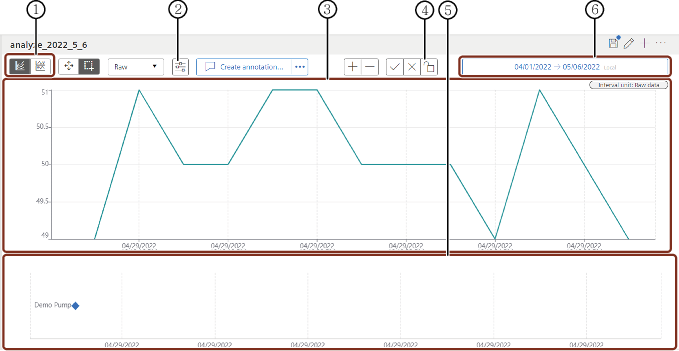
① Visualization options
② Chart options: Enables interpolations in tooltip and enables you to see the data with the filled line area
③ Asset data visualization in Aggregates view
④ Locks time series API request
⑤ Events visualization chart
⑥ Time selection panel
Note
- By default, "Aggregates" view is selected with "Last hour" time period. The dotted lines in the "Raw" chart represents additional data. You can Zoom-in or scroll the cursor in the chart to visualize additional data.
- In "Raw" chart, if the time period exceeds 90 days, then an error message is displayed. It is then required to reduce the time period below 90 days. This screen also allows you to switch between Raw and Aggregate view.
Last update: May 6, 2025