Training Board
The Training Board is where you can review the accuracy, validation tests, feature importance and configuration. You can also interact with the training data points to understand how they relate to the energy consumption and/or reference value. A Training Board is available for every model, but if the model has not been trained, then it will be displayed as "No Data".
In the Training Board header, you can view the the model name, description, state, the owner and the date range used for the training data. The Training Board contains the following tabs:
Model Accuracy
This section shows the standard metrics for evaluating model accuracy.
- R2, sometimes called coefficient of determination, reports the proportion of the variation in the target variable that is predictable.
- Root Mean Square Error measures the magnitude of the typical error that a model makes.
- Mean Absolute Error is similar to Root Mean Square Error.
The page shows these metrics for both the training and test data. In all cases, a 20% proportion of the data is used to create a test data set. The test set is data that the training algorithm has not used to build the model, so the scores on this are a much more reliable test of model performance.
Each model actually consists of two sub-models, one for energy and the other for the reference. Scores are displayed for each model on the separate rows.

The R2 on the test data are used to determine if a "Trained" model becomes an "Active" model. By default, they both need to be over 70% to be activated.
Prediction
This section shows the validation plots for both Energy and Reference models. The predicted vs actual chart shows the correlation between the Predicted value and the Actual value. If the model is accurate, then these points should be close to straight or diagonal line. This correlation between the predicted and actual is used to calculate R2. The plot though gives more information than R2 as it can be used to determine if there are any ranges of the target variable where the model is performing poorly.

The Delta vs actual chart shows the distribution of residuals between the model prediction and the actual values for both the training and test data sets. A good model should have small residuals, should not be skewed and should be centered around 0. Ideally, the variance in the test data residuals is not a lot larger than for the training data.

Feature Importance
This section assists the user to select the most important features of the model. They could focus only on these features during the optimization procedure, for example. There are three charts:

The first two charts show the relative importance of the features using standard measures such as SHAP values. Ideally, these two charts should agree on the order of importance. The third chart shows the feature effects. These indicate in which direction the features influence the model target. For example, in the chart above, the value of 'Sulfur' is positively correlated with the model output.
Explainability
The Explainability tab provides an interactive parallel coordinate plot for the user to see how the features are related to the models targets. The training data is displayed both in the chart and the table. The user can select a row in the table to see all the feature values and corresponding energy and reference values. Alternatively, the user can select a point directly in the plot.
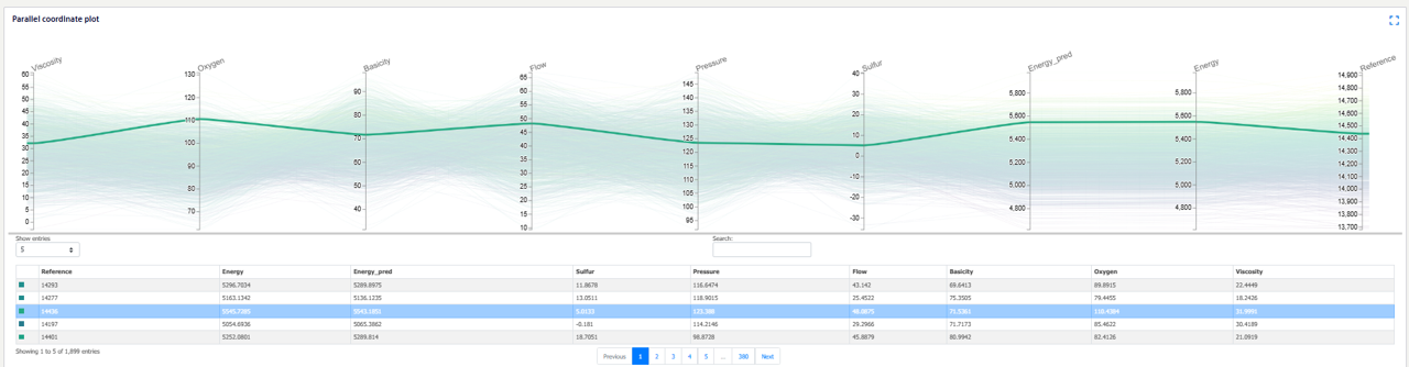
The user can also box select a range for any of the variables on the plot. This could be useful if, for example, they would like to see the variable values corresponding to a range of energy and reference values.
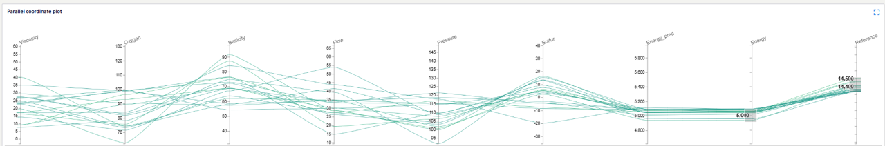
These plots assist the user find the best results within their training data. To identify new process settings that minimize energy, then the model can be used in the Process Optimization.
Input Data
These charts show all of the training data plotted as time series. The first chart shows the features, and the second both energy and reference targets. The user can zoom into particular time ranges to view the data in detail. This could be useful to see any particular time dependency or patterns in the training dat that could be affecting the model performance.

Data Analysis
This section shows the training data analysis results plotted as histograms, scatterplots and a correlation heatmap. The user can use these plots to detect patterns and correlations between the features and model targets. Each plot can be downloaded as a jpg by clicking on the training-board-analysis-download.

Configuration
The configuration includes all information on the features, target and training data that are needed to reproduce this model.